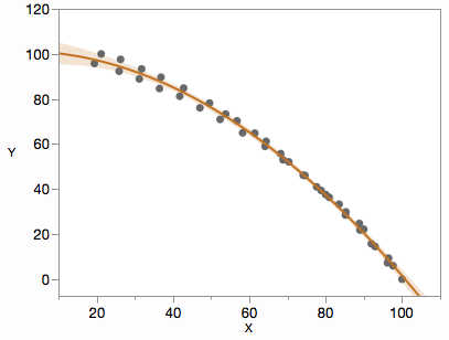
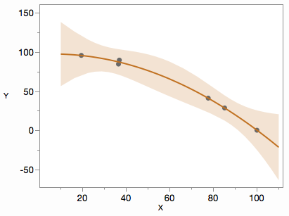
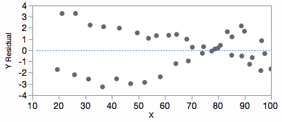
I have been trying for a while plotting a polynomial regression using R. I have read several libraries, as ggplot2, qplot, etc, with no succeed. The next are my data:
I normally use the R GUI called R commander. Is there any option to get this plot without writing commands directly in the prompt line by using this GUI?
X   Y
97.6470588235   5.98290598291
92.9411764706   14.5299145299
90,00   22.2222222222
85.2941176471   29.9145299145
80,00   37.6068376068
74.1176470588   46.1538461538
68.8235294118   52.9914529915
64.1176470588   58.9743589744
58.2352941176   64.9572649573
52.3529411765   70.9401709402
47.0588235294   76.0683760684
41.7647058824   81.1965811966
36.4705882353   84.6153846154
31.1764705882   88.8888888889
25.8823529412   92.3076923077
19.4117647059   95.7264957265
77.6470588235   41.0256410256
83.5294117647   33.3333333333
96.4705882353   9.40170940171
88.8235294118   24.7863247863
100,00  0,00
96.186440678    7.27272727273
91.9491525424   15.7575757576
88.9830508475   21.8181818182
85.1694915254   28.4848484848
80.9322033898   36.3636363636
78.813559322    39.3939393939
74.5762711864   46.0606060606
70.3389830508   52.1212121212
64.406779661    61.2121212121
56.7796610169   70.303030303
49.5762711864   78.1818181818
42.7966101695   84.8484848485
36.8644067797   89.696969697
31.7796610169   93.3333333333
26.2711864407   97.5757575758
21.186440678    100,00
61.4406779661   64.8484848485
68.2203389831   55.7575757576
53.813559322    73.3333333333
I obtained its quadratic regression and the coefficients for the confidence intervals:
Call:
lm(formula = Y ~ X + I(X^2), data = Datos2)

Residuals:
    Min      1Q  Median      3Q     Max
-3.2599 -1.3415  0.1541  1.3610  3.2911

Coefficients:
              Estimate Std. Error t value Pr(>|t|)
(Intercept)  1.013e+02  1.971e+00  51.419   <2e-16 ***
X           -8.086e-03  7.069e-02  -0.114     0.91
I(X^2)      -9.886e-03  5.727e-04 -17.263   <2e-16 ***
---
Signif. codes:  0 '***' 0.001 '**' 0.01 '*' 0.05 '.' 0.1 ' ' 1

Residual standard error: 1.824 on 37 degrees of freedom
Multiple R-squared:  0.9964,    Adjusted R-squared:  0.9962
F-statistic:  5132 on 2 and 37 DF,  p-value: < 2.2e-16


> Confint(LinearModel.3, level=0.95)
                 Estimate       2.5 %        97.5 %
(Intercept) 101.323700913 97.33098252 105.316419306
X            -0.008086099 -0.15131294   0.135140742
I(X^2)       -0.009885921 -0.01104624  -0.008725598
However, trying to plot the quadratic regression and its Confidence intervals resulted in a more than expected hard work.
Which could be the correct command (or route using R commander) to get a professional plot view? I tried several ggplot and qplot with no succeed.
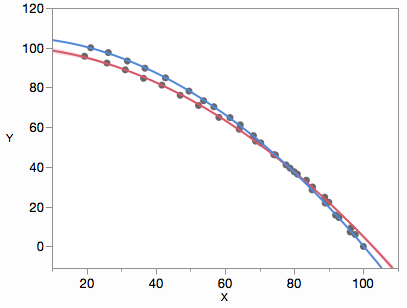
On the other hand, substituting particular X values in those three equations I get something which may be wrong. I mean. On the left side, the confidence interval must be wider than on the right side. However, what I see is the contrary, narrower the left and wider the right. A quick plot using LibreOffice Calc showing this:
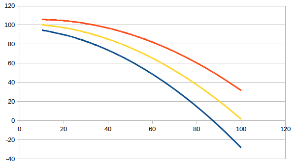 The distance between the red and blue lines (95%CI) must be narrower on the right side than on the left side.
Thanks in advance for your comments. Mario

