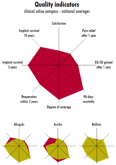
I like spider-web (radar/star) plots for multiple variables. The Swedish Hip Arthroplasty Register which I work with have nice spider plots that convey multiple variables nicely:

For an example on how to create them I've found the plotrix package (R), their example(radial.plot) has an example that shows how to create the plot:
ion.names<-c("Na","Ca","Mg","Cl","HCO3","SO4"
ions<-c(3.2,5,1,3.1,2.1,4.5)
radial.plot(ions,labels=ion.names,rp.type="p",main="Dissolved ions in water",
            grid.unit="meq/l",radial.lim=c(0,5),poly.col="yellow")
diamondplot() in the same package may also be an alternative.
UPDATE
I've looked at the dataset and I've tried to figure out how to group the variables:
# I've saved the file as a csv so that it's easier to import it
library(foreign)
my_data <- read.csv(file.choose(), sep=";")

# Create a new clean dataset
# merge the different variable 4 future creation of the outcome variable
my_cleaned_data <- data.frame(id=my_data$subject.id,
  role=my_data$role,
  no_GREEN=my_data$no..GREEN,
  no_RED=my_data$no..RED,
  # This creates a variable where 1 == red and 2 == blue,
  # any other value indicates an error, se below
  org_colour=
  ((my_data$Colour.of.ball.from.Urn.1=="red")*1 + (my_data$Message.received=="red")*1 +
   (my_data$Colour.of.ball.from.Urn.1=="blue")*2 + (my_data$Message.received=="blue")*2),
  decision_colour=
   ((my_data$Decision.as.Hider=="RED")*1 + (my_data$Decision.as.Seeker=="RED")*1 +
    (my_data$Decision.as.Hider=="BLUE")*2 + (my_data$Decision.as.Seeker=="BLUE")*2))

# There are some empty rows ==> remove all rows without id
my_cleaned_data <- subset(my_cleaned_data, id > 0)

# Check that only 1 & 2
table(my_cleaned_data$org_colour)
table(my_cleaned_data$decision_colour)

# Factor and label the original colours
#  - not really necessary step but it's always nice to know your data
my_cleaned_data$org_colour = factor(my_cleaned_data$org_colour, levels=c(1, 2), labels=c("red", "blue"))
my_cleaned_data$decision_colour = factor(my_cleaned_data$decision_colour, levels=c(1, 2), labels=c("red", "blue"))

# Create the outcome variable
my_cleaned_data$same_colour = my_cleaned_data$org_colour==my_cleaned_data$decision_colour

# Aggregate by the variables that your interested in
# This part gets an average for the same colour & that id
# I'm a little uncertain if no_GREEN may affect the average for that subject
# since it is a variable that may change within the subject and the whole point
# of this part is to aggregate by the id variable
t <- aggregate(same_colour ~ id + role + no_RED + no_GREEN, data=my_cleaned_data, mean)

# These are probably the outputs that you want to put into your graph
# use the role data to sort out the different parts of the spider-web graph
res.base <- aggregate(same_colour ~ role, data=t, mean)
res.no_RED <- aggregate(same_colour ~ no_RED + role, data=t, mean)
res.no_GREEN <- aggregate(same_colour ~ no_GREEN + role, data=t, mean)

# Create the output for the spider web graph
# I guess this is the lazy solution, there
# probably is a much speedier solution out there
# I find though sometimes that a little more code
# often enhances the readability
hider_data <- subset(res.no_RED, role=="hider")
hider_data_output <- hider_data$same_colour
data_labels <- paste("No. RED:", hider_data$no_RED)
hider_data <- subset(res.no_GREEN, role=="hider")
hider_data_output <- c(hider_data_output, hider_data$same_colour)
data_labels <- c(data_labels, paste("No. GREEN:", hider_data$no_GREEN))

seeker_data <- subset(res.no_RED, role=="seeker")
seeker_data_output <- seeker_data$same_colour
seeker_data <- subset(res.no_GREEN, role=="seeker")
seeker_data_output <- c(seeker_data_output, seeker_data$same_colour)

# Create a 2-row matrix since we
# want to output two polygons
data_output <- rbind(seeker_data_output, hider_data_output)

library(plotrix)
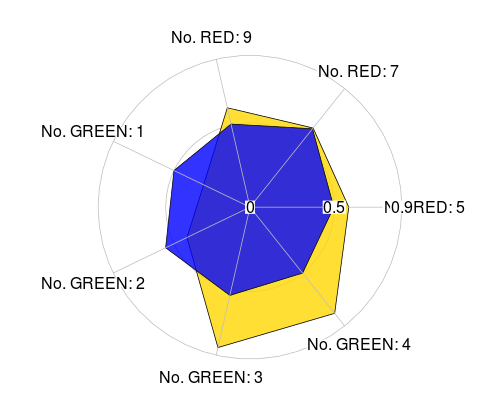
# The plot with two transparent polygons, one yellow
# and the other one blue
# If you omit the .5 in limits you get more lines
# you could also add .25 & .75
radial.plot(data_output,
  labels=data_labels,
  rp.type="p",
  radial.lim=c(0,0.5,round(max(data_output), digits=1)),
  poly.col=c(rgb(255/255, 215/255, 0, .8), rgb(0, 0, 1, .8)),
  line.col=c("black", "black"),
  lwd=1)
Adding more complexity shouldn't be that hard. The same_color indicates the proportion with the same colour. This gives a graph:

I guess you need to ask yourself what the seeker/hider means and how their colours depend. If you want to know if they change colours depending on some base colour information it shouldn't matter that you merge the two into one variable since the don't overlap. I find it easier to calculate the change in this way.


