I have a collection of highly irregular sampled data. The gap between measurements can be few seconds, or few weeks or few decades ... What are the techniques to plot irregularly spaced time series data?
2 Answers
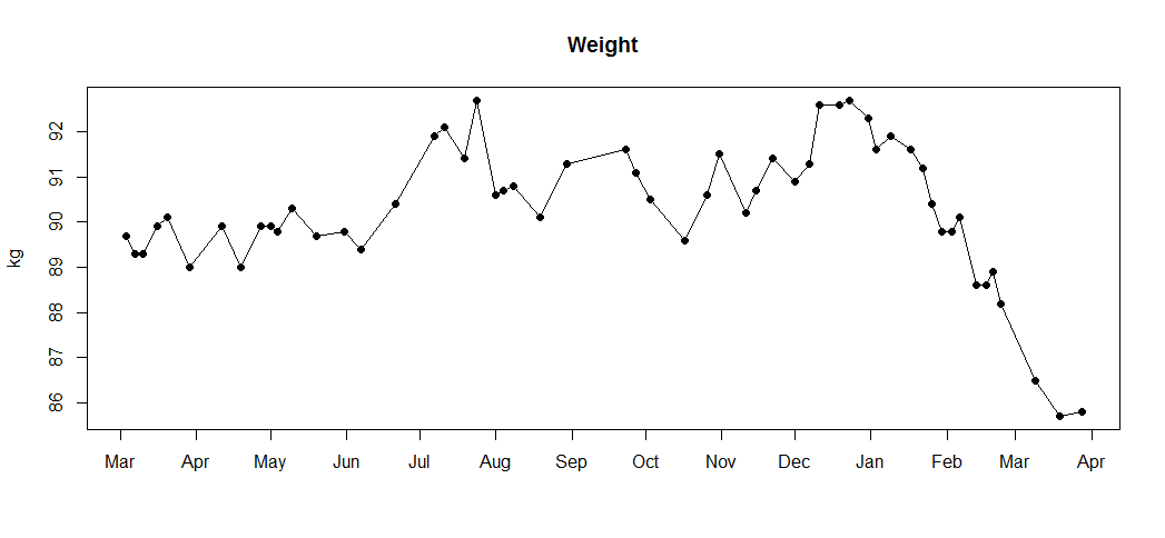
Just plot observations against timestamps and connect the dots.
For example, I measure my weight every time I get to the gym, which happens rather irregularly, indeed:

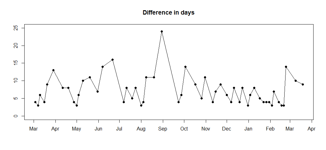
Depending on what information you want to show, you may also want to plot the length of each interval between successive observations, e.g.:

-
3$\begingroup$ If the times series is mostly regular (e.g., daily values, but missing values at public holidays), you might want to plot the lines spanning (i.e., connected to) the missing days as dotted or dashed lines, to make it clearer that there are days with missing data. $\endgroup$ Commented Apr 1, 2015 at 8:15
-
$\begingroup$ @KarlOveHufthammer: I work with retail sales, and in many countries, I only have daily data Mon-Sat, since stores are closed on (most) Sundays. In such cases, I only connect adjacent valid observations, so my time series has "holes". However, I'd call that a "regular time series with missing data", not an "irregular time series". $\endgroup$ Commented Apr 1, 2015 at 8:18
-
$\begingroup$ What about if sometimes your are measuring your weight obsesivly every few seconds, or every few minutes or every other day. Then severals months pass and you do not weight yourself until you get another compulsive obsessive episode? In summary, I have a highly irregular sampled data. The gap between measurements can be few seconds, or few weeks or few decades... Then we cannot have a graph plotted by month as you suggest... $\endgroup$– mfroeseCommented Apr 1, 2015 at 16:49
-
$\begingroup$ My data are not plotted by month - the months are only axis annotations. I have daily data. You can simply use whatever timestamp you have on the x axis. Perhaps you want to separate different obsessive episodes into different side-by-side panels. $\endgroup$ Commented Apr 2, 2015 at 6:36
-
$\begingroup$ How about highly irregular data such as only having a couple of data points over a decade followed by data points measured multiple times a day? Are there any commonly used plots that can sensibly show this kind of data? Plotting it with linear time on the horizontal axis would result in a couple of data points for a long time and then nearly vertical lines with lots of dots in the end. That's obviously the true data but the right side of the graph would be unreadable. $\endgroup$ Commented Feb 24, 2022 at 12:57
You could create a "time map" which is a type of scatterplot. Each event is a point, with the x-value being the time elapsed since the previous event, and the y-value is the waiting time until the next event. See this blog or on Twitter, check out #time_map_viz for examples.
You can color-code the dots to carry additional information. To deal with varying timescales, you can use logarithmic axes.
