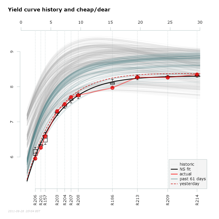
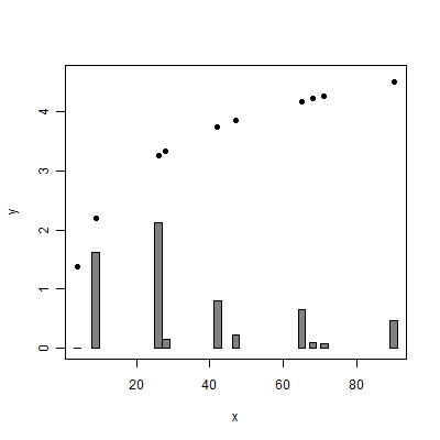
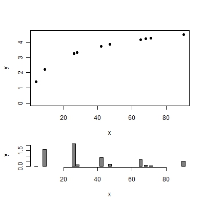
Hi in base graphics in R, I would like to overlay a bar plot on a chart which has irregularly spaced points on a curve. The bars should represent the change in these points since the previous sample. But I would like the bars to align to the points in the horizontal direction, so there should basically be a lot of whitespace, and wherever there's a point in the line chart, a bar should also appear at the same x-axis location, showing the change. The bottom of bars will start either on the x-axis (i.e. at y=0), or possibly underneath as a separate chart.
How would I go about doing this in R?
I know I can do this with bloxplots, as you can see in the chart in question below, where the boxes align to the various points (which are, fyi, south african government bonds). Now how do I add the bar plot?


