1
vote
$\begingroup$

I have a function that plots (I think) various conditions within a set of motor racing timing data using boxplot:

library(RCurl)

gsqAPI = function(key, query, gid=0){
                  return(
                    read.csv( paste( sep="",'http://spreadsheets.google.com/tq?', 'tqx=out:csv','&tq=', curlEscape(query), '&key=', key, '&gid=', curlEscape(gid) ) )
                    ) }
pd=gsqAPI('0AmbQbL4Lrd61dHVNemlLLWNaZ1NzX3JhaS1DYURTZVE',
          'select A,C,E,G', gid='6')

boxplot(Time~Stint*Session*DriverNum,
        data=subset(pd, (DriverNum==1 | DriverNum==2)&Time<110),
        las=2, ylab="Time(s)", xlab="FP Stint:Session:DriverNum",
        ylim=c(80,110), main='F1 2011 Italy FP Times (Red Bull)')

What's the equivalent way of doing this using ggplot2? (That is, what's the ggplot2 equivalent of the boxplot command above?)

As a second part to the question, how would I generate a separate chart using ggplot2 that displays the boxplot overlaid with a plot of the raw data points within each condition?

$\endgroup$

1 Answer 1

2
votes
$\begingroup$

Given your data.frame pd:

library("ggplot2")

ggplot(subset(pd, (DriverNum==1 | DriverNum==2) & Time < 110)) +
  geom_boxplot(aes(x=interaction(Stint,Session,DriverNum,sep=":"), y=Time)) +
  scale_y_continuous("Time(s)") +
  scale_x_discrete("FP Stint:Session:DriverNum") +
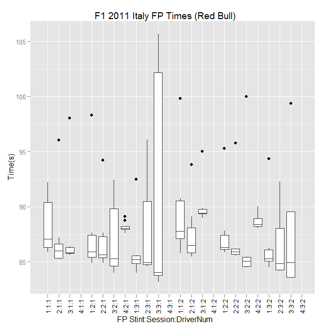
  opts(title = "F1 2011 Italy FP Times (Red Bull)")

enter image description here

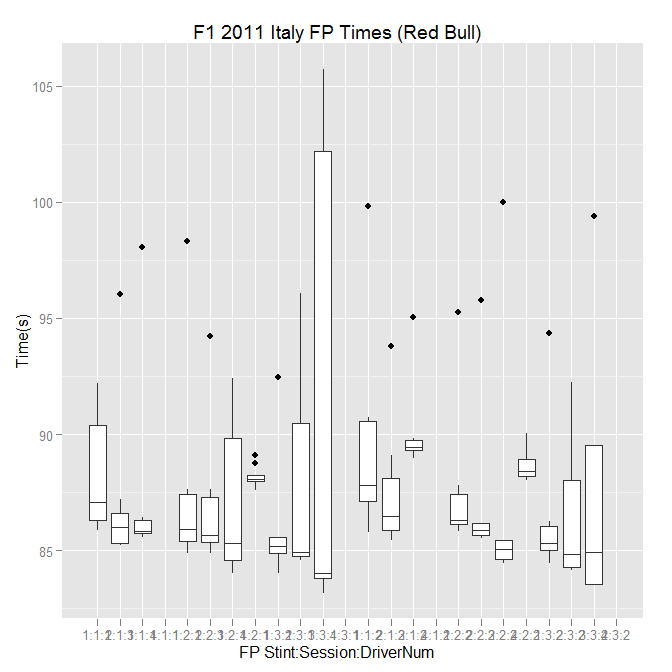
You can rotate the lower labels with this modification

ggplot(subset(pd, (DriverNum==1 | DriverNum==2) & Time < 110)) +
  geom_boxplot(aes(x=interaction(Stint,Session,DriverNum,sep=":"), y=Time)) +
  scale_y_continuous("Time(s)") +
  scale_x_discrete("FP Stint:Session:DriverNum") +
  opts(title = "F1 2011 Italy FP Times (Red Bull)",
    axis.text.x = theme_text(angle=90)) 

enter image description here

$\endgroup$
7
  • $\begingroup$ Wonderful - thanks:-) Interaction() was the trick I was missing... $\endgroup$ Commented Sep 12, 2011 at 23:28
  • $\begingroup$ Is it possible to also: a) explicitly set the yrange; b) overlay the raw data points on the chart? $\endgroup$ Commented Sep 12, 2011 at 23:28
  • 3
    $\begingroup$ @psych - without testing it, something like + geom_point() + ylim(0,XXX) should do the trick. You may want to set the alpha parameter in geom_point() to get some transparency so you can see the underlying box plot. I also recommend reading through had.co.nz/ggplot2 as there are quite a few examples. $\endgroup$
    – Chase
    Commented Sep 13, 2011 at 0:38
  • 1
    $\begingroup$ @Chase has it right, @psychemedia. Adding + geom_point() after the geom_boxplot line will add the points (the order is important; the order of the geoms defines the order they are put down in and thus what covers what). The ylim call will work, or you can incorporate it into the scale_y_continuous call like scale_y_continuous("Time(s)", limits=c(0,XXX)) $\endgroup$ Commented Sep 13, 2011 at 3:04
  • $\begingroup$ @Chase, Brian Great - thanks... I need to to work through some of the ggplot docs I think; the layering is quite powerful, I think, especially when you can make use of transparency too... $\endgroup$ Commented Sep 13, 2011 at 8:04

Not the answer you're looking for? Browse other questions tagged or ask your own question.