3
$\begingroup$

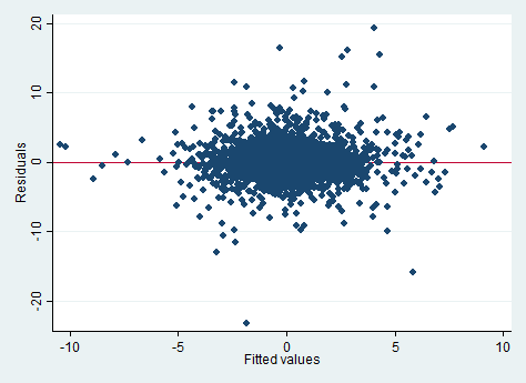
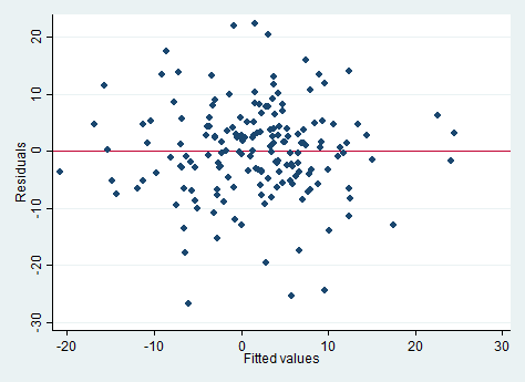
I am working on a linear regression model and I am not sure how to interpret the following residual vs fitted values plot.

DAILY

For all I know residuals are supposed to fluctuate randomly around 0 which I would say is what my data does more or less (at least there is no apparent trend in one direction or the other).

However might it be a problem that so many of my data points are clustered around the centre? Or that I got too many outliers?

I know that I got quite a large number of data points (3,632) which adds to the clustering but shouldn't the points be more spread out?

I use daily returns for my regression but I could also use monthly data which would look like this. MONTHLY

$\endgroup$

2 Answers 2

2
$\begingroup$

The plots you have reproduced are generally used to detect model misspecifications, usually curvature and heteroscedasticity.

What people do, and R does automatically, is superimpose a non-parametric lowess curve on this figure. This a local regression technique that offers an informal assessment of whether higher order terms need to be included in the model, among others. You would see that if the local regression line is curved. Then you might want to examine whether your model improves upon introducing them.

Heteroscedasticity means unequal variances and as such is a violation of the OLS assumptions. Although the estimator is still consistent and unbiased, it longer is Minimum Variance (BLUE) so that's something you need to guard against. The way to judge whether your errors are heteroscedastic is by observing the scatter in your figure. Unequal scatter across the horizontal zero line can be indicative of different variances and it might be worth investigating further. There are tests for heteroscedasticity, depending on how serious you are.

When it comes to outliers, these plots do not tell us much. Sure, there seem to be some points further away from others but what we need to remember is that the residuals do not have equal variances. Thus, a better way of detecting outliers is plotting standardized residuals against fitted values, where values above three or below minus three would suggest the presence of an outlier.

Conclusions from plots can be quite subjective though and they cannot take the place of formal tests. You can find a lot more on the internet, so take a look.
$\endgroup$
3
  • 1
    $\begingroup$ (1) It is curious that you mention only R when the OP is using Stata. (2) More importantly, with the phrase "heteroscedasticity manifests in this plot" are you or are you not claiming that the plots in the question exhibit heteroscedastic residuals? $\endgroup$
    – whuber
    Commented Jun 4, 2015 at 17:09
  • $\begingroup$ I used more formal tests to test for the other assumptions underlying my model (homoscedasticity, no serial correlation, normality, etc.). I intended to use the plots above to justify the linearity assumption within my model - is it safe to assume that the plots depict a linear relationship or would it be useful to have some other kind of test? $\endgroup$
    – Wiebi
    Commented Jun 4, 2015 at 17:26
  • $\begingroup$ @Wiebi I do not see worrying signs but that's just me. As I noted, evaluations of these plots is quite subjective. $\endgroup$
    – JohnK
    Commented Jun 4, 2015 at 17:29
0
$\begingroup$

One way to familiarize yourself with what to expect from the plot when the assumptions hold is through simulation. Here is a reference that talks about this:

Buja, A., Cook, D. Hofmann, H., Lawrence, M. Lee, E.-K., Swayne, D.F and Wickham, H. (2009) Statistical Inference for exploratory data analysis and model diagnostics Phil. Trans. R. Soc. A 2009 367, 4361-4383 doi: 10.1098/rsta.2009.0120

One basic idea from the paper is to randomly permute the residuals (so there is no relationship with the fitted values) and replot. Do this several times. Each of those plots represent the "No Relationship" ideal. If the plot of the actual data looks similar then the plot does not cause concern, if it clearly looks different then the assumption is unlikely to hold.

The vis.test function in the TeachingDemos package for R implements the "lineup" approach mentioned in the paper

$\endgroup$

Your Answer

By clicking “Post Your Answer”, you agree to our terms of service and acknowledge you have read our privacy policy.

Not the answer you're looking for? Browse other questions tagged or ask your own question.