The qqnorm() R function produces a normal QQ-plot and qqline() adds a line which passes through the first and third quartiles. What is the origin of this line? Is it helpful to check normality? This is not the classical line (the diagonal $y=x$ possibly after linear scaling).
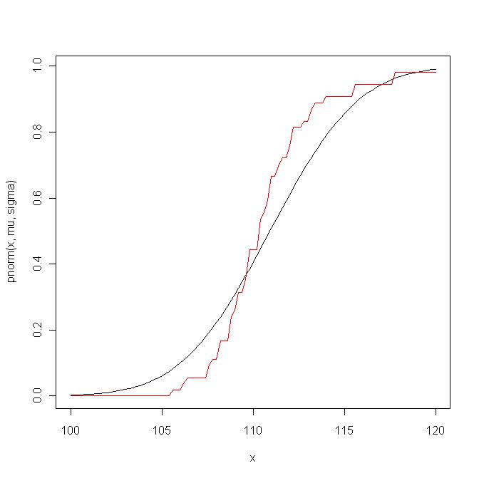
Here is an example. First I compare the empirical distribution function with the theoretical distribution function of ${\cal N}(\hat\mu,\hat\sigma^2)$:
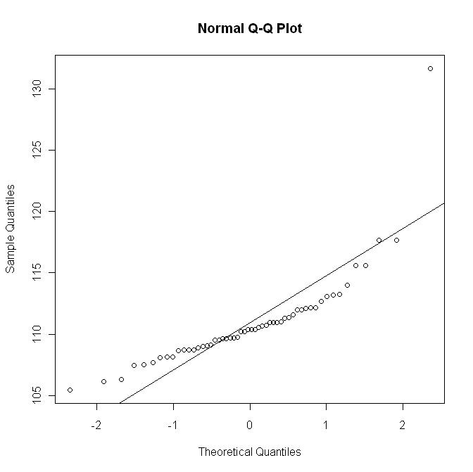
 Now I plot the qq-plot with the line $y=\hat\mu + \hat\sigma x$; this graph roughly corresponds to a (non-linear) scaling of the previous graph:
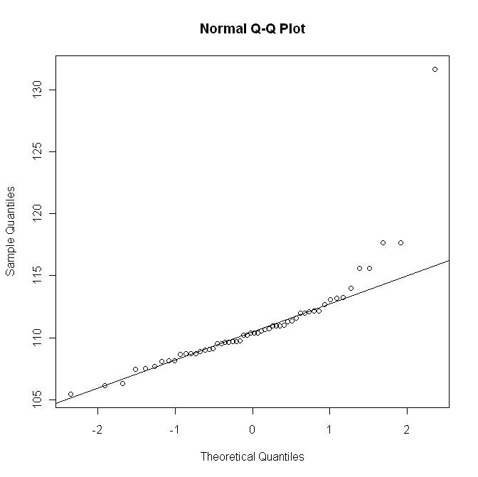
 But here is the qq-plot with the R qqline:
 This last graph does not show the departure as in the first graph.

