7
$\begingroup$

I am trying to plot the auto and cross correlation of the bitstream that is obtained from a nonlinear dynamical system.
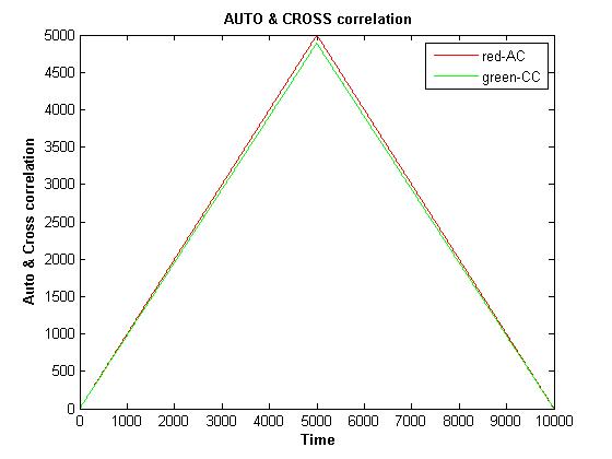
The graph is the Auto and cross-correlation for the bitstream obtained from the same nonlinear dyanamical system.

bitstream

I am not sure how to interpret the graph. Whether the program is incorrect or not. I wanted to obtain the plot of lags vs ACF but what I got is different than the actual plot given in a book. Please help.

A = .5;  B = 1.99;  phin = .5;  xphi(1) = A - (B*phin);

for it = 2:1:5000    
 xphi(it) = A - (B*abs(xphi(it-1)));    
end
phi = 2*(xphi>=0.5)-1; 
A = .51;  B = 1.90;  phin = .5;  xphit(1) = A - (B*phin);

for it = 2:1:5000   
 xphit(it) = A - (B*abs(xphit(it-1)));    
end
phit = 2*(xphit>=0.5)-1; 


CST = xcorr(phit,phi);
AST = xcorr(phi,phi);

Time = 0;
for nn = 2:1:length(CST)
Time(nn) = Time(nn-1) + 1; 
end

plot(Time,AST,'r',Time,CST,'g');       title('\bf AUTO & CROSS correlation');    
xlabel('\bf Time');    ylabel('\bf Auto & Cross correlation'); legend('red-AC','green-CC');

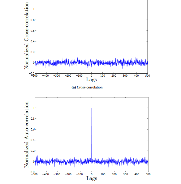
The plot should resemble

actual plot

where the figure on top is the cross-correlation and the bottom is the auto-correlation

$\endgroup$
2
  • 2
    $\begingroup$ I am not sure what graph have you plotted. Are you using R ? How can ACF values be outside -1 and 1 $\endgroup$
    – NG_21
    Commented Aug 31, 2016 at 5:33
  • $\begingroup$ @NG_21: I have used Matlab and included the code that is used to generate the plot $\endgroup$
    – Srishti M
    Commented Aug 31, 2016 at 15:18

1 Answer 1

1
$\begingroup$

tl;dr: Your time axis is wrong and the correlation values could be rescaled.

Time Axis

The cross-correlation of two continuous signals $F$ and $G$ is $$(F \star G)(\tau) = \int_{-\infty}^{\infty} F^*(t)G(t+\tau)dt$$ In other words, it is the dot product between $F$ (or its complex conjugate $F^*$ for complex-valued signals) and a version of $G$ that has been shifted forwards and backwards. (It's very much like convolution, except that for convolution, one of them is also reversed: $t+\tau$ becomes $t-\tau$ for convolution).

This implies that your cross-correlation plot has zero at its center, rather than on one edge. You constructed the time axis yourself, so you could change the code to put 0 at the center, -1 and +1 on either side, etc. Matlab also does this for you as the second argument from xcorr (docs):

[CST, lags] = xcorr(phit, phi); plot(lags, CST); title('Cross-correlation'); [AST, langs] = xcorr(phi, phi); plot(lags, AST); title('Autocorrelation');

Rescaling

The formula above assumes that your signals are infinite, but your actual data probably is not. As you "push" one array past the other, they become different lengths and you can no longer compare them. One approach is to shift one array circularly (i.e., G(1) becomes G(2), G(2) becomes G(3), ...., G(N-1) becomes G(N), and G(N) becomes G(1)).

Matlab doesn't do that. Instead, it pads them with zeros (it actually does the computation in the frequency domain, and the fft call does the padding). If your signal has a non-zero mean, it becomes a strangely-shaped little "step" in the midst of zeros. The convolution or cross-correlation of the two steps produces that weird triangular shape. There are a few ways of dealing with it:

  1. Standardizing your signal so it has zero mean and unit variance helps
  2. You can also get an unbiased estimate of the cross-correlation by rescaling $R(\tau)$ by $\frac{1}{N-|\tau|}$. Matlab does this if you add a third option to the function call xcorr(F,G,'unbiased') (there are a few other normalization options too).

Incidentally, you might want to play around with a less pathological pair of "signals" for practice so you can see by eye what the result should be.

$\endgroup$
1
  • $\begingroup$ Thank you for your reply. I am getting the same triangle ACF plot using the code that you have given. I still cannot understand what the plot means, whether the bit stream data is correlated or not. Could you please elaborate on these points (a) what can we infer about independence by looking at the spike in the ACF plot (b) What does the plot for ACF using the bit stream indicates about independence (c) How can I get normalized ACF on the Y Axis? $\endgroup$
    – Srishti M
    Commented Sep 9, 2016 at 1:58

Your Answer

By clicking “Post Your Answer”, you agree to our terms of service and acknowledge you have read our privacy policy.

Not the answer you're looking for? Browse other questions tagged or ask your own question.