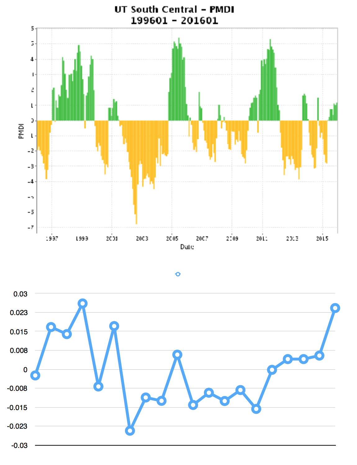
I have two data sets, both ranging from 1996-2016. However, the y-axis values are on completely different scales. The first is for mean NDVI values where 0 is centered on the mean (.1865) and the ranges are the differences between the mean and the values for that year that range from -0.03 to 0.03. The second dataset is the Palmer Drought Severity Index with the same date range, but range from -7 and 6.
I want to know the best way to find correlation between these two datasets, and would prefer to be able to do it in python. Here is an image of the two plots, both have the same x-axis which is the year range from 1996-2016

