Consider upvoting @amoeba's and @ttnphns' post. Thank you both for your help and ideas.
The following relies on the Iris dataset in R, and specifically the first three variables (columns): Sepal.Length, Sepal.Width, Petal.Length.
A biplot combines a loading plot (unstandardized eigenvectors) - in concrete, the first two loadings, and a score plot (rotated and dilated data points plotted with respect to principal components). Utilizing the same dataset, @amoeba describes 9 possible combinations of PCA biplot based on 3 possible normalizations of the score plot of the first and second principal components, and 3 normalizations of the loading plot (arrows) of the initial variables. To see how R handles these possible combinations, it is interesting to look at the biplot() method:
First the linear algebra ready to copy and paste:
X = as.matrix(iris[,1:3])             # Three first variables of Iris dataset
CEN = scale(X, center = T, scale = T) # Centering and scaling the data
PCA = prcomp(CEN)

# EIGENVECTORS:
(evecs.ei = eigen(cor(CEN))$vectors)       # Using eigen() method
(evecs.svd = svd(CEN)$v)                   # PCA with SVD...
(evecs = prcomp(CEN)$rotation)             # Confirming with prcomp()

# EIGENVALUES:
(evals.ei = eigen(cor(CEN))$values)        # Using the eigen() method
(evals.svd = svd(CEN)$d^2/(nrow(X) - 1))   # and SVD: sing.values^2/n - 1
(evals = prcomp(CEN)$sdev^2)               # with prcomp() (needs squaring)

# SCORES:
scr.svd = svd(CEN)$u %*% diag(svd(CEN)$d)  # with SVD
scr = prcomp(CEN)$x                        # with prcomp()
scr.mm = CEN %*% prcomp(CEN)$rotation      # "Manually" [data] [eigvecs]

# LOADINGS:

loaded = evecs %*% diag(prcomp(CEN)$sdev)  # [E-vectors] [sqrt(E-values)]
1. Reproducing the loading plot (arrows):
Here the geometric interpretation on this post by @ttnphns helps a lot. The notation of the diagram in the post has been maintained: $V$ stands for the Sepal L. variable in the subject space. $h'$ is the corresponding arrow ultimately plotted; and the coordinates $a_1$ and $a_2$ are the component loads a variable $V$ with respect to $\small \text{PC} 1$ and $\small \text{PC} 2$:
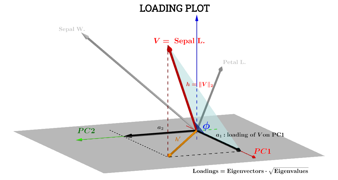
The component of the variable Sepal L. with respect to $\small\text{PC}1$ will then be:
$$\begin{align}
a_1 &= h\cdot\cos(\phi)\\[2ex]
\end{align}$$
which, if the scores with respect to $\small\text{PC}1$ - let's call them $\small\text{S}1$ - are standardized so that their
$\Vert\text{S}1\Vert = \sqrt{\sum_1^n \text{scores}_1^2} = 1$, the equation above is the equivalent to the dot product $V\cdot \text{S}1$:
$$\begin{align}
a_1 &= V\cdot \text{S}1\\[2ex]
&=\Vert V\Vert\,\Vert \text{S}1\Vert\, \cos(\phi)\\[2ex]
&= h\times 1\times \cdot\cos(\phi)\tag{1}
\end{align}$$
Since $\Vert V \Vert=\sqrt{\small{\sum x^2}}$,
$$\sqrt{\small{\text{Var}(V)}}=\frac{\sqrt{\small{\sum x^2}}}{\sqrt{n-1}}=\frac{\Vert V \Vert}{\sqrt{n-1}} \implies \Vert V\Vert =h=\sqrt{\small{\text{var}(V)}} \sqrt {n-1}.$$
Likewise,
$$\Vert\text{S}1\Vert=1=\sqrt{\small \text{var(S}1)}\sqrt {n-1}.$$
Going back to Eq.$(1)$,
$$a_1=h\times 1\times \cdot\cos(\phi)=\sqrt{\small{\text{var}(V)}}\,\sqrt{\small{\text{var}(\text{S}1)}}\, \cos(\theta) \;(n-1)$$
$\cos(\phi)$ can, therefore, be considered a Pearson's correlation coefficient, $r$, with the caveat that I don't understand the wrinkle of the $n-1$ factor.
Duplicating and overlapping in blue the red arrows of biplot()
par(mfrow = c(1,2)); par(mar=c(1.2,1.2,1.2,1.2))

biplot(PCA, cex = 0.6, cex.axis = .6, ann = F, tck=-0.01) # R biplot
# R biplot with overlapping (reproduced) arrows in blue completely covering red arrows:
biplot(PCA, cex = 0.6, cex.axis = .6, ann = F, tck=-0.01)
arrows(0, 0,
       cor(X[,1], scr[,1]) * 0.8 * sqrt(nrow(X) - 1),
       cor(X[,1], scr[,2]) * 0.8 * sqrt(nrow(X) - 1),
       lwd = 1, angle = 30, length = 0.1, col = 4)
arrows(0, 0,
       cor(X[,2], scr[,1]) * 0.8 * sqrt(nrow(X) - 1),
       cor(X[,2], scr[,2]) * 0.8 * sqrt(nrow(X) - 1),
       lwd = 1, angle = 30, length = 0.1, col = 4)
arrows(0, 0,
       cor(X[,3], scr[,1]) * 0.8 * sqrt(nrow(X) - 1),
       cor(X[,3], scr[,2]) * 0.8 * sqrt(nrow(X) - 1),
       lwd = 1, angle = 30, length = 0.1, col = 4)
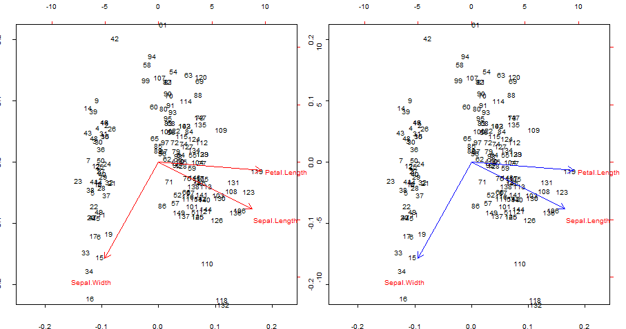
Points of interest:
- The arrows can be reproduced as the correlation of the original variables with the scores generated by the first two principal components.
- Alternatively, this can be achieved like in the first plot in the second row, labeled $\mathbf{ V*S}$ in @amoeba's post:

or in R code:
    biplot(PCA, cex = 0.6, cex.axis = .6, ann = F, tck=-0.01) # R biplot
    # R biplot with overlapping arrows in blue completely covering red arrows:
    biplot(PCA, cex = 0.6, cex.axis = .6, ann = F, tck=-0.01)
    arrows(0, 0,
       (svd(CEN)$v %*% diag(svd(CEN)$d))[1,1] * 0.8,
       (svd(CEN)$v %*% diag(svd(CEN)$d))[1,2] * 0.8,
       lwd = 1, angle = 30, length = 0.1, col = 4)
    arrows(0, 0,
       (svd(CEN)$v %*% diag(svd(CEN)$d))[2,1] * 0.8,
       (svd(CEN)$v %*% diag(svd(CEN)$d))[2,2] * 0.8,
       lwd = 1, angle = 30, length = 0.1, col = 4)
    arrows(0, 0,
       (svd(CEN)$v %*% diag(svd(CEN)$d))[3,1] * 0.8,
       (svd(CEN)$v %*% diag(svd(CEN)$d))[3,2] * 0.8,
       lwd = 1, angle = 30, length = 0.1, col = 4)
or even yet...
    biplot(PCA, cex = 0.6, cex.axis = .6, ann = F, tck=-0.01) # R biplot
    # R biplot with overlapping (reproduced) arrows in blue completely covering red arrows:
    biplot(PCA, cex = 0.6, cex.axis = .6, ann = F, tck=-0.01)
    arrows(0, 0,
       (loaded)[1,1] * 0.8 * sqrt(nrow(X) - 1),
       (loaded)[1,2] * 0.8 * sqrt(nrow(X) - 1),
       lwd = 1, angle = 30, length = 0.1, col = 4)
    arrows(0, 0,
       (loaded)[2,1] * 0.8 * sqrt(nrow(X) - 1),
       (loaded)[2,2] * 0.8 * sqrt(nrow(X) - 1),
       lwd = 1, angle = 30, length = 0.1, col = 4)
    arrows(0, 0,
       (loaded)[3,1] * 0.8 * sqrt(nrow(X) - 1),
       (loaded)[3,2] * 0.8 * sqrt(nrow(X) - 1),
       lwd = 1, angle = 30, length = 0.1, col = 4)
connecting with the geometric explanation of loadings by @ttnphns, or this other informative post also by @ttnphns.
There is a scaling factor: sqrt(nrow(X) - 1), which remains a bit of a mystery.
$0.8$ has to do with creating space for the label - see this comment here:
Further in addition, one should say that the arrows are plotted such
that the center of the text label is where it should be! The arrows
are then multiplied by 0.80.8 before plotting, i.e. all the arrows are
shorter than what they should be, presumably to prevent overlapping
with the text label (see code for biplot.default). I find this is
extremely confusing. – amoeba Mar 19 '15 at 10:06
2. Plotting the biplot() scores plot (and arrows simultaneously):
The axes are scaled to unit sum of squares, corresponding to the first plot of the first row on @amoeba's post, which can be reproduced plotting the matrix $\mathbf U$ of the svd decomposition (more on this later) - "Columns of $\mathbf U$: these are principal components scaled to unit sum of squares."

There are two different scales at play on the bottom and top horizontal axes in the biplot construction:
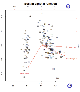
However the relative scale is not immediately obvious, requiring delving into the functions and methods:
biplot() plots scores as columns of $\mathbf U$ in SVD, which are orthogonal unit vectors:
> scr.svd = svd(CEN)$u %*% diag(svd(CEN)$d)
> U = svd(CEN)$u
> apply(U, 2, function(x) sum(x^2))
[1] 1 1 1
Whereas the prcomp() function in R returns the scores scaled to their eigenvalues:
> apply(scr, 2, function(x) var(x))         # pr.comp() scores scaled to evals
       PC1        PC2        PC3
2.02142986 0.90743458 0.07113557
> evals                                     #... here is the proof:
[1] 2.02142986 0.90743458 0.07113557
Therefore we can scale the variance to $1$ by dividing by the eigenvalues:
> scr_var_one = scr/sqrt(evals)[col(scr)]  # to scale to var = 1
> apply(scr_var_one, 2, function(x) var(x)) # proved!
[1] 1 1 1
But since we want the sum of squares to be $1$, we'll need to divide by $\sqrt{n-1}$ because:
$$\small \text{var}(\text{scr_var_one})= 1 =\frac{\sum_1^n \text{scr_var_one}}{n -1}$$
> scr_sum_sqrs_one = scr_var_one / sqrt(nrow(scr) - 1) # We / by sqrt n - 1.
> apply(scr_sum_sqrs_one, 2, function(x) sum(x^2))     #... proving it...
PC1 PC2 PC3
  1   1   1
Of note the use of the scaling factor $\sqrt{n-1}$, is changed later on to $\sqrt{n}$ when defining lan the explanation seems to lie in the fact that
prcomp uses $n-1$: "Unlike princomp, variances are computed with the usual divisor $n - 1$".
After stripping them of all the if statements and other housecleaning fluff, biplot() proceeds as follows:
X   = as.matrix(iris[,1:3])                    # The original dataset
CEN = scale(X, center = T, scale = T)          # Centered and scaled
PCA = prcomp(CEN)                              # PCA analysis

par(mfrow = c(1,2))                            # Splitting the plot in 2.
biplot(PCA)                                    # In-built biplot() R func.

# Following getAnywhere(biplot.prcomp):

choices = 1:2                                  # Selecting first two PC's
scale = 1                                      # Default
scores= PCA$x                                  # The scores
lam = PCA$sdev[choices]                        # Sqrt e-vals (lambda) 2 PC's
n = nrow(scores)                               # no. rows scores
lam = lam * sqrt(n)                            # See below.

# at this point the following is called...
# biplot.default(t(t(scores[,choices])      /  lam),
#                t(t(x$rotation[,choices]) *   lam))

# Following from now on getAnywhere(biplot.default):

x = t(t(scores[,choices])       / lam)         # scaled scores
# "Scores that you get out of prcomp are scaled to have variance equal to
#  the eigenvalue. So dividing by the sq root of the eigenvalue (lam in
#  biplot) will scale them to unit variance. But if you want unit sum of
#  squares, instead of unit variance, you need to scale by sqrt(n)" (see comments).
# > colSums(x^2)
# PC1       PC2
# 0.9933333 0.9933333    # It turns out that the it's scaled to sqrt(n/(n-1)),
# ...rather than 1 (?) - 0.9933333=149/150

y = t(t(PCA$rotation[,choices]) * lam)         # scaled eigenvecs (loadings)


n = nrow(x)                                    # Same as dataset (150)
p = nrow(y)                                    # Three var -> 3 rows

# Names for the plotting:

xlabs = 1L:n
xlabs = as.character(xlabs)                    # no. from 1 to 150
dimnames(x) = list(xlabs, dimnames(x)[[2L]])   # no's and PC1 / PC2

ylabs = dimnames(y)[[1L]]                      # Iris species
ylabs = as.character(ylabs)
dimnames(y) <- list(ylabs, dimnames(y)[[2L]])  # Species and PC1/PC2

# Function to get the range:
unsigned.range = function(x) c(-abs(min(x, na.rm = TRUE)),
                                abs(max(x, na.rm = TRUE)))
rangx1 = unsigned.range(x[, 1L])               # Range first col x
# -0.1418269  0.1731236
rangx2 = unsigned.range(x[, 2L])               # Range second col x
# -0.2330564  0.2255037
rangy1 = unsigned.range(y[, 1L])               # Range 1st scaled evec
# -6.288626   11.986589
rangy2 = unsigned.range(y[, 2L])               # Range 2nd scaled evec
# -10.4776155   0.8761695

(xlim = ylim = rangx1 = rangx2 = range(rangx1, rangx2))
# range(rangx1, rangx2) = -0.2330564  0.2255037

# And the critical value is the maximum of the ratios of ranges of
# scaled e-vectors / scaled scores:

(ratio = max(rangy1/rangx1, rangy2/rangx2))
# rangy1/rangx1   =   26.98328    53.15472
# rangy2/rangx2   =   44.957418   3.885388
# ratio           =   53.15472

par(pty = "s")                                 # Calling a square plot

# Plotting a box with x and y limits -0.2330564  0.2255037
# for the scaled scores:

plot(x, type = "n", xlim = xlim, ylim = ylim)  # No points
# Filling in the points as no's and the PC1 and PC2 labels:
text(x, xlabs)
par(new = TRUE)                                # Avoids plotting what follows separately

# Setting now x and y limits for the arrows:

(xlim = xlim * ratio)  # We multiply the original limits x ratio
# -16.13617  15.61324
(ylim = ylim * ratio)  # ... for both the x and y axis
# -16.13617  15.61324

# The following doesn't change the plot intially...
plot(y, axes = FALSE, type = "n",
     xlim = xlim,
     ylim = ylim, xlab = "", ylab = "")

# ... but it does now by plotting the ticks and new limits...
# ... along the top margin (3) and the right margin (4)
axis(3); axis(4)
text(y, labels = ylabs, col = 2)  # This just prints the species

arrow.len = 0.1                   # Length of the arrows about to plot.

# The scaled e-vecs are further reduced to 80% of their value
arrows(0, 0, y[, 1L] * 0.8, y[, 2L] * 0.8,
       length = arrow.len, col = 2)
which, as expected, reproduces (right image below) the biplot() output as called directly with biplot(PCA) (left plot below) in all its untouched aesthetic shortcomings:
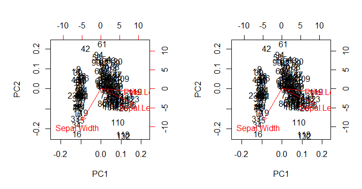
Points of interest:
- The arrows are plotted at a scale related to the maximum ratio between the scaled eigenvector of each one of the two principal components and their respective scaled scores (the
ratio). AS @amoeba comments:
the scatter plot and the "arrow plot" are scaled such that the largest (in absolute value) x or y arrow coordinate of the arrows was exactly equal to the largest (in absolute value) x or y coordinate of the scattered data points
- As anticipated above, the points can be directly plotted as the scores in the matrix $\mathbf U$ of the SVD:


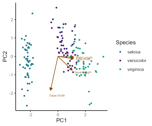
.74752, .66424; -.74752, .66424. $\endgroup$biplot(name_of_the_PCA)call, which in this case isbiplot(PCA). I had centered and scaled the data. $\endgroup$