2
$\begingroup$

I have two time series; (1) with average daily temperature (which is negative in Q1 and Q4 on some days) and (2) gas consumption of a client:

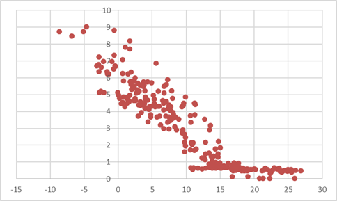
scatterplot temperature versus gas consumption

A part of the process I am trying to achieve is to calculate the relationship between gas consumption and temperature. I expect the consumption to be higher on average when it's colder. How shall I calculate the correlation between the two series?

I can check the correlation between the absolute values of temp in deg. C and gas consumption, the correlation between the log (temp, t-1 / temp, t) & log(consumpt, t-1 / consumpt, t), or either of the options with the temperature in Kelvin. Every method gives a substantially different result and I do not know which is correct. Any input would be helpful.

$\endgroup$
5
  • 1
    $\begingroup$ start with the scatter plot of temperature vs consumption, these are stationary. you may want to look at simple differences too. once you look at the scatters it'll give you an idea as to whether linear correlation makes a sense or not $\endgroup$
    – Aksakal
    Commented Sep 15, 2017 at 19:45
  • $\begingroup$ What are my options if the scatters don't show that linear correlation makes sense? The data I have produces the following scatterplot link, which I think has two regions of linearity. $\endgroup$
    – Dave R
    Commented Sep 22, 2017 at 17:47
  • $\begingroup$ the scatter is beautiful, looks very linear to me, with some threshold $\endgroup$
    – Aksakal
    Commented Sep 22, 2017 at 19:54
  • $\begingroup$ Words of caution: kdnuggets.com/2018/06/… and researchgate.net/post/… $\endgroup$
    – Tim
    Commented Jul 17, 2018 at 20:33
  • 1
    $\begingroup$ is this not a problem that has been identified with terms like Cooling Degree Days (CDD) and Heating degree days (HDD) .... aka :BATHTUB EFFECT , $\endgroup$
    – IrishStat
    Commented Sep 9, 2019 at 22:36

1 Answer 1

1
$\begingroup$

Assuming temperature (degrees celsius) on the x-axis, consumption on the y-axis, there is a clear floor effect, the gas consumption cannot be negative, and above about 15/16 C the consumption levels out. Before the leveling the relationship is linear. So I would consider first a broken-line linear regression rather than a correlation (with the restriction that the above-cutpoint linear part has slope zero, and maybe even a lower error variance).

For the broken-part model see Model broken stick model in R where one line has a constant gradient?.

$\endgroup$
1
  • 1
    $\begingroup$ Your assumptions regarding the axis are correct. The broken-part model is a good lead, thanks $\endgroup$
    – Dave R
    Commented Aug 4, 2018 at 10:47

Your Answer

By clicking “Post Your Answer”, you agree to our terms of service and acknowledge you have read our privacy policy.

Not the answer you're looking for? Browse other questions tagged or ask your own question.