1
$\begingroup$

I'm currently working with R on some oculometric data produced after an experiment I made. I have two conditions ("Risky" & "Safe") and 3 mental states ("Focus" & "Around" & "Mind wandering"). I put subjects doing both condition. Each 2 minutes on average they had to report there mental state ("Focus" & "Around" & "Mind wandering"). To suppress the interindividual variability, I wanted to normalize my data, i.e. take all data for each subject, subtract the mean pupil diameter of this subject and divide by the standard deviation of the same subject.

That done, I'm facing something quite strange. Here is my data before scaling: enter image description here
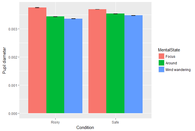
And here is my data after normalization: enter image description here
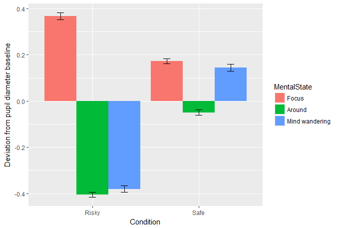
As you can see, the order of mental states on both conditions is different. I'm talking about the fact that I have a kind of linear relation between mental states before, while it gets messy after normalization.

  1. I used the native "scale" for the scaling, I did my own scaling function, both yield the same result.
  2. Subject exhibited different repartition of reports: some were more mind wandering, others more focused.
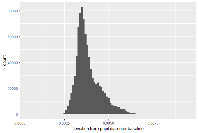
  3. My normalized data are normal (by definition...), however data before are quite skewed to the right.

enter image description here

So my questions are:

  1. is it mathematically possible to have such change?
  2. if yes, what would be the factors allowing such change
$\endgroup$
4
  • $\begingroup$ How many individuals are in this study exactly? I am confused by the counts going in the ten thousands in your final plot. Are these perhaps a repeated measures? In that case, the data are not independent and you will need to choose a model accordingly. $\endgroup$ Commented Nov 22, 2017 at 10:54
  • $\begingroup$ These are oculometric data yielded by a 120Hz eye-tracker during 40minutes. You can easily understand that I have tens of thousands of data. There are 2 subjects showed here (to simplify) and this is a repeated-measure study. $\endgroup$
    – Pyxel
    Commented Nov 22, 2017 at 11:03
  • 2
    $\begingroup$ A more common approach is to use a mixed model and include subject as a random effect. You don't need to manually remove the mean per individual. $\endgroup$ Commented Nov 22, 2017 at 11:07
  • $\begingroup$ Indeed I used a linear mixed-effect model using 'subject' as a random intercept. However I wanted here to include a visualization of my data for a publication. $\endgroup$
    – Pyxel
    Commented Nov 22, 2017 at 14:05

2 Answers 2

3
$\begingroup$

Negative numbers
When you subtract the mean, all differences will be centered around zero. So if you present your data in a barplot, the bars may suddenly be negative. However, how you apply standardization can have quite a different effect.

Scale
When you divide by the standard deviation, the data will have variance and standard deviation equal to one. Hence the difference in scale.

My normalized data are normal (by definition...)

By what definition exactly? They just have mean $0$ and variance $1$. They don't look normal to me and there is no reason why standardization would yield normally distributed data.

Normalization vs Standardization
Subtracting the mean and dividing by the standard deviation is usually referred to as standardization (see the standardization tag description). On the other hand, normalization is more often used to describe methods that change values such that they lie within a certain range.

$\endgroup$
1
  • $\begingroup$ Thanks for the answer Frans. I may have not used the best words to ask, unfortunately I lack the proper keywords. What I wanted to know is why I have some linear relation between mental state before normalization, whereas it gets messy afterwards. $\endgroup$
    – Pyxel
    Commented Nov 22, 2017 at 10:59
2
$\begingroup$

The problem probably arises, because you compare two different kinds of data. In your first bar plot, all measurements of both subjects are displayed together and undistinguishable. Frans Rodenberg has commented on that in the first comment. In the next bar graph, one part of the data has been treated differently than another part, as you normalized by subject. So different means have been subtracted and the data were divided by different standard deviations. Why should a different look of the barplots be unexpected, if you change parts of the data, that are not distinguishable in the first plot, differently?

If one subject was "focused" more often, then his mean and his standard deviation will influence the "focused" bar stronger and the other subject's mean an d standard deviation will influence the other bars stronger.

It burns down, to what @Frans Rodenburg already mentioned: You need to treat the data with respect to its inhomogenous nature, i. e. as data from two different subjects. None of the bar plots above account for that. A mixed-effects model may well be the best way to approach your analysis, of maybe a fixed effects model will do. As an R user, if you want to approach this via mixed effects, then you should familiarize yourself with the lmer or lme4 package.

$\endgroup$
1
  • $\begingroup$ Thank you for the complete answer. Indeed I used a linear mixed-effect model using 'subject' as a random intercept. However I wanted here to include a visualization of my data for a publication. $\endgroup$
    – Pyxel
    Commented Nov 22, 2017 at 14:03

Your Answer

By clicking “Post Your Answer”, you agree to our terms of service and acknowledge you have read our privacy policy.

Not the answer you're looking for? Browse other questions tagged or ask your own question.