There are three issues here:
The simulation probably doesn't do exactly what it seems.
The analysis does not evaluate whether the relationship between mean and variance is linear.
What can one do to check whether data appear Poisson?
Many answers to #3 have appeared elsewhere on our site, so I will focus on the first two issues.
What the simulation does
The lines of code
pos<-rpois(100,5)
...
samp<-sample(pos, 10)
draw $100$ iid values from a Poisson distribution with mean $5$ and then randomly obtain $10$ of those values (without replacement). Iterating the second command is a form of resampling analysis. It does not really test what happens when data are repeatedly drawn from the same underlying Poisson distribution; instead, it explores the distribution of the $100$ values obtained in the first line, which are fixed for the duration of the simulation.
To study a Poisson distribution, we need to draw repeated independent samples from it:
set.seed(17)      # Create reproducible results
mu <- 3           # Mean
n <- 10           # Sample size
n.trials <- 10000 # Number of trials

sim <- replicate(n.trials, {x <- rpois(n, mu); c(mean(x), var(x))})
At this point sim is a matrix with two rows: one for the means, the next for the variances. Each column summarizes a separate simulation (ergo, there are $10000$ columns in this example).
What the analysis does
Here it is in a compact form:
xy <- apply(sim, 1, function(x) quantile(x, probs=seq(0.001, 0.999, length.out=99)))
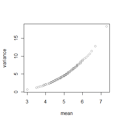
This creates an array of percentiles of the two rows of output, thereby tracing out their distributions. A plot is illuminating:
plot(xy, xlab="mean", ylab="variance",col=hsv(0, 0, 0.25, .4))

Like any Q-Q plot, this one systematically compares percentiles of one distribution (simulation of the variance of samples of $10$ Poisson values) to percentiles of another distribution (simulation of the mean of samples of $10$ Poisson values).
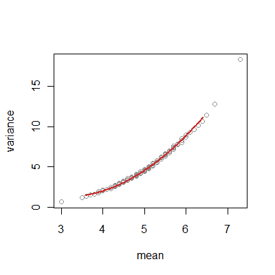
The curve isn't really straight, as we can find by regressing the y values on the x values with a quadratic term included:
z <- xy[,1]^2                  # Quadratic term
fit <- lm(xy[,2] ~ xy[,1] + z) # Regression of y-values against x and x^2
#
# Overplot the fit in red.
x0 <- seq(mu - 2 * sqrt(mu/n), mu + 2 * sqrt(mu/n), length.out=99)
u <- cbind(rep(1,length(x0)), x0, x0^2) %*% coefficients(fit)
lines(x0, u, lwd=2, col=hsv(0, .8, .8, 1))

The quadratic term is highly significant and has a large coefficient:
>coefficients(fit)[3]
         z
 0.8779665
I encourage interested readers to play with the parameters (mu, n, and n.trials) to see how things (don't) change. Consider also changing rpois in the simulation to something else (such as rnorm).
Some theory
The mean of $10$ independent draws from many distributions will have approximately a normal distribution. A Poisson (with mean $5$) is no exception: its mean should have a normal distribution of mean $5$ and variance $5/10$.
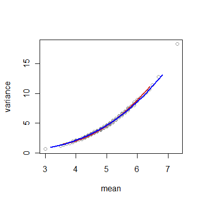
The CDF of a Poisson distribution with sizable mean (say, $3$ or greater) will itself begin approximating that of a normal distribution, with the approximation improving for larger means. Accordingly, we can hope that the variance of a sample of $10$ independent Poisson draws will begin to assume the distribution of the variance of a sample of $10$ independent draws from a comparable normal distribution. (The variance has a distribution proportional to a chi-squared distribution.) We can check by computing the exact percentiles of these approximating distributions and overplotting them on the simulated values:
q <- (1:100 - 0.5) / 100 # An array of percentiles for plotting
lines(qnorm(q, mean=mu, sd=sqrt(mu/n)), mu*qchisq(q, df=n-1) / (n-1), col="Blue")

Even for this fairly small mean ($5$) and modest sample size ($10$), the fit is extraordinarily good. Unfortunately, this shows that we should expect a similar-looking plot for almost any moderate sample size for many different underlying distributions, thereby demonstrating that this plot tells us little or nothing that is useful concerning whether the data come from a Poisson distribution.
What can we do instead?
"Checking" whether a distribution has a particular shape can be improved by indicating the ways in which the data might depart from that shape.
For example, Poisson distributions are special examples of negative binomial distributions, which can be considered overdispersed Poisson distributions. Specifically, if we obtain a sequence of Poisson values where the underlying mean of the Poisson distribution changes in a way that approximates a Gamma distribution, then the collected dataset is described by the negative binomial.
In such a setting, we can fit the negative binomial parameters (using maximum likelihood, for instance) and test whether the "non-Poissonness" parameter differs significantly from a value corresponding to a Poisson distribution. In the interest of space, and to keep this reply reasonably elementary, I will not pursue this option here.
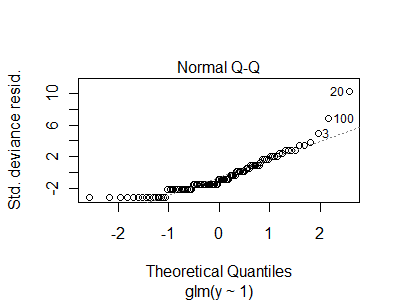
Less formally, we can simply apply a Poisson generalized linear model and look at its diagnostics:
set.seed(17)
y <- rnbinom(100, mu=5, size=1)      # NOT Poisson
x <- rpois(100, 5)                   # Poisson
fit.y <- glm(y ~ 1, family=poisson())
fit.x <- glm(x ~ 1, family=poisson())
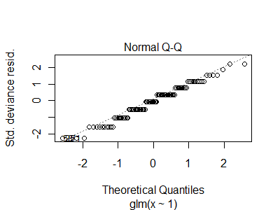
plot(fit.y)                          # Includes a residual Q-Q plot
plot(fit.x)                          # Includes a residual Q-Q plot
The residual Q-Q plot for the Poisson data is almost linear, whereas that of the negative binomial data has some pronounced extremes


As one can see, it takes a moderate sample size to detect these differences, but at least they do show up.

