I run a poisson regression by hand and now want to investigate plots whether overdispersion might be a problem or not. What should I plot against each other?
1 Answer
One somewhat useful plot would be to plot absolute Pearson residuals against $\sqrt{\hat{y}}$ (or $\hat{y}$ or $\log(\hat{y})$...). It should look flat, and as long as the fitted mean isn't too small the mean value on the y-axis should be roughly about 0.8 (the mean of the squared Pearson residuals should be about 1).
If it deviates considerably above 0.8 ($\sqrt{2/\pi}\approx 0.79788$ asymptotically) it's overdispersed, while if it isn't reasonably close to flat the variance-function is misspecified.
Here's an example in R:
x <- runif(200,3,14)
m <- exp(0.3*x-1.5)
y <- rpois(m,m)
xyglmfit <- glm(y~x,family=poisson)
xyfitted <- fitted(xyglmfit)
pres <- residuals(xyglmfit,type="pearson")
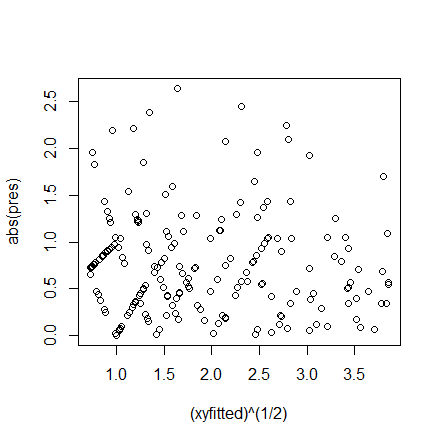
plot((xyfitted)^(1/2),abs(pres))
Note that the left end of the plot should have more skewness than the right end and will tend to have slightly larger values at the top. (That is, if you focus just on the maximum values rather than the middle, you'd expect to see a slight downslope.)
It looks fairly flat and the mean looks somewhere in the region of 0.8. We could compute it:
mean(abs(pres))
0.7844303
This is about what we should see.
However, if you're using R there's a standard plot there that does essentially the same job, the scale-location plot:
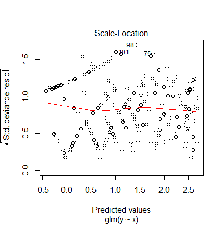
plot(xyglmfit,which=3)
This plot substitutes deviance residuals for Pearson residuals, which should work a little better at the smaller fitted values. However, the y-axis is now the square root of the scale above (square root of absolute deviance residuals), and the mean value under a correct specification would tend to be a little higher, at about 0.82 ($2^\frac14 \Gamma(\frac34)/\sqrt{\pi}\approx 0.82218$ asymptotically), at least for fitted values that are not too small. I added a blue horizontal line at 0.82 for reference there (via abline(h=0.82,col="blue")).
It's also plotting against fitted values on the scale of the linear predictor (i.e. log-fitted), but the basic interpretation is the same -- if the trend is flat and roughly around 0.82, it's about what it should be, if it's higher than that you have overdispersion and if it's not flat you have a variance misspecification.
Here we see that everything looks fine. The red curve is a local mean (a smoothed local fit) and the blue line is the asymptotic 0.82 value we should expect. As you see they're almost coincident.
Here's a case with overdispersion done in R:
 y2 <- rpois(m,m)*10+rpois(m,m)
 xyglmfit2 <- glm(y2~x,family=poisson)
 xyfitted2 <- fitted(xyglmfit2)
 pres2 <- residuals(xyglmfit2,type="pearson")
 par(mfrow=c(1,2))
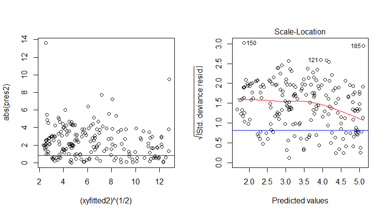
 plot((xyfitted2)^(1/2),abs(pres2))
 abline(h=0.8,col="blue")
 plot(xyglmfit2,which=3)
 abline(h=0.82,col="blue")
The plot on the left is the first plot (with a 0.8 line marked in) and the second is the default scale-location plot in R with the 0.82 horizontal line marked in. We can see that the spread is wider (if we compute the mean square Pearson residual it comes out to about 9, rather than the "about 1" we should get).
A caveat: these plots are only interpretable in this fashion if you get the mean specification essentially correct; otherwise you're confounding mean misspecification with variance issues in these plots.


