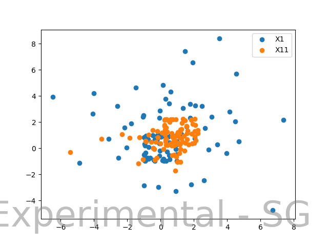
I was experimenting with K-Means and Gaussian Mixture Models (Expectation-Maximization) on the data set that I generated. Here is how the plot for two distributions looks like:
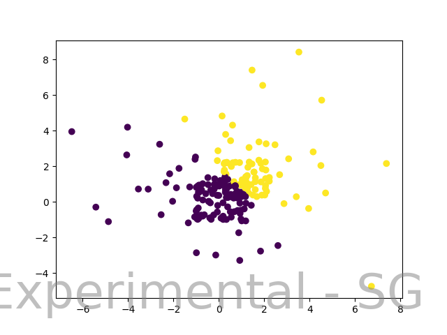
Since this was generated using 2 distributions, I wanted to see the clusters created by both K-Means and Expectation-Maximization. So I created and plotted them. Cluster using K-Means looks as follows:
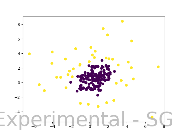
The 2 clusters created from K-Means were somewhat expected. But the clusters created using Expectation Maximization were not close to what I had imagined it to be. It looks as follows:
I really feel that K-Means was able to capture more points from a particular distribution as compared to EM. Also, I had imagined that EM would be able to create overlapping clusters to distinguish the 2 square formations you see in the dataset plot. What is the intuition behind EM performing this way?
Here is the complete code using which I generated these plots.
    from nltk.cluster import KMeansClusterer, euclidean_distance, cosine_distance
    import numpy as np
    import matplotlib.pyplot as plt
    from sklearn.cluster import KMeans
    from sklearn.mixture import GaussianMixture

    np.random.seed(1)

    distr_1 = np.sin(2 * np.random.randn(100) + np.random.randn())
    distr_2 = (3 * np.random.randn(100)) + np.random.randn()

    distr_11 = np.log(np.absolute(2 * np.random.randn(100) + np.random.randn()))
    distr_21 = np.sin(3 * np.random.randn(100)) + np.random.randn()


    X1_train = np.concatenate((distr_1, distr_2))
    X1_train = X1_train.reshape(100, 2)

    X11_train = np.concatenate((distr_11, distr_21))
    X11_train = X11_train.reshape(100, 2)


    X1_plot = X1_train[:, 0]
    Y1_plot = X1_train[:, 1]

    X11_plot = X11_train[:, 0]
    Y11_plot = X11_train[:, 1]


    plt.figure('dataset')
    fig, ax = plt.subplots()
    plt.scatter(X1_plot, Y1_plot)
    plt.scatter(X11_plot, Y11_plot)
    fig.text(0.95, 0.05, 'Experimental - SG',
            fontsize=50, color='gray',
            ha='right', va='bottom', alpha=0.5)

    plt.gca().legend(('X1', 'X11'))
    plt.savefig("data_set.png")
    plt.clf()
    #plt.show()

    merged_x = np.concatenate((X1_train[:,0],X11_train[:,0])).reshape(200,1)
    merged_y = np.concatenate((X1_train[:,1],X11_train[:,1])).reshape(200,1)

    merged = np.concatenate((merged_x, merged_y), axis=1)

    km = KMeans(2, random_state=0)
    labels = km.fit(merged).predict(merged)

    print(labels)
    plt.figure('cluster-euclidean')
    fig, ax = plt.subplots()
    plt.scatter(merged[:,0], merged[:,1], c=labels, cmap='viridis')
    fig.text(0.95, 0.05, 'Experimental - SG',
            fontsize=50, color='gray',
            ha='right', va='bottom', alpha=0.5)

    plt.savefig("euclidean.png")
    plt.clf()

    clusterer = KMeansClusterer(2, cosine_distance)
    clusters = clusterer.cluster(merged, True, trace=True)
    plt.figure('cluster-cosine-distance')
    fig, ax = plt.subplots()
    plt.scatter(merged[:,0], merged[:,1], c=clusters, cmap='viridis')
    fig.text(0.95, 0.05, 'Experimental - SG',
            fontsize=50, color='gray',
            ha='right', va='bottom', alpha=0.5)

    plt.savefig('cosine.png')
    plt.clf()

    ###
    gmm = GaussianMixture(n_components=2, covariance_type='full')
    gmm.fit(merged)
    labels = gmm.predict(merged)
    plt.figure('EM')
    fig, ax = plt.subplots()
    plt.scatter(merged[:,0], merged[:,1], c=labels, cmap='viridis')
    fig.text(0.95, 0.05, 'Experimental - SG',
            fontsize=50, color='gray',
            ha='right', va='bottom', alpha=0.5)

    plt.savefig('em.png')
    plt.clf()
    #plt.show()
Edit:
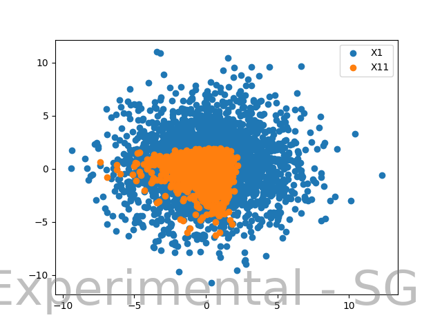
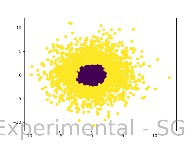
As I generated a lot more data samples, EM was able to give out clusters that were visually much more satisfying. What could be concluded from this? Here is the plot of dataset with much more samples.
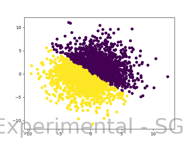
And the plot where EM created clusters:
Here K-Means just adds a linear separator, which was expected from K-Means on this dataset.
How do we explain the result here? Why was EM able to cluster data better with much more data samples?


tiedthe results were pretty much similar. $\endgroup$