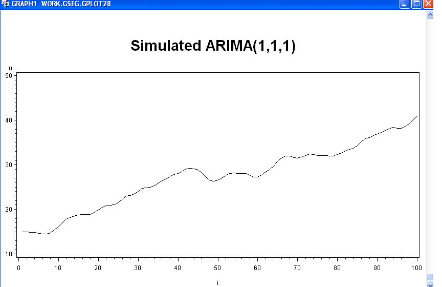
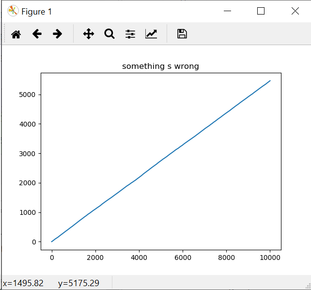
I'm trying to understand the ARIMA process by generating a sequence manually, then fitting an ARIMA model from statsmodel.tsa to check my results I've found an example there (not in english but doesn't matter): https://www.math.u-bordeaux.fr/~hzhang/m2/st/sas_tp_ind/node13.html
I have two problems:
- the plot I draw doesn't look at all like the plot they draw.
- the ar an ma parameters found by the statsmodel ARIMA implementation are not the one I expect (which may or may not due to problem #1)
Could someone please explain me what is wrong with my implementation and/or understanding of how to generate an ARIMA series in simple terms as my maths skills are somewhat limited.
import numpy as np
import matplotlib.pyplot as plt
from statsmodels.tsa.arima_model import ARIMA

# arima(1, 1, 1) with alpha1 = -2/3 and beta1 = 5/6
# (1 - 2/3 . B)(1 - B)Xt = Wt + 5/6 . Wt-1
# on canonical form:
# (1 - 2/3 B)(Xt - Xt-1) = Wt + 5/6 . Wt-1
# Xt - Xt-1 - 2/3 . Xt-1 + 2/3 . Xt-2 = Wt + 5/6 . Wt-1
# Xt = 5/3 . Xt-1 -2/3 . Xt-2 + Wt + 5/6 . Wt-1
# we now have an ARMA model with parameters alpha1 = 5/3, alpha2 = -2/3 and beta1 = 5/6

alpha1 = 5/3
alpha2 = -2/3
beta1 = 5/6
sigma = 0.2


w = np.random.rand(10000) * sigma
x = w.copy()

for t in range(2, len(w)):
    x[t] = alpha1 * x[t-1] + alpha2 * x[t-2] + w[t] + beta1 * w[t-1]


model = ARIMA(x, order=(1,1,1))
model_fit = model.fit(disp=0, trend='nc')
print(model_fit.summary())

plt.plot(x)


