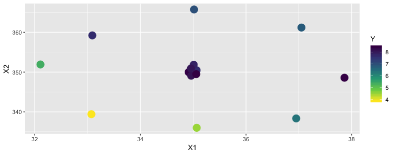
You might start by looking at the data. This suggests that 35 minutes @ 350 is ideal, but you can get similar results going hotter shorter or if you give it a few more minutes. But it's not monotonically increasing in either dimension.
cakes <- alr4::cakes
cakes %>%
  ggplot(aes(X1, X2)) +
  # I used geom_point initially, but then realized the central point has multiple
  #   measurements which are individually perceptible using geom_jitter.
  geom_jitter(aes(color = Y), size = 5, width = 0.1, height = 2) +
  scale_color_viridis_c(direction = -1)

Consequently, a linear model doesn't perform particularly well...
> mod = lm(Y ~ X1 * X2, data = cakes)
> broom::glance(mod)
# A tibble: 1 x 11
  r.squared adj.r.squared sigma statistic p.value    df logLik   AIC   BIC deviance df.residual
      <dbl>         <dbl> <dbl>     <dbl>   <dbl> <int>  <dbl> <dbl> <dbl>    <dbl>       <int>
1     0.507         0.359  1.19      3.42  0.0606     4  -19.9  49.9  53.1     14.1          10
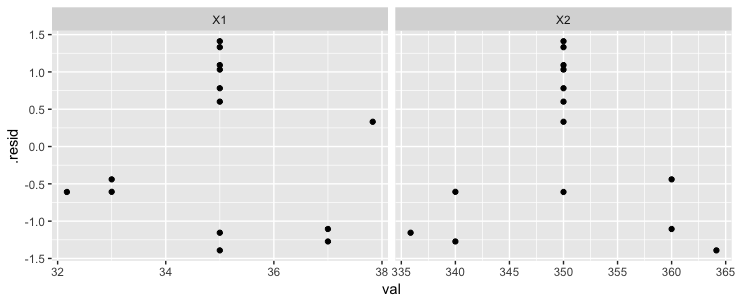
...and has messy residuals. We see here that the model error tends to be worst near the middle, where some cakes with central X1 and X2 values near the sweet spot are often underrated by this model, while cakes with values on the sides tend to be underrated.
broom::augment(mod) %>%
  select(X1:X2, .resid) %>%
  gather(col, val, -.resid) %>%
  ggplot(aes(val, .resid)) + geom_point() +
  facet_grid(~col, scales = "free_x")

One approach would be to use a polynomial fit -- this should capture more of the "sweet spot" phenomenon here. Sure enough, this would provide a much higher adjusted r^2 and a lower AIC and BIC, suggesting it's a much better model, even after penalizing for using more terms.
> mod_quad = lm(formula = Y ~ poly(X1, 2) * poly(X2, 2), data = cakes)
> broom::glance(mod_quad)
# A tibble: 1 x 11
  r.squared adj.r.squared sigma statistic  p.value    df logLik   AIC   BIC deviance df.residual
      <dbl>         <dbl> <dbl>     <dbl>    <dbl> <int>  <dbl> <dbl> <dbl>    <dbl>       <int>
1     0.983         0.956 0.311      36.3 0.000517     9   3.68  12.6  19.0    0.485           5


