1
$\begingroup$

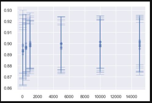
I have some observations, each with an accompanying standard deviation (shown here as error bars):

enter image description here

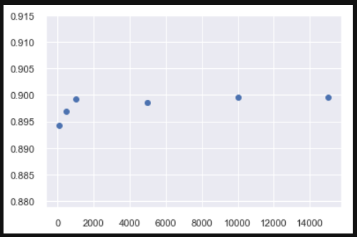
I want to make a summarised plot of this data by taking mean of all observations for a given X value, so something like this:

enter image description here

I'm confused how I will calculate the standard deviation for these averaged measurements. Will it be just the mean of the std. devs of all observations for a given X?

$\endgroup$
5
  • $\begingroup$ First, what is the formula for your 'error bars'. $\endgroup$
    – BruceET
    Commented Jun 16, 2019 at 16:29
  • $\begingroup$ @BruceET they're just standard deviations as I mention. So it's the point +- SD $\endgroup$ Commented Jun 16, 2019 at 18:19
  • $\begingroup$ OK, but such 'error bars' can often be misleading (understating the variability of the mean), which I fear may be a major reason for their continued use. // If $SD(X) = \sigma_x,$ $SD(Y) = \sigma_y,$ and $X$ and $Y$ are independent, then $SD(X+Y) = \sqrt{\sigma_x^2 + \sigma_y^2}.$ Maybe that is useful in your situation, which I do not fully understand. $\endgroup$
    – BruceET
    Commented Jun 16, 2019 at 19:39
  • $\begingroup$ Alright, then what would be a similar formula for $SD(X/n)$. I think I can use this along with the formula for $SD(X+Y)$ to get the SD for my averaged values. $\endgroup$ Commented Jun 16, 2019 at 20:19
  • $\begingroup$ Not clear what you're doing. Suppose you have sample mean $\bar X$ based on $m$ observations and $\bar Y$ based on $n$ observations. Are you dealing with $\bar X + \bar Y.$ with,.$5(\bar X + \bar Y),$ or with $(n\bar X + m\bar Y)/(n+m).$? // Also not clear whether your error bars are based on the SD $S$ or on the estimated standard error $S/\sqrt{n}.$ $\endgroup$
    – BruceET
    Commented Jun 16, 2019 at 22:41

1 Answer 1

1
$\begingroup$

First, before dealing with combinations of two samples, here are some methods for displaying variability of a single sample. Suppose you have a random sample of size $n=50$ from $\mathsf{Norm}(\mu = 70, \sigma=4),$ as simulated in R below:

set.seed(616)
x = round(rnorm(50, 70, 4), 2)
x
 [1] 79.76 72.52 68.73 72.78 67.00 72.52 71.42 68.52 73.62 67.13
[11] 67.89 73.98 65.48 73.36 68.67 74.39 67.96 67.57 75.20 73.87
[21] 66.75 66.73 75.51 73.55 68.79 68.76 71.03 65.22 69.25 67.42
[31] 71.34 71.21 74.38 73.12 70.09 73.19 68.54 71.02 73.29 59.00
[41] 69.94 68.24 73.57 72.40 65.21 67.93 68.10 70.33 71.95 76.71
summary(x);  sd(x)
   Min. 1st Qu.  Median    Mean 3rd Qu.    Max. 
  59.00   68.00   70.67   70.50   73.27   79.76 
[1] 3.618636

One way to display the data is with a 'notched' boxplot, where the notches in the sides of the box show a nonparametric confidence interval for the population median. It is calibrated so that, roughly speaking, nonoverlapping notches from two samples indicates they are from populations with different medians. (For our data the notch includes the true population median $\eta = \mu = 70,$ but with a real-life dataset we wouldn't know the true value of $\eta$ of the population from which the data were taken.)

boxplot(x, notch=T, horizontal=T, col="skyblue2", pch=19)
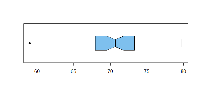
enter image description here

A 95% confidence interval for $\mu$ based on the data above would be of the form $\bar X + 2.0S/\sqrt{n},$ which computes to $(69.47, 71.53).$

t.test(x)$conf.int
[1] 69.47039 71.52721
attr(,"conf.level")
[1] 0.95

A 95% prediction interval for the value of the next ($(n+1)$st) observation from the same population is of the form $\bar X \pm S\sqrt{1+1/n}.$ For our sample this interval is $(63/19, 77.81).$

mean(x) + pm*2.0*sd(x)*sqrt(1 + 1/50)
[1] 63.18951 77.80809

Here is a stripchart of the $n = 50$ observations, with the confidence interval shown as solid green bars and the prediction interval as broken maroon bars.

stripchart(x, pch="|")
 abline(v=c(69.47, 71.53), col="darkgreen")
 abline(v=c(63.12, 77.81), col="maroon", lty="dashed", lwd=2)
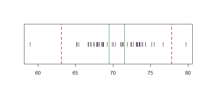
enter image description here

Note: Sometimes 'error bars' are of the form $\bar X \pm S$ and sometimes of the form $\bar X \pm S/\sqrt{n}.$ The former a are not as far apart as the lower and upper confidence bounds; the latter are not quite as far apart as the lower and upper prediction bounds.

$\endgroup$
4
  • $\begingroup$ Your point about boxplots gave me an idea. Since all I wanted to do was display a summarised version of the original data for each X with some information about the variability visible, I'll just draw a boxplot at each X. $\endgroup$ Commented Jun 17, 2019 at 19:43
  • $\begingroup$ Your further explanation about different bounds which can be shown as 'error bars' cleared some other confusions I had. Thanks $\endgroup$ Commented Jun 17, 2019 at 19:44
  • $\begingroup$ Good idea to use boxplots, as long as you don't get the idea there is necessarily something 'wrong' with outliers. For example, see/ $\endgroup$
    – BruceET
    Commented Jun 17, 2019 at 22:36
  • $\begingroup$ Not at all. I actually prefer that the outliers are visible for my task. $\endgroup$ Commented Jun 18, 2019 at 9:03

Your Answer

By clicking “Post Your Answer”, you agree to our terms of service and acknowledge you have read our privacy policy.

Not the answer you're looking for? Browse other questions tagged or ask your own question.