1
$\begingroup$

Can someone explain why does boxplot in R show me outliers when they are actually not?

I have a dataset for computer sales and I have to predict the price based on configurations of a computer and it contains a column RAM.

The range of RAM is from 2 to 32. Unique values of RAM are: 4 2 8 16 32 24

So after plotting the boxplot and checking for outliers it shows all values with 16 and 24 as outliers which I don't think they are.

ramoutlier <- boxplot(ram)

ramoutlier$out

[958] 16 24 24 16 24 24 16 24 16 16 16 16 16 24 24 16 24 16 16 16 16 24 16 16 16 16 16 16 24 16 24 16 16

[991] 24 16 16 16 16 16 16 16 24 24

Can anyone please explain is there anything am going wrong and how to understand the boxplot?

$\endgroup$
5
  • 2
    $\begingroup$ There's too little information here to determine if anything is wrong, but I highly doubt there's a problem with R here (since boxplots are very heavily used; I'd have noticed substantial issues myself by now, let alone many thousands of other users capable of making basic checks). Can you explain why you believe these are not "outliers"? Are you aware of the 'outlier' rule used by boxplots? Can you show the output of table(ram)? (this will show us the entire distribution in a small table, making it possible to explain the calculation being done on your data in detail) $\endgroup$
    – Glen_b
    Commented Jun 7, 2019 at 2:41
  • 1
    $\begingroup$ Put another way, your prior belief appears to be that boxplot in R is smart enough to detect which data values are not genuine. Not so. One of its purposes is just to flag points that might need consideration. $\endgroup$
    – Nick Cox
    Commented Jun 7, 2019 at 6:17
  • 2
    $\begingroup$ Using boxplots to visualize such a highly discretized variable is not going to be terribly useful. Start by tabulating the data and then consider ways to visualize those counts. $\endgroup$
    – whuber
    Commented Jun 7, 2019 at 13:52
  • 1
    $\begingroup$ Amplifying @whuber's point about discreteness: it strikes me that your data could reasonably be thought in terms of $\log_2$ as having values like 1, 2, 3, 4 and 5. Admittedly 24 spoils the simplicity of this pattern without undermining it, but the appearance of being an outlier often arises because analysis is not being conducted on the most appropriate scale. $\endgroup$
    – Nick Cox
    Commented Jun 7, 2019 at 14:22
  • 1
    $\begingroup$ Why the tags machine-learning multiple-regression? What you want to do later is not obviously relevant to this question. $\endgroup$
    – Nick Cox
    Commented Jun 7, 2019 at 15:43

1 Answer 1

7
$\begingroup$

The outlier rule is based on the inter-quartile range (upper minus lower quartile).

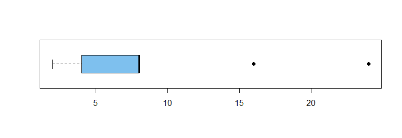
Your data. If you have so many RAM values at 4 and 8 that those are the lower and upper quartiles, respectively, then $\text{IQR} = 8 - 4 = 4,$ and any value above $Q_3 + 1.5(\text{IQR}) = 8 + 1.5(4) = 14$ will show as a high outlier. A small-sample version follows:

x = c(2,2,4,4,4,4,4,4,8,8,8,8,8,8,8,8,16,16,16,24,24)
summary(x)
   Min. 1st Qu.  Median    Mean 3rd Qu.    Max. 
  2.000   4.000   8.000   8.952   8.000  24.000 
IQR(x)
[1] 4

boxplot(x, horizontal=T, col="skyblue2", pch=19)
enter image description here

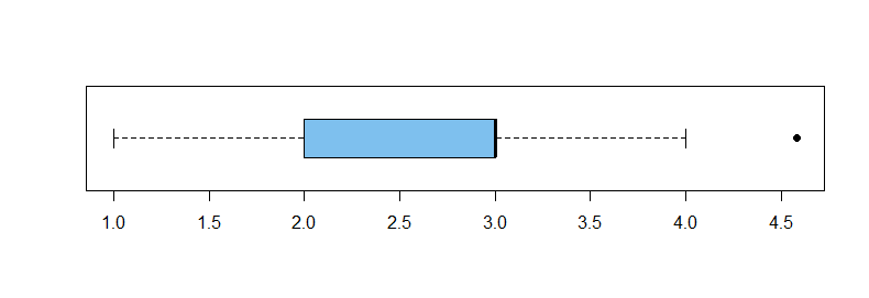
If you take logs of your observations, a boxplot may be somewhat better suited as a graphical description.

y = log2(x)
summary(y)
   Min. 1st Qu.  Median    Mean 3rd Qu.    Max. 
  1.000   2.000   3.000   2.818   3.000   4.585 
IQR(y)
[1] 1
boxplot(y, horizontal=T, col="skyblue2", pch=19)
enter image description here

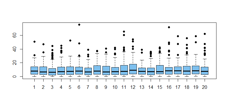
Outliers are common in exponential data. It is a characteristic of samples from right-skewed distributions to show numerous 'outliers'. Below are boxplots for 20 samples of size $n = 100$ from an exponential distribution with mean 10. (About 99% of such samples will show at least one outlier.)

m = 20;  n = 100;  x = rexp(m*n, .1);  g = rep(1:20, each=100)
boxplot(x ~ g, col="skyblue2", pch=19)
enter image description here

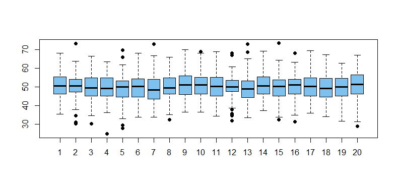
Outliers are not rare in normal data. Moreover, slightly more than half of normal samples of size $n = 100$ show at least one outlier.

set.seed(606)
nr.out = replicate(10^5,
          length(boxplot.stats(rnorm(100, 50, 7))$out))
mean(nr.out >= 1)
[1] 0.52505
    nr.out
      0       1       2       3       4       5       6       7 
0.47495 0.28644 0.13589 0.06059 0.02475 0.01010 0.00439 0.00171 
      8       9      10      11      12      13 
0.00073 0.00027 0.00007 0.00006 0.00004 0.00001 

Boxplots for 20 of the 100,000 normal samples from this simulation are shown below.
enter image description here

Note: Applied to a normal population the outlier rule would label observations more than about 2.7 SDs from the mean as outliers. Samples do not precisely emulate populations, but normal tails have enough probability that it is not rare for moderately large samples to have some outliers.

In real data, boxplot 'outliers' are worth a second look, even though they are by no means necessarily 'errors'. (For example, some investigation might show an outlier arose from data entry error or equipment failure.)

qnorm(.75) + 1.5*diff(qnorm(c(.25,.75)))
[1] 2.697959
2*pnorm(-2.7)
[1] 0.006933948
$\endgroup$
4
  • 2
    $\begingroup$ Excellent. You're not responsible for the way that Tukey's ad hoc rule for identifying data points worth thinking about has sometimes morphed to be thought of as a criterion for identifying outliers -- or, even worse, as a criterion for identifying data points that should be removed from the data. I don't give references, but I've seen both interpretations echoed here on CV. Thus every qualification, even by saying "outliers" not outliers, is welcome pushback against these memes. $\endgroup$
    – Nick Cox
    Commented Jun 7, 2019 at 6:24
  • 1
    $\begingroup$ @Nick Tukey's rule is not completely ad hoc: one of his justifications (among several) is the low rate at which it identifies outliers in Normal samples. Another is the relatively high breakdown point. I'm not quoting "outliers" because Tukey discussed their meaning and treatment explicitly. In any case, I'm sure he never intended people to use boxplots to visualize discrete data having only 6 categories! $\endgroup$
    – whuber
    Commented Jun 7, 2019 at 13:55
  • $\begingroup$ I didn't give my ironic, idiosyncratic and anachronistic translation of ad hoc as fit for purpose. Your point about discrete data is apposite and prompts a comment from me on the question. $\endgroup$
    – Nick Cox
    Commented Jun 7, 2019 at 14:18
  • 1
    $\begingroup$ Tukey is reported orally (by Paul Velleman) as saying 1 is too few and 2 is too many when asked why 1.5? It was left tacit that it was a practical compromise. $\endgroup$
    – Nick Cox
    Commented Jun 7, 2019 at 14:23

Your Answer

By clicking “Post Your Answer”, you agree to our terms of service and acknowledge you have read our privacy policy.

Not the answer you're looking for? Browse other questions tagged or ask your own question.