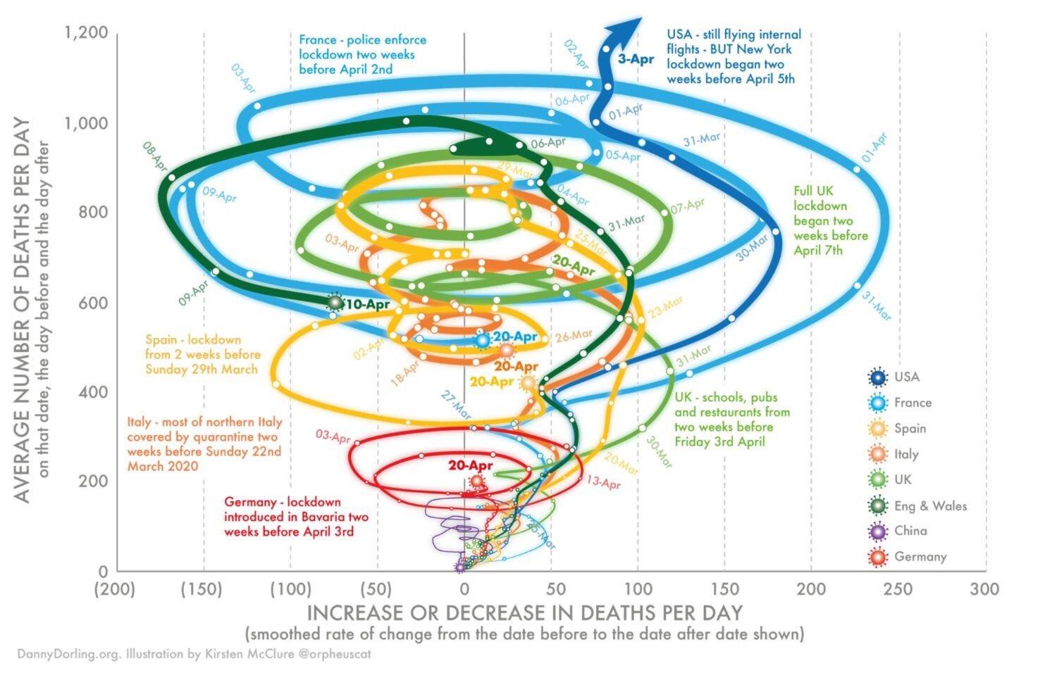
I'm sure some of you would have seen this graph, which is going viral on twitter and getting a fair bit of criticism. It describes the trajectories of numbers of deaths per day vs rate of change of numbers of deaths per day in coronavirus patients by country. My question is how would this data be better represented in a way that isn't so... rainbow tornadoey... and easier to interpret, without loss of information? There's a lot of useful information here, but clearly this wasn't the best way of presenting it and I'm curious as to how others here would have more practically presented this data.
-
4$\begingroup$ I don't think I have ever seen statistical noise represented in such a dramatic way before :-). $\endgroup$– whuber ♦Commented Apr 29, 2020 at 12:24
-
$\begingroup$ I think everyone can see that this is a very poor graph. The question was about how this information could have been better presented $\endgroup$– E. ReiCommented Apr 29, 2020 at 14:42
1 Answer
Some of this will be a matter of opinion but some isn't. William S. Cleveland has established (by experiment) some types of graphs that don't work well and 3-D graphs are among them.
Here, the two axes are badly chosen. If you know the deaths on April 19 and April 20, then the change is clear. Then they have graphed time .... well, what have they done with time? They've placed dots on ribbon like curves, but you have to look pretty closely to figure them out and there's no easy way to compare different countries at different times.
So, make time the x-axis. You could choose calendar date or date since first identified case or maybe some other time based measure.
Then I'd make the y-axis deaths per day per capita, unless the purpose of the graph is very particular.
Including both England and Wales AND UK is pretty strange. You could have just UK, or else England, Scotland, Northern Ireland and Wales separately (I'd go with the former).
Then you could use dots for "important events" that are included in the current version but in a way that makes them almost useless, since time isn't represented properly.

