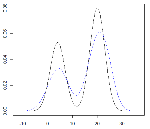
I have some code (shown below) for sampling from and then estimating a normal mixture distribution in one dimension. When I plot the estimate (blue) against the true distribution (black) I get images of the following form:

My issue is that the estimated distribution seems to be ALWAYS more spread out with peaks that are lower than the peaks of the true distribution. I would have expected that since the estimated distribution is random, that sometimes it would have higher peaks and sometimes it would have lower peaks than the true distribution. But this is not the case as you can see by running the code.
If I increasing the sampling from N=1e2 to say N=1e4, the peaks of the estimated distribution get closer to the those of the true distribution, but they are still always lower.
So what's the cause of this phenomenon, why is the estimated distribution more spread out with peaks that are lower than those of the true distribution?
library(distr)

N = 1e2
means = c(4,20)
sds = c(3,3)
w_1 = 0.4
ws = c(w_1,1-w_1)

myMix <- UnivarMixingDistribution(Norm(mean=means[1], sd=sds[1]),
                                  Norm(mean=means[2], sd=sds[1]),
                                  mixCoeff=ws)

# Reference distribution
dmyMix <- d(myMix)
grid_Min = -9
grid_Max = 35
grid_N = 5e2

# Sample from distribution
rmyMix <- r(myMix)
Y <- rmyMix(N)
f_hat_density <- density(Y)

x_Min = -12
x_Max = 37
x_N = 512

f_hat_density <- density(Y, from=x_Min, to=x_Max, n=x_N)

x = f_hat_density$x
f_approx = f_hat_density$y
f_exact = dmyMix(x)

# Plot
plot(x,f_exact, type="l")
lines(x,f_approx, col='blue',lty=2)

density()function smearing the estimated pdf sideways and so bringing down the height. This could explain why larger sample sizes reduce the effect $\endgroup$