3
$\begingroup$

I would like to compare two methods on qualitative and paired data.

To summarize my study for you (it's for an internship), I have activity values ​​that were measured on 13 sites, for 12 species of bats (some species are not found on all sites).

These activity values ​​are then organized according to 4 levels: weak, medium, strong and very strong, by two different methods. I would like to know if these methods give significantly different activity levels, and if so, which method gives higher activity levels in general?

Then I want to compare these methods on smaller samples, such as groups of species or just by specie (so with only a few samples). I think method 1 will sometimes give higher levels than method 2 depending on the species group formed, and vice versa.

Here is an example from my data: (I have 132 samples in total)

On M1 and M2 you have the activity levels : 1 = weak, 2 = medium, 3 = strong and 4 = very strong enter image description here
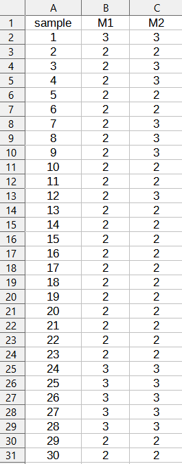
What test could I perform on R to compare these methods and tell which one produces higher activity levels? Also, I would like to present my results in a fairly visual way, with graphics. What is possible to do?

I apologize if there are any mistakes, english is not my native language. Also I'm new to this website !

$\endgroup$
2
  • 4
    $\begingroup$ Your data are rankings. They are ordinal, hence categorical quantitative, not qualitative, values. The most natural to use would be paired Wilcoxon test. $\endgroup$
    – ttnphns
    Commented Jun 30, 2021 at 10:08
  • $\begingroup$ Welcome to stackexchange. If the answer below solved your problem, please consider to accept it. $\endgroup$
    – ava
    Commented Jul 12, 2021 at 9:16

2 Answers 2

0
$\begingroup$

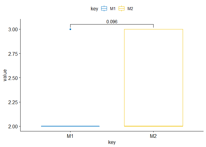
Here a R solution with a Wilcoxon test and a figure example:

# library
library(tidyverse)
library(ggpubr)

# get data
sample= c(1:30)
M1=c(3,2,2,2,2,2,2,2,2,2,2,2,2,2,2,2,2,2,2,2,2,2,2,3,3,3,3,3,2,2)
M2=c(3,2,3,3,2,2,3,3,3,2,2,3,2,2,2,2,2,2,2,2,2,2,2,3,3,3,3,3,2,2)

data.frame(sample,M1,M2) -> df

# calculate wilcox test
wilcox.test(df$M1,df$M2)
#>  Wilcoxon rank sum test with continuity correction
#> 
#> data:  df$M1 and df$M2
#> W = 360, p-value = 0.09554
#> alternative hypothesis: true location shift is not equal to 0

# prepare data for figure
df %>% 
  gather(key="key",value="value",-sample) -> df

# make figure
my_comparisons <- list( c("M1", "M2"))
ggboxplot(df, x = "key", y = "value",
          color = "key", palette = "jco")+ 
  stat_compare_means(comparisons = my_comparisons) # Add pairwise comparisons p-value

Figure

$\endgroup$
1
  • $\begingroup$ Can you please explain what this figure is meant to show? Would a simple (stacked) bar chart not be a more natural visualization? $\endgroup$
    – cdalitz
    Commented Sep 23 at 12:14
0
$\begingroup$

As @ava pointed out in an answer, the Wilcoxon signed rank test can be used for your specific problem of comparing two methods applied each to independently drawn samples. There are some points that might be worth consideration, though.

First, note that a statistical test will only tell you how incompatible the null hypothesis (in this case $H_0$: both methods have on average the same effect) is with the observations. This does not tell you anything about the strength ("effect size") of the relationship. Although there are effect sizes that can be computed for the Wilcoxon signed rank test statistic, they are not intuitively interpretable (at least to me). A more natural effect size would be the probability that M2 leads to more activity than M1, i.e. $P(M2>M1)$, which can be directly estimated as the corresponding proportion from the data, and you can even compute a confidence interval for this probability, e.g. with the binom.test function in R (despite its function name, it also computes a confidence interval for the estimated probability).

Second, note that your data contains many ties, which makes the Wilcoxon sign test less reliable. For a simple sign test, which corresponds to my suggested effect size estimate, there is a modification that can handle ties, the trinomial test, which can be used to test whether $P(M1>M2) > P(M1<M2)$ (the third probability $P(M1=M2)$ is not used for the test statistic, but estimated and used for for computing the p-value).

Another, possibly more fundamental problem arises with your suggested procedure to

"compare these methods on smaller samples, such as groups of species or just by specie (so with only a few samples). I think method 1 will sometimes give higher levels than method 2 depending on the species group formed, and vice versa."

Beware that this can lead to spurious findings merely by chance, as in this XKCD cartoon. To lower this risk, you might consider lowering the p-values depending on the number of groups into which you split up our data, e.g. with a Bonferroni correction.

$\endgroup$

Your Answer

By clicking “Post Your Answer”, you agree to our terms of service and acknowledge you have read our privacy policy.

Not the answer you're looking for? Browse other questions tagged or ask your own question.