4
$\begingroup$

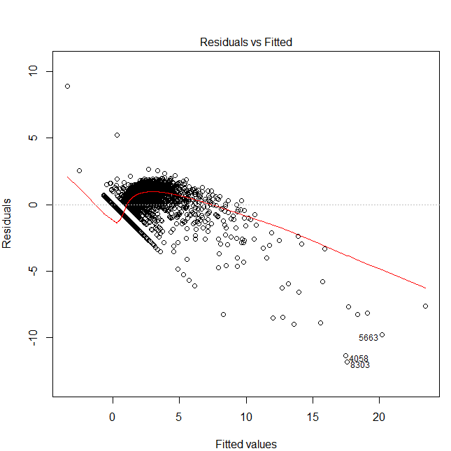
I'm doing a multivariate linear regression with R, and i find myself with the following residuals vs fitted plot:
plot

As you can see there is a very regular line of points that seems to follow a precise pattern.

My questions are:

  1. How do I interpret such a behavior, and what can I do to fix it?
  2. Is there a way to isolate/extract those points? I'd like to take a look at them individually in my data set to see if by examining them I notice some patterns in the data.

Additional info: My model is:

v.lm = lm(sqrt(v.stima$Y)~., data=v.stima)

Y is a count-variable (non-negative integer). I'm using sqrt because without it the plot has the typical "funnel" shape that indicates a non-homoscedastic error.

$\endgroup$
7
  • $\begingroup$ More information would help. My first guess: those are y=0 values. Is y a count-variable? $\endgroup$
    – Glen_b
    Commented Apr 29, 2013 at 8:52
  • $\begingroup$ Edited with additional info. $\endgroup$
    – Master_T
    Commented Apr 29, 2013 at 9:05
  • 2
    $\begingroup$ If you're asking about the line that goes down diagonally at the left side, that's when y=0, as I suggested before. It's what you often see with count data. Why not use a Poisson glm (or other suitable-for-count-data glm), though? $\endgroup$
    – Glen_b
    Commented Apr 29, 2013 at 10:56
  • $\begingroup$ I will search some tutorial/article about the Poisson glm, thanks for the suggestion. As you can probably guess from my ignorance, this is not my field of expertise, I'm a programmer not a statistician, but I have to to this model (for reasons I won't bore you with) so I'm trying to cobble together some knowledge from a book I have and online sources. If you know of a good tutorial about the Poisson GLM, a link would be really appreciated ;) $\endgroup$
    – Master_T
    Commented Apr 29, 2013 at 15:39
  • 1
    $\begingroup$ Hi all, the question got accepted, yet the poster says in his comment that the solution does not work. What should we learn from this? $\endgroup$
    – famargar
    Commented Mar 10, 2017 at 15:42

1 Answer 1

3
$\begingroup$

Well done for looking at the diagnostic plots for your regression. In this case, they have revealed that your model is inappropriate, as @Glen_b says in the comments. Sometimes you can get away with modelling count data with a gaussian "ordinary" regression. But in this case clearly the violations of the standard assumptions are too strong. There are too many actual values at zero where the model predicts negative values; and this is skewing the whole result and hence leaving a lot of structure in the residuals. You need to move to a Poisson distribution glm.

On the second part of your question, for future reference the identify() function is a good way to identify a few points in a plot eg

plot(predict(v.lm), residuals(v.lm))
identify(predict(v.lm), residuals(v.lm))

Another good trick, when you suspect something about those points, is to create a dummy variable for your candidate explanations (eg 1 when the response=0, 0 otherwise) and map that to a colour aesthetic. ggplot2 is a great package to use for this sort of thing.

$\endgroup$

Your Answer

By clicking “Post Your Answer”, you agree to our terms of service and acknowledge you have read our privacy policy.

Not the answer you're looking for? Browse other questions tagged or ask your own question.