I have the next dataset:
 structure(list(TOTAL = c(8, 17, 23, 26, 8, 13, NA, 16, 8,
 0, 0, 0, 0, 0, 8, 13, 7, 2, 28, 41, 56, 60, 60, NA, 0, 47, 47,
 64, 6, 4, 3, 12, 0, 0, 0, 6, 44, 54, 53, NA), sex = structure(c(2L,
 2L, 2L, 2L, 1L, 1L, 1L, 1L, 1L, 1L, 1L, 1L, 2L, 2L, 2L, 2L, 1L,
 1L, 1L, 1L, 2L, 2L, 2L, 2L, 2L, 2L, 2L, 2L, 1L, 1L, 1L, 1L, 1L,
 1L, 1L, 1L, 1L, 1L, 1L, 1L), levels = c("1", "2"), class = "factor"),
 t = structure(c(1L, 2L, 3L, 4L, 1L, 2L, 3L, 4L, 1L,
 2L, 3L, 4L, 1L, 2L, 3L, 4L, 1L, 2L, 3L, 4L, 1L, 2L, 3L, 4L,
 1L, 2L, 3L, 4L, 1L, 2L, 3L, 4L, 1L, 2L, 3L, 4L, 1L, 2L, 3L,
 4L), levels = c("1", "2", "3", "4"), class = "factor"), id = c("pat144",
 "pat144", "pat144", "pat144", "pat17", "pat17", "pat17",
 "pat17", "pat207", "pat207", "pat207", "pat207", "pat277",
 "pat277", "pat277", "pat277", "pat339", "pat339", "pat339",
 "pat339", "pat387", "pat387", "pat387", "pat387", "pat483",
 "pat483", "pat483", "pat483", "pat586", "pat586", "pat586",
 "pat586", "pat6", "pat6", "pat6", "pat6", "pat964", "pat964",
 "pat964", "pat964")), row.names = c(NA, -40L), class = "data.frame")
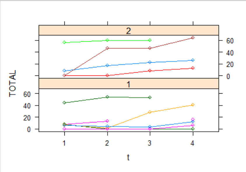
This dataset represents repeated measurements TOTAL, in four-time points. The variable id, identifies every person in the sample (everyone appears 4 times). sex is the variable sex, and the variable t is basically represents the when the measure was taken. If I plot the data. I have a plot like this:
xyplot(TOTAL ~ t|sex,data=sample_data,group=id,type="b")
This plot basically show the trajectory of the TOTAL values over time t.
Then I am estimating a mixed effects model, using this:
    mod.0 <- lmer(TOTAL ~ t + sex + (1 | id),
          data = sample_data)

    summary(mod.0)

Linear mixed model fit by REML ['lmerMod']
Formula: TOTAL ~ t + sex + (1 | id)
   Data: sample_data

REML criterion at convergence: 272.2

Scaled residuals:
     Min       1Q   Median       3Q      Max
-3.05893 -0.40536 -0.00919  0.48353  1.62346

Random effects:
 Groups   Name        Variance Std.Dev.
 id       (Intercept) 433.3    20.82
 Residual             101.6    10.08
Number of obs: 37, groups:  id, 10

Fixed effects:
            Estimate Std. Error t value
(Intercept)    7.594      9.178   0.827
t2             6.000      4.508   1.331
t3             9.993      4.670   2.140
t4            16.802      4.864   3.455
sex2          15.265     13.862   1.101

Correlation of Fixed Effects:
     (Intr) t2     t3     t4
t2   -0.246
t3   -0.231  0.483
t4   -0.231  0.463  0.442
sex2 -0.604  0.000 -0.010  0.006
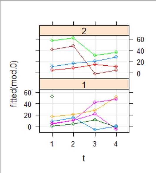
Then, I am considering the fitted values of this model:
xyplot(fitted(mod.0) ~ t | sex,groups=id, data =
         sample_data, type = c("b", "g"))
(I have a question regarding this plot, why is appearing one green point alone with a line joining it with other point??)
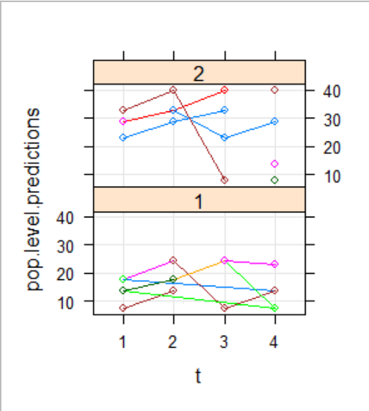
THen I have considered then population level predictions:
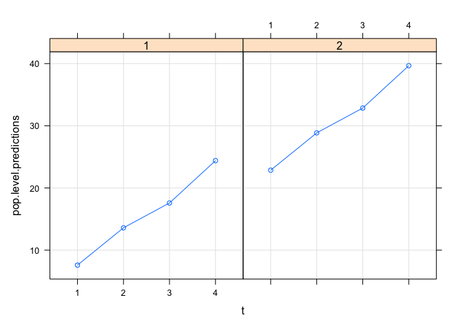
pop.level.predictions <- predict(mod.0, re.form = ~0)
xyplot(pop.level.predictions ~ t | sex, group=idpat,data =sample_data, type = c("b", "g"))
Note that in the previous plot, I have some questions:
- why there are in t1a and t2 3 points, but in the t3 and t4 4 points??
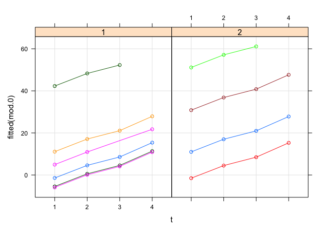
- I cant give an interpretation of this plot, what does it represents? Why I dont have only one line as in the tutorial that I am seeing?
I am interested in apply a repeated measures approach, given that I have a measure in different time points, I am testing it based on the next tutorial:
Thanks in advance for your help.-

