0
$\begingroup$

enter image description here

I am analyzing data on some biossays and I need an advice on which statistical analysis to use and how to use ggplot2 R package to better visualize the results.

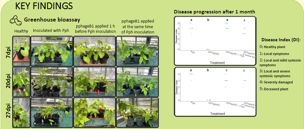
As you can see in the above image I have infected bean plants with a pathogen, a Pseudomonas bacterium, and then tested the treatment with bacteriophages applied at the same time or 1h before the inoculation. In the scatter plot on the right you can see two repetitions of the four I have. In each plot on the y axis there is the disease index of the plants (from healthy plants designed by 0 to deceased plants, 5). I wanted to test if there is a significant difference between the four cases (positive and negative control and the two phage applications) and between all the possible pairs. I tried with Kruskal-Wallis test and Wilcoxon paired test and I found out that there are significant differences only in two of the four repetition (the two represented).

Now the doubts I have: 1) Are there better suited statistical tests I can conduct? 2) There is a better way to visualize dthe data (I applied the letters directly on the image with power point, but I would prefer to do all by an R script)

I add here the script I used to analyze the data.

# load libraries
library(tidyverse)
library(patchwork)
library(broom)
library(agricolae)
library(ggplot2)
library (reshape2)


#Clear the Worskspace
rm(list=ls())


# Read data
DF<- read_csv2("R_summary_bioassay_4.csv")
#Looks at data as structure , first rows  or whole dataset
str(DF)
head(DF)
View(DF)


DF1 <- DF %>%
filter(date=="23/11/2020")

DF2 <- DF %>%
  filter(date=="18/02/2022")

DF3 <- DF %>%
  filter(date=="22/03/2022")

DF4 <- DF %>%
  filter(date=="29/04/2022")

class(DF$treatment)

plot1 <- DF1 %>%
ggplot(aes(x = treatment,
           y = index)) +
  geom_col(fill = "grey") +
  geom_jitter(data = DF, 
              aes(x = treatment,
                  y = index),
              width = 0.1, height = 0) +
  theme_classic() +
  theme(text = element_text(size = 20 )) +
  theme(axis.title.y = element_text(size = 14)) +
  labs(title = "23/11/2020",
       x = "Treatment",
       y = "Disease index") 

plot1

plot2 <- DF2 %>%
ggplot(aes(x = treatment,
           y = index)) +
  geom_col(fill = "grey") +
  geom_jitter(data = DF, 
              aes(x = treatment,
                  y = index),
              width = 0.1, height = 0) +
  theme_classic() +
  theme(text = element_text(size = 20 )) +
  theme(axis.title.y = element_text(size = 14)) +
  labs(title = "18/02/2022",
       # caption = paste0("ANOVA value: ", unique(x$ANOVA)),
       x = "Treatment",
       y = "Disease index") 

plot2

plot3 <- DF3 %>%
  ggplot(aes(x = treatment,
             y = index)) +
  geom_col(fill = "grey") +
  geom_jitter(data = DF, 
              aes(x = treatment,
                  y = index),
              width = 0.1, height = 0) +
  theme_classic() +
  theme(text = element_text(size = 20 )) +
  theme(axis.title.y = element_text(size = 14)) +
  labs(title = "23/03/2022",
       # caption = paste0("ANOVA value: ", unique(x$ANOVA)),
       x = "Treatment",
       y = "Disease index") 

plot3

plot4<- DF4 %>%
  ggplot(aes(x = treatment,
             y = index)) +
  geom_col(fill = "grey") +
  geom_jitter(data = DF, 
              aes(x = treatment,
                  y = index),
              width = 0.1, height = 0) +
  theme_classic() +
  theme(text = element_text(size = 20 )) +
  theme(axis.title.y = element_text(size = 14)) +
  labs(title = "23/03/2022",
       # caption = paste0("ANOVA value: ", unique(x$ANOVA)),
       x = "Treatment",
       y = "Disease index") 

plot4

scatterplot1 <- DF1 %>%
  ggplot(aes(x = treatment,
             y = index)) +
  geom_jitter(data = DF1,
              aes(x = treatment,
                  y = index, colour = treatment),
              show.legend = F,
              width = 0.1, height = 0) +
  
  theme_classic() +
  theme(text = element_text(size = 20 )) +
  theme(axis.title.y = element_text(size = 14)) +
  theme(axis.text.x = element_text(angle = -15, vjust = 0.5, hjust=0)) +
  
  labs(title = "23/11/2020",
       # caption = paste0("ANOVA value: ", unique(x$ANOVA)),
       x = "Treatment",
       y = "Disease index")

scatterplot1

scatterplot2 <- DF2 %>%
  ggplot(aes(x = treatment,
             y = index)) +
  geom_jitter(data = DF2,
              aes(x = treatment,
                  y = index, colour = treatment),
              show.legend = F,
              width = 0.1, height = 0) +
  
  theme_classic() +
  theme(text = element_text(size = 20 )) +
  theme(axis.title.y = element_text(size = 14)) +
  theme(axis.text.x = element_text(angle = -15, vjust = 0.5, hjust=0)) +
  
  labs(title = "18/02/202",
       # caption = paste0("ANOVA value: ", unique(x$ANOVA)),
       x = "Treatment",
       y = "Disease index")

scatterplot2

scatterplot3 <- DF3 %>%
  ggplot(aes(x = treatment,
             y = index)) +
  geom_jitter(data = DF3,
              aes(x = treatment,
                  y = index, colour = treatment),
              show.legend = F,
              width = 0.1, height = 0) +
  
  theme_classic() +
  theme(text = element_text(size = 20 )) +
  theme(axis.title.y = element_text(size = 14)) +
  theme(axis.text.x = element_text(angle = -15, vjust = 0.5, hjust=0)) +
  
  labs(title = "22/03/2022",
       # caption = paste0("ANOVA value: ", unique(x$ANOVA)),
       x = "Treatment",
       y = "Disease index")

scatterplot3

scatterplot4 <- DF4 %>%
  ggplot(aes(x = treatment,
             y = index)) +
  geom_jitter(data = DF4,
              aes(x = treatment,
                  y = index, colour = treatment),
              show.legend = F,
              width = 0.1, height = 0) +
  
  theme_classic() +
  theme(text = element_text(size = 20 )) +
  theme(axis.title.y = element_text(size = 14)) +
  theme(axis.text.x = element_text(angle = -15, vjust = 0.5, hjust=0)) +
  
  labs(title = "29/04/2022",
       # caption = paste0("ANOVA value: ", unique(x$ANOVA)),
       x = "Treatment",
       y = "Disease index")

scatterplot4

kruskal.test(index ~ treatment, data = DF1)
kruskal.test(index ~ treatment, data = DF2)
kruskal.test(index ~ treatment, data = DF3)
kruskal.test(index ~ treatment, data = DF4)

pairwise.wilcox.test(DF1$index, DF1$treatment,
                     p.adjust.method = "BH")
pairwise.wilcox.test(DF2$index, DF2$treatment,
                     p.adjust.method = "BH")
pairwise.wilcox.test(DF3$index, DF3$treatment,
                     p.adjust.method = "BH")
pairwise.wilcox.test(DF4$index, DF4$treatment,
                     p.adjust.method = "BH")
$\endgroup$
5
  • $\begingroup$ Hi Gabriele and welcome to SO! A few things to improve your question.... $\endgroup$ Commented Jul 28, 2022 at 17:40
  • 1
    $\begingroup$ 1) ask one focused question $\endgroup$ Commented Jul 28, 2022 at 17:41
  • 1
    $\begingroup$ 2) make your examples reproducible by including example data with dput stackoverflow.com/help/minimal-reproducible-example $\endgroup$ Commented Jul 28, 2022 at 17:41
  • $\begingroup$ 4) typically questions like "how can I do it better" ask for opinions, maybe you can narrow your questions a bit more. $\endgroup$ Commented Jul 28, 2022 at 17:43
  • 1
    $\begingroup$ Welcome to Cross Validated! I edited your question a bit, to bring it more into alignment with site policy. Your greetings and thanks in advance, although polite, don't quite comport with the simple question-and-answer format we strive for. It would simplify things if you could show the code for just one of each of the two types of your plots (the 4 examples of each type seem quite repetitive), and to add examples of how they look. The example data, provided as recommended in a comment by @MichaelRoswell, would be a big help. $\endgroup$
    – EdM
    Commented Jul 28, 2022 at 19:43

1 Answer 1

0
$\begingroup$

Perhaps a Tukey End Count might help in your assessment and visualization. You have multiple treatments comparisons so a typical minimum end count of 7 for 95% confidence should be increased to say 9. I have a formula somewhere if you need it. For example the Disease index 0 with 6 samples is completely separated (no-overlap) with the other treatments so an end count of 12 (6+6). Imagine 6 red and 6 green marbles drawn randomly (blind) from a well mixed bag. There are 924 possible combinations (12 choose 6), but only 2 ways for complete separation (drawing the first six of one color) so p chance = 2/924 = 0.0022 (99.78% Conf). So one can be ~99.78% confident that this did not happen by chance.

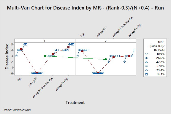
Since the response is bounded and is an ordered response, Ordinal Logistic Regression (OLR) is a likely candidate. Here is a similar question with some good information: Which model should I use to fit my data ? ordinal and non-ordinal, not normal and not homoscedastic . Perhaps a Multi-Vari Chart may be another way to show the data. Instead of jitter in a dot plot, using the cumulative % (~ Median Rank using (rank(i)-0.3)/(n+0.4) would allow one to see the transitions between Disease Index Steps. This also illustrates the differences between runs (average 3 in run1 vs. 2.4 ref. Green Line). Here is an example I did using Minitab with the assumption that there are 6 samples in each treatment group. I see R has a function as well (mvPlot) https://rdrr.io/cran/qualityTools/man/mvPlot.html Multi-Vari Chart (Minitab)

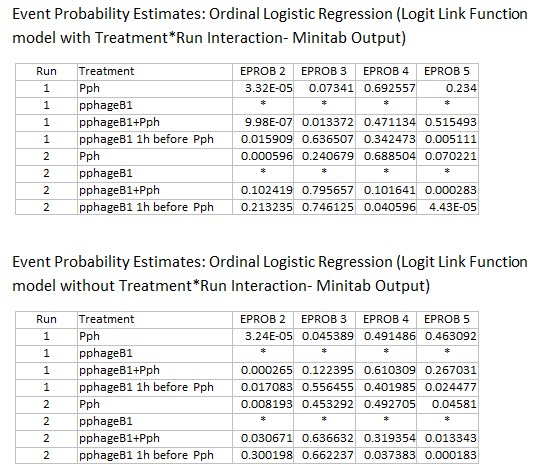
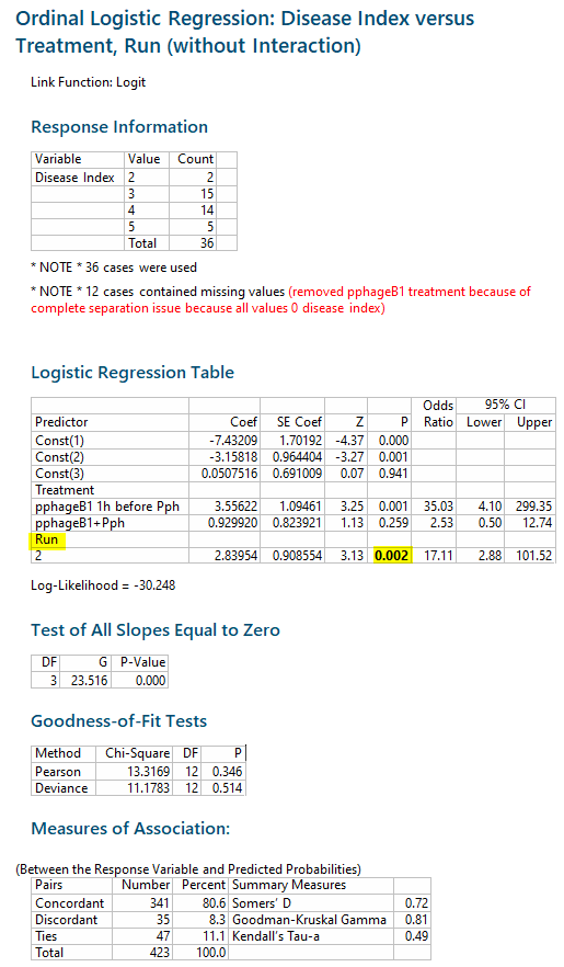
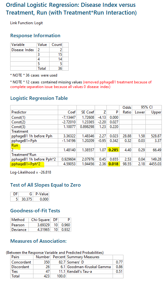
If you do Ordinal Logistic Regression on this dataset, you will run into a couple of issues: 1) complete separation of pphage B1 (disease index 0) will result in a model with ever increasing coefficients because the likelihood never peaks. 2) There are no data with Disease Index 1. One could run an OLR with pphageB1 excluded for a Disease Index range of 2 to 5. Below is an OLR model for the response with and without Treatment-Run Interaction. The differences in runs is largely due to pphageB1+pph. The model with the Treatment Run Interaction fits the data better. The estimate for the Run effect probability ~p 0.002. With the Treatment Run interaction the main effect of Run increases p~0.285 (no longer significant on its own), but driven by the pphageB1+pph * Run interaction p~0.018.

OLR Event Probability

Ref OLR Model without Interaction: Run effect probability ~p 0.002   OLR Model with Run Effect

Ref OLR Model With Treatment-Run Interaction: Run increases p~0.285 (no longer significant on its own), but driven by the pphageB1+pph * Run interaction p~0.018 ORL Model With Run Interaction

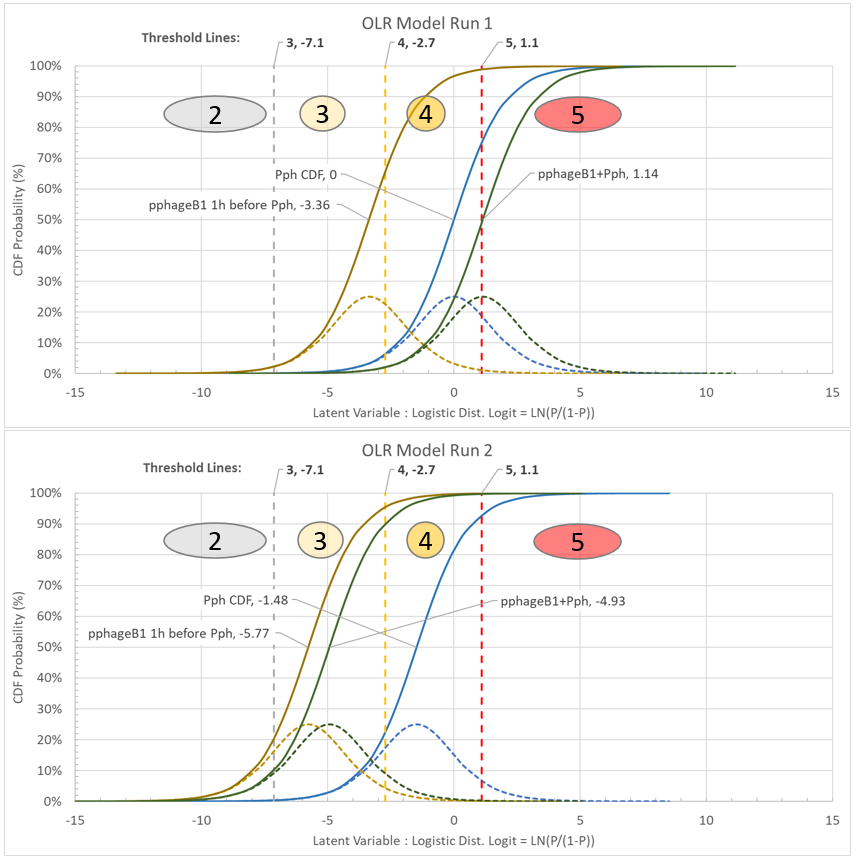
Another Graphical view that I have found helpful in OLR is a Latent Variable PDF and CDF plot of the model (here I am using Excel, but r has some nice graphs I have seen with CDF). You can see pphageB1+Pph shifting from Run1 to Run 2, and visualize the probabilities of being in Disease Group. The Threshold Lines represent the cut points between groups (left of -7.1 Disease Index 2 (or lower), right of -7.1 Disease Index 3 or higher. enter image description here

For more info on Tukey End Count: Tukey handled ties as 0.5 in his original paper, it would be more conservative to not count ties.

Andy Sleeper has a brief overview here in "Pocket Stats": https://www.processexcellencenetwork.com/lean-six-sigma-business-performance/columns/pocket-stats-quick-significance-tests-you-can-rem

The Tukey End Count test (aka Tukey's Quick Test) is a non-parametric (distribution free) test John Tukey developed, after Duckworth (an Engineer) asked if something easier than a t-test could be developed. Tukey published it in the first edition of Technometrics (1959) "A Quick, Compact, Two-Sample Test to Duckworth’s Specifications".

$\endgroup$
0

Your Answer

By clicking “Post Your Answer”, you agree to our terms of service and acknowledge you have read our privacy policy.