4
$\begingroup$

I'am modelling the effect of individuals' chronotype on their respective school performance. So, my dataframe consist of the subjective and school declared performance (dependent variable) of middle school students (random variable), and their chronotype (independent variable). The students' subjective performance was measured on a scale from 1 to 5, while the school declared performance was on a scale from 0 to 10. Thus, I Z-standardized these performance values.

#Loading data
data <- read.table("clipboard", header=T)
#Scale function: Z-Score Standardization
data.st <- as.data.frame(scale(data$performance, center = FALSE))
data$performance.st <- data.st$V1
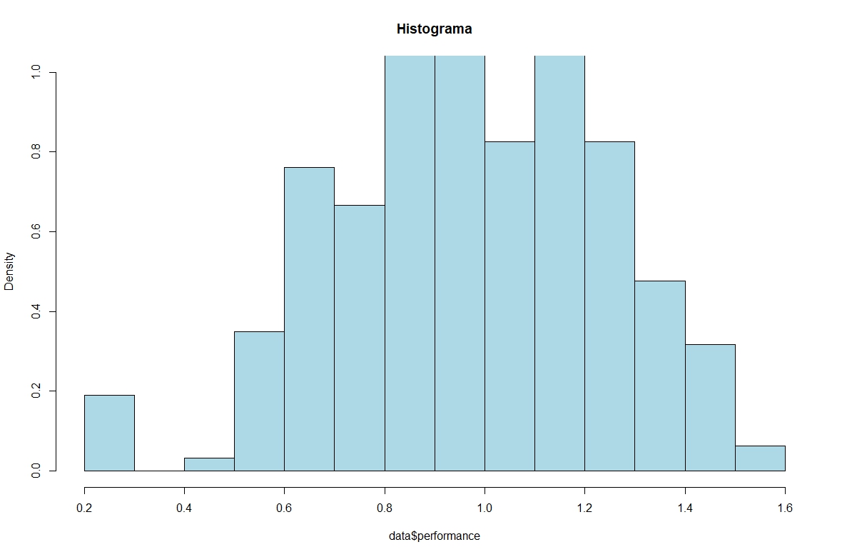
hist(data$performance.st, prob=TRUE, ylim=c(0,1), 
     main = "Histogram", col= "lightblue")

enter image description here

shapiro.test(data$performance.st)
#W = 0.96497, p-value = 6.798e-07

Then I modelled my data considering a poisson family:

# Poisson distribution
glmer.poisson <- glmer(performance ~ chronotype + (1|random), 
               family = poisson(link = log),
                     data =  data)

Generalized linear mixed model fit by maximum likelihood (Laplace Approximation) ['glmerMod']
 Family: poisson  ( log )
Formula: performance ~ chronotype + (1 | random)
   Data: data
     AIC      BIC   logLik deviance df.resid 
     Inf      Inf     -Inf      Inf      310 
Random effects:
 Groups Name        Std.Dev.
 random (Intercept) 1       
Number of obs: 315, groups:  random, 55
Fixed Effects:
 (Intercept)  chronotypemm  chronotypemv  chronotypeve  
    -0.03279      -0.02495      -0.12318       0.01500  
optimizer (Nelder_Mead) convergence code: 0 (OK) ; 29610 optimizer warnings; 1 lme4 warnings

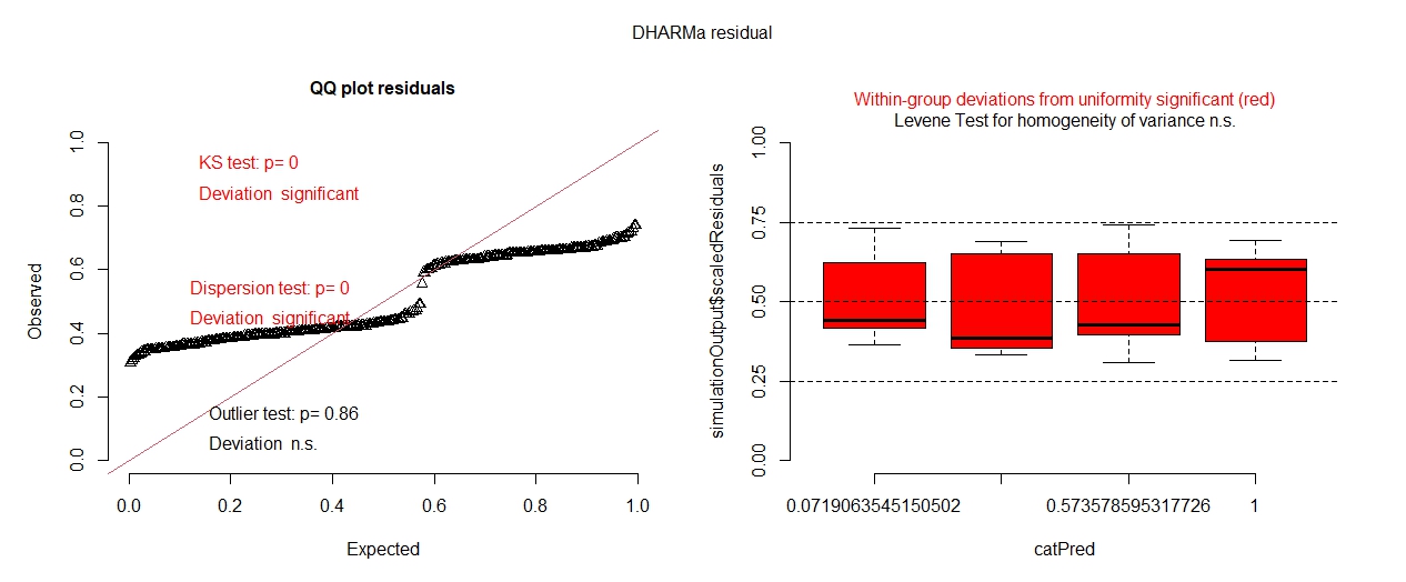
plot(simulateResiduals(glmer.poisson))

enter image description here

However, the GLMM clearly did not fit. And now I have some questions regarding my data and GLMMs.

First: I don't really know which family to use to model my data. Although I have non-integer values, I think poisson is the right family to use (although lognormal distribution provided nice results). Though, what about the warnings returned in the lm4 package saying that my values are non-integer? and the optimizer warnings? should I change my optimizer? if so, how?

Second: A fellow of mine suggested for me to use gamma or negative binomial instead of poisson. Though, after I see the histogram i thought a lognormal distribution would be a nice try. So I modelled accordingly:

#Gamma distribution
gamma <- glmer(performance ~ chronotype + (1|random), 
               family = Gamma(link="inverse"),
               data =  data)
qqnorm(resid(gamma), pch=16)
qqline(resid(gamma))
plot(gamma)

# Negative binomal distribution
glmer.nb <- glmer.nb(performance ~ chronotype + (1|random),
               data =  data, family=MASS::negative.binomial(theta=1.75))

plot(simulateResiduals(glmer.nb)) 
# The simulated residuals of the glmer.nb were very similar to the poisson model
plot(glmer.nb)
qqnorm(resid(glmer.nb), pch=16)
qqline(resid(glmer.nb))

# lognormal distribution
lognormal <- glmer(formula = log(performance) ~ chronotype + (1|random),
               data = data, family=gaussian(link = identity))
plot(simulateResiduals(lognormal))
plot(lognormal)

qqnorm(resid(lognormal), pch=16)
qqline(resid(lognormal))

The lognormal seems to be a good distribution for my data, but I am not sure.

Finally: Suppose that I'am building a GLMM considering a poisson family. Should I standardize my dependent variable even though poisson use a log link function? I think the correct answer is yes since my data have different scales.

$\endgroup$
5
  • $\begingroup$ Can you show us the lognormal qqplots you say look good? And can you tell us more about what a chronotype is? Like, what do some of the chronotypes in your data "look" like? $\endgroup$ Commented Aug 20, 2022 at 22:25
  • $\begingroup$ Since you've linked to your data, I took a look. You have 2 performance measures for three subjects (math, science, pt). Your model should include subject but there is a bigger issue. You standardize the performance scores by computing one variance across the two scales (subjective and school-declared) and the three subjects. This doesn't make sense. For one the means of these six groupings (scale x subject) might be different. $\endgroup$
    – dipetkov
    Commented Aug 20, 2022 at 23:22
  • 1
    $\begingroup$ I suggest you write a new question that explains your study and asks more broadly how to analyze the data. Choosing a different distribution family once you've applied the standardization might not be as helpful. $\endgroup$
    – dipetkov
    Commented Aug 20, 2022 at 23:23
  • $\begingroup$ Indeed, I should have added "subject" to my model. Beyond that, I thought that after I have Z-standardized my two dependent scales (subjective and school-declared performance) I could add it in a single model. $\endgroup$ Commented Aug 21, 2022 at 1:26
  • $\begingroup$ The lognormal qqplot looks good compared to gamma, nb and poisson distributions, although it's still doesn't fit well. Lognormal qqplots: 1drv.ms/u/s!AuvDWe9kv3Dqh7teT6xWmXPWUZEJeQ?e=HbMqgU Dharma residuals of the lognormal model: 1drv.ms/u/s!AuvDWe9kv3DqirAJVRRcSk_g5qT2IA?e=c9HNSf Also, individual differences in the timing of sleep (in reference to local time) along with individuals’ circadian peaks in temperature is referred to as chronotype. $\endgroup$ Commented Aug 21, 2022 at 2:03

1 Answer 1

4
$\begingroup$

Plots are good.

We often learn a lot from visualizing the raw data. It's more effective than fitting an inappropriate model and then wondering whether the residual QQ plot looks normal "enough".

So I made a few plots of your data. The plots suggest a substantial revision of your analysis; choosing a different distribution family won't be sufficient to make sense of your data.

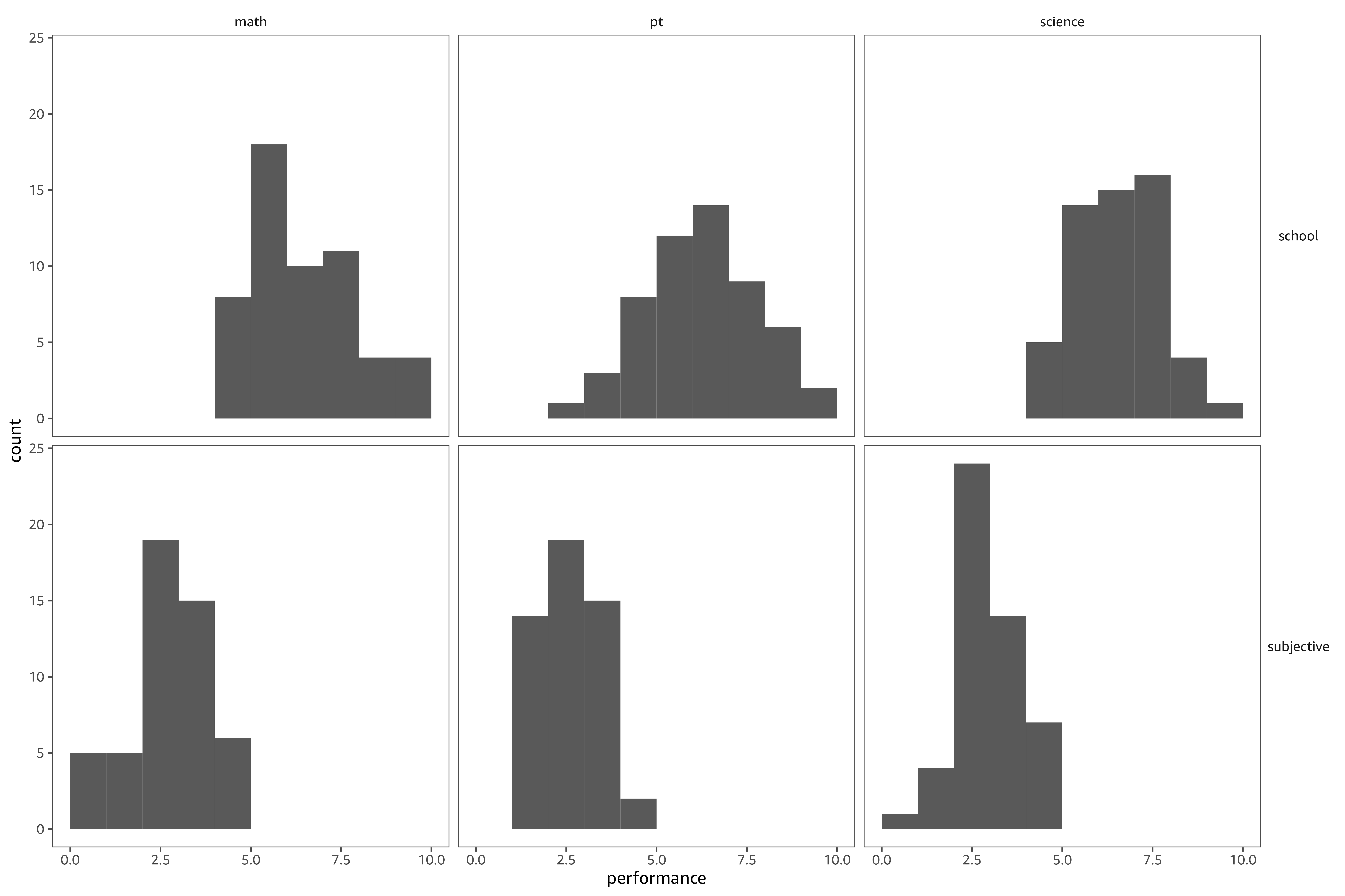
First, we look at histograms of performance scores by subject (mat, pt, science) and type (school-declared, subjective).

enter image description here

The transformation

data$performance = scale(data$performance, center = FALSE)

assumes subjective scores and school-declared scores have the same variance. The histograms, which are aligned on the x-axis, show the assumption doesn't hold. So the transformation is misapplied.

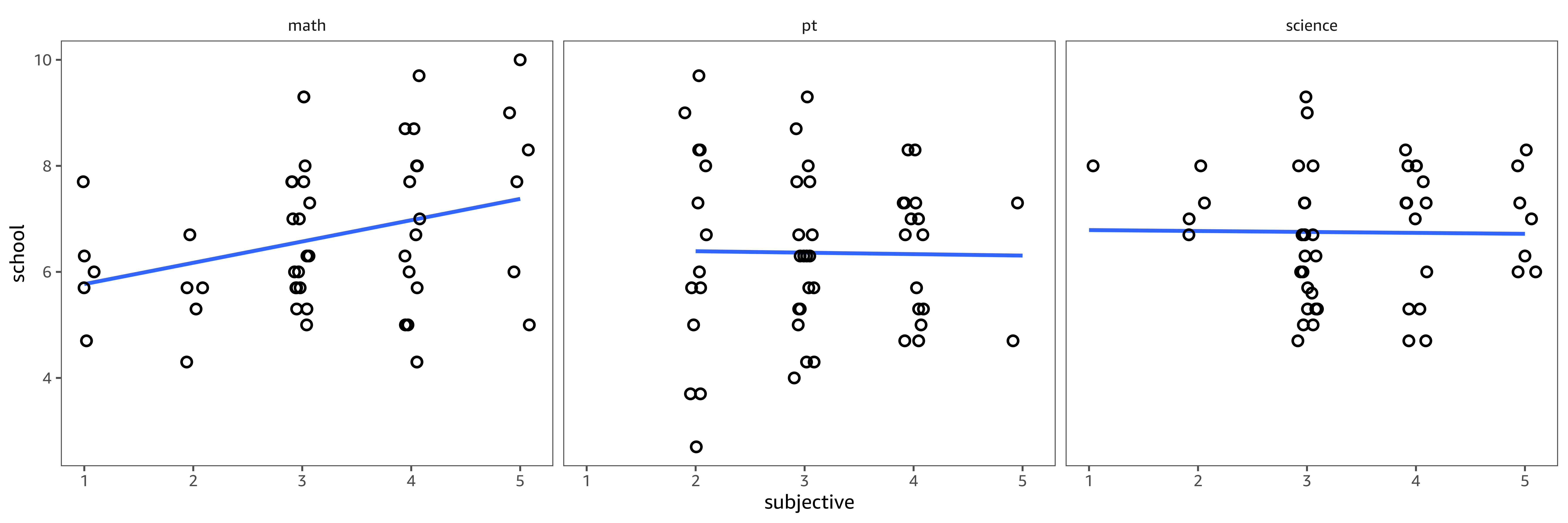
Once you standardize the scores, you ignore the fact that you are working with different measures of performance. By plotting subjective against school-declared scores, we see that the two measures are correlated only for math. There is little agreement between students' perception and teachers' evaluation of performance in pt and science.

enter image description here

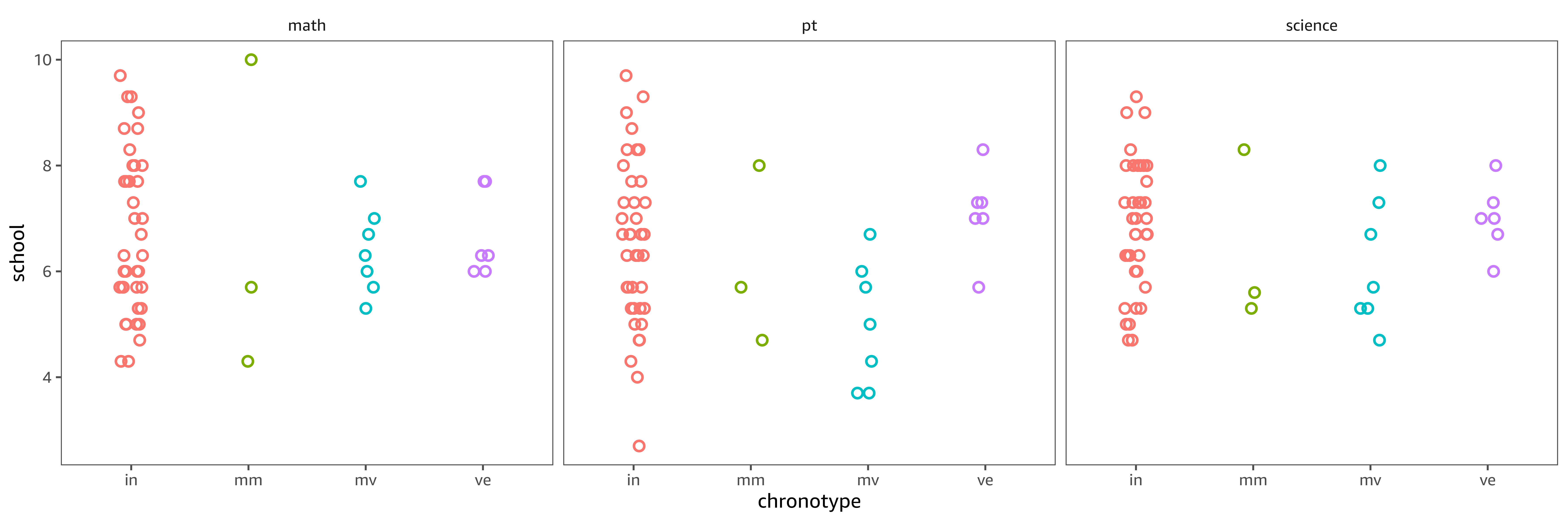
And finally, let's look at (school-declared) performance as a function of choronotype. There seems to be something going on though it will be difficult to estimate the effect of chronotype with high precision as 39 out of 55 students have the in chronotype; the other three types are rare. A lot of the difference is in the spread (variability) rather than the mean, except for pt where mv seems to be associated with lower performance.

enter image description here


Here is the R code to reproduce the figures; I use ggplot2.

library("readxl")
library("tidyverse")

data <-
  read_xlsx(
    "data.xlsx",
    col_types = c("text", "text", "text", "numeric")
  ) %>%
  separate(
    subjects,
    c("type", "subject")
  ) %>%
  mutate(
    type = recode(type, "subj" = "subjective")
  )

data %>%
  ggplot(
    aes(performance)
  ) +
  geom_histogram(
    breaks = 0:10
  ) +
  facet_grid(
    type ~ subject
  )

ggsave("chronotypes1.png", width = 12, height = 8, dpi = 600)

data %>%
  pivot_wider(
    names_from = type,
    values_from = performance
  ) %>%
  ggplot(
    aes(subjective, school)
  ) +
  geom_smooth(
    method = "lm", formula = y ~ x, se = FALSE
  ) +
  geom_jitter(
    width = 0.1,
    height = 0,
    shape = 1,
    size = 2,
    stroke = 1
  ) +
  facet_grid(
    ~subject
  )

ggsave("chronotypes2.png", width = 12, height = 4, dpi = 600)

data %>%
  pivot_wider(
    names_from = type,
    values_from = performance
  ) %>%
  ggplot(
    aes(chronotype, school)
  ) +
  geom_jitter(
    aes(color = chronotype),
    width = 0.1,
    height = 0,
    shape = 1,
    size = 2,
    stroke = 1
  ) +
  facet_grid(
    ~subject
  ) +
  theme(legend.position = "none")

ggsave("chronotypes3.png", width = 12, height = 4, dpi = 600)
$\endgroup$
2
  • $\begingroup$ I know it's been a while but could you provide the code for the scatterplots? I liked their aesthetics, though I couldn't reproduce it here. $\endgroup$ Commented Aug 28, 2022 at 23:39
  • $\begingroup$ Sure. You just have to change the ggplot theme. I have my own because I'm a bit particular about fonts. $\endgroup$
    – dipetkov
    Commented Aug 28, 2022 at 23:51

Your Answer

By clicking “Post Your Answer”, you agree to our terms of service and acknowledge you have read our privacy policy.

Not the answer you're looking for? Browse other questions tagged or ask your own question.