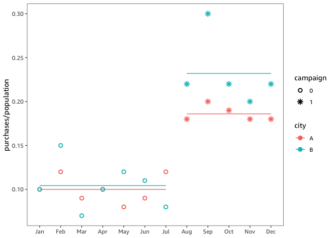
If this is actual data from a marketing campaign, you don't need statistics to show that there is a bigger increase in purchases after July in the larger city. A scatterplot of the data illustrates this convincingly. (The interpretation on the other hand might require some nuance: after all, the larger the city, the more potential customers for any kind of product. In other words, why not do the campaign in the larger city only?)
With so many even numbers, however, it's unlikely this is real-world data. So let's estimate the proportional campaign effect in each city. First, divide by the population size to normalize the monthly purchases: y = purchases / population. Now the outcome variable y (purchases per person) is comparable between cities.
(At least) One challenge remains: it's not reasonable to make the equal variance assumption: since the scale of the business is different, we expect more variability in purchases in the larger city and, as a result, higher variance in y also. This expectation holds true for the provided data. (I'll ignore other potential challenges — for example, seasonality in demand — and let you think about them instead.)
So let's use regression (which generalizes the t-test) but allow the variance of y to differ by city. I fit this regression using Generalized Least Squares (GLS); the R code is attached at the end. Both visually and statistically, the campaign has a bigger effect in city B.
model <- gls(
  y ~ city * campaign,
  weights = varIdent(form = ~ 1 | city),
  data = campaign
)

emmeans(model, ~ city | campaign)
#> campaign = 0:
#>  city emmean      SE df lower.CL upper.CL
#>  A     0.100 0.00496 10   0.0890    0.111
#>  B     0.104 0.01210 10   0.0773    0.131
#>
#> campaign = 1:
#>  city emmean      SE df lower.CL upper.CL
#>  A     0.186 0.00587 10   0.1729    0.199
#>  B     0.232 0.01432 10   0.2001    0.264
#>
#> Degrees-of-freedom method: satterthwaite
#> Confidence level used: 0.95

Here is the R code to reproduce the analysis and the figure.
library("nlme")
library("emmeans")
library("tidyverse")

campaign <- tibble::tribble(
  ~month, ~Purchases_A, ~Purchases_B, ~campaign,
  "January", 100L, 100000L, 0L,
  "February", 120L, 150000L, 0L,
  "March", 90L, 70000L, 0L,
  "April", 100L, 100000L, 0L,
  "May", 80L, 120000L, 0L,
  "June", 90L, 110000L, 0L,
  "July", 120L, 80000L, 0L,
  "August", 180L, 220000L, 1L,
  "September", 200L, 300000L, 1L,
  "October", 190L, 220000L, 1L,
  "November", 180L, 200000L, 1L,
  "December", 180L, 220000L, 1L
)

population <- setNames(c(1000L, 1000000L), c("A", "B"))

campaign <- campaign %>%
  rename(
    A = Purchases_A,
    B = Purchases_B
  ) %>%
  pivot_longer(
    c(A, B),
    names_to = "city",
    values_to = "purchases"
  ) %>%
  mutate(
    campaign = as.character(campaign),
    month = factor(month, levels = month.name, labels = month.abb, ordered = TRUE),
    population = population[city],
    y = purchases / population
  )

model <- gls(
  y ~ city * campaign,
  weights = varIdent(form = ~ 1 | city),
  data = campaign
)

emmeans(model, ~ city | campaign)

campaign$.fitted <- predict(model)

campaign %>%
  ggplot(
    aes(month, purchases / population, group = city)
  ) +
  geom_point(
    aes(
      color = city,
      shape = campaign
    ),
    size = 2,
    stroke = 1
  ) +
  geom_line(
    aes(month, .fitted,
      group = interaction(city, campaign),
      color = city
    ),
    inherit.aes = FALSE,
    data = campaign
  ) +
  scale_shape_manual(
    values = c(1, 8)
  ) +
  theme(
    axis.title.x = element_blank()
  )

