2
$\begingroup$

I'm using scipy's optimize to fit two Gaussian distributions to my data. I expected the posterior likelihood of belonging to the rightmost class to start from 0 before the distributions cross, and go to 1 from that point.

However, the output looks like this,
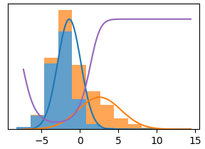
GMM output
so the probability of belonging to the second class is high on both sides of the peaks.

I tried to reproduce this behaviour with the parameters of the two distributions:

import matplotlib.pyplot as plt;
import scipy.stats as stats;
import numpy as np;

params1 = [ 1.68, 2.13 ];
params2 = [ -.81, 1.22 ];

x  = np.linspace ( -5, 15, 100);
y1 = stats.norm.pdf ( x, params1[0], params1[1] );
y2 = stats.norm.pdf ( x, params2[0], params2[1] );
y3 = y1 / y2; y3 = y3 / ( 1 + abs ( y3 ) );

plt.plot ( x, y1, x, y2, x, y3 * .33 );
plt.show();

so the problem is that if the right distribution has a heavier tail than the left, and the posterior probability is defined by the ratio (or sign of difference) of the two densities, it will be higher for the right distribution on the left side (as well as on the right).

Is there a way to overcome this in Gaussian mixture modelling? Should I use a different fit function, or modify the inputs?

$\endgroup$
0

1 Answer 1

4
$\begingroup$

Your diagnosis about this being orange's heavier tails is correct. The model seems to be behaving properly under the circumstances.

If you simply disagree with the classification of $x < -5$ instances as blue, then flip them to orange.

However, there are several reasons this might be disadvised. First would be if your application is density estimation or prediction. I.e. things which involve a factor like $g(y|x)=\sum_c g(y | x, c) f(c | x)$. In which case just let the model do its thing.

The second is that such classifications could reflect a true data generating process. For instance, if the data were log returns on stocks, but there was a missing variable representing how many time steps had elapsed. You'd probably expect returns over longer periods to dominate in both tails. Then, if you classified this data, it would be reasonable for GMM to show a blue cluster (mapping to short timespans) and an orange cluster (mapping to long time spans). This is a matter of domain intuition.

$\endgroup$
1
  • $\begingroup$ Thanks - I can see how it may be better to discard some 'bad' data points than to make questionable adjustments to the model. If I want a sigmoid shape then I can always fit a sigmoid to the purple line. I was hopeful after seeing solutions by SAS and multinomial logistic regression (figure 1), but I don't know those methods. $\endgroup$
    – alle_meije
    Commented Jan 2, 2023 at 9:49

Your Answer

By clicking “Post Your Answer”, you agree to our terms of service and acknowledge you have read our privacy policy.

Not the answer you're looking for? Browse other questions tagged or ask your own question.