11
$\begingroup$

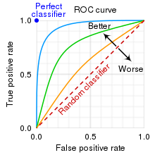
In my understanding, the ROC curve plots the True positive rate and the False positive rate.

enter image description here

However, I've also read in other places that the ROC curve helps determine where the threshold for classifying something as "1" should be. Eg. Lets say if the probability of an an object is a "dog" is greater than 50% or 0.5, the classifier would classify it as 1=Dog, and <0.5 = 0 (Not Dog).

So where on this ROC curve does it show that threshold, if it only plots the True positive rate and False positive rate? Is the threshold simply where the "elbow" is? And do we pull the x axis' number or the y axis' number?

Eg. If we use the x axis' number (false positive rate), the green classifier's threshold should be 0.3 (aka anything above a 30% probability will be classified as 1=Dog)

$\endgroup$
2
  • 15
    $\begingroup$ the roc is a curve obtained as you keep varying the threshold, thus, every point in the curve corresponds to a threshold. $\endgroup$
    – utobi
    Commented May 4, 2023 at 6:43
  • $\begingroup$ This took me a long time to wrap my head around too, and I ended up doing one of those "answer your own question" things on here: stats.stackexchange.com/questions/512172/… $\endgroup$
    – Max
    Commented May 6, 2023 at 19:47

6 Answers 6

23
$\begingroup$

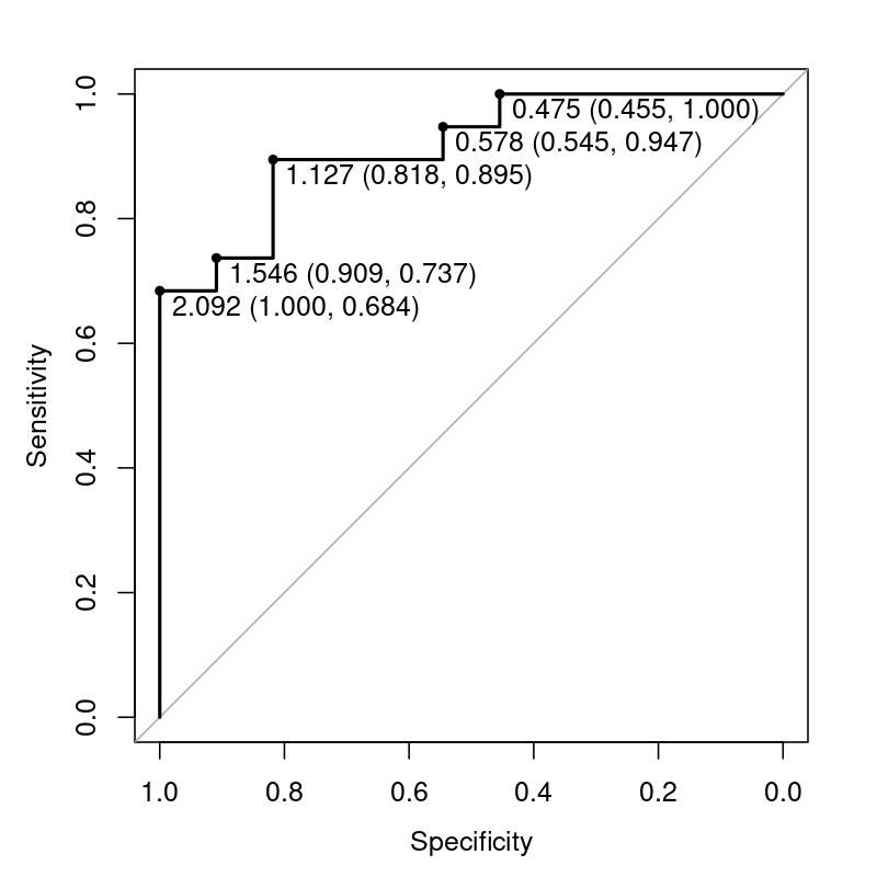
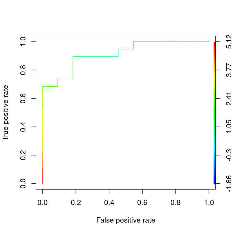
Each (FPR, TPR) point on a ROC curve is associated with a threshold. However, the thresholds are not typically drawn on the curve itself.

It is possible to reveal them, either adding extra annotation to the curve, or by coloring the curves. Here are some examples generated in R with pROC and ROCR, respectively:

Plot of thresholds on a ROC curve annotated with pROCPlot of thresholds on a ROC curve colorized with ROCR

Here is R code to generate these plots:

set.seed(42)
truth <- rbinom(30, 1, 0.5)
predictor <- rnorm(30) + truth + 1

library(pROC)
plot(roc(truth, predictor), print.thres="local")


library(ROCR)
pred <- prediction(predictor, truth)
perf <- performance(pred, measure = "tpr", x.measure = "fpr")
plot(perf, colorize=TRUE)
$\endgroup$
4
  • 9
    $\begingroup$ +1. showing the code used to generate the plots could be helpful to future readers I believe. $\endgroup$
    – utobi
    Commented May 4, 2023 at 8:38
  • $\begingroup$ Great plot but the thresholds do not make sense? Can you explain what the first number on the left plot means? I had imagined the thresholds to be between [0, 1] as cutoffs to classify something as 1=Dog. $\endgroup$
    – Katsu
    Commented May 4, 2023 at 17:17
  • 4
    $\begingroup$ @Katsu An ROC only requires a numeric scoring/ranking of samples, but those numeric values can take any range whatsoever. Sometimes your variable is a probability in the range [0,1], sometimes it's a physical value limited by some realistic range, or sometimes it's an arbitrary score with no theoretical upper or lower limit. As a simple example, you could build a model to classify men vs. women using height as an input, in which case your ROC threshold values might be in the range of 1.5m-2.5m. If you built that classifier based on weight, threshold values might vary from 40kg-200kg. $\endgroup$ Commented May 4, 2023 at 20:29
  • 1
    $\begingroup$ @NuclearHoagie in reality you can drop the "numeric scoring" part too. IN theory all you really need is a value you can rank (ie low, medium, high should work, although most software would have trouble handle it of course). $\endgroup$
    – Calimo
    Commented May 5, 2023 at 7:10
12
$\begingroup$

It doesn't. If you care about having the highest possible TPR and FPR, the threshold is where the elbow is. If you care more about TPR than FPR, or the other way around, it's something else. If you care about optimizing some other metric, it may be something else.

$\endgroup$
5
  • $\begingroup$ Well yes, lets say I want the highest possible TPR and lowest possible FPR. Then the threshold would be 0.3 (based on the FPR x axis) or 0.8 (based on the TPR y axis)? $\endgroup$
    – Katsu
    Commented May 4, 2023 at 4:33
  • 2
    $\begingroup$ @Katsu The point is that the threshold does not appear on the graph. $\endgroup$
    – Dave
    Commented May 4, 2023 at 4:37
  • 5
    $\begingroup$ @Katsu it's neither, the information is not available on the plot. The threshold would be the threshold that has led to those metrics, here you can see a plot showing it stackoverflow.com/questions/22518230/… $\endgroup$
    – Tim
    Commented May 4, 2023 at 4:39
  • $\begingroup$ Ah got it, so its hidden as part of the (calculated) inputs into the plot. That would be awesome if we had something like that in Python! $\endgroup$
    – Katsu
    Commented May 4, 2023 at 4:42
  • 5
    $\begingroup$ @Katsu "highest possible TPR and lowest possible FPR" are not simultaneously possible - that is the reason for the curve so you can see the trade-off you need to make. $\endgroup$
    – Henry
    Commented May 5, 2023 at 12:07
8
$\begingroup$

There is no universal truth to that question. There is always a tradeoff made with any threshold and the ROC visualizes all possible thresholds for you to pick the best.

Is it better to err on one side or better to err on the other? That will heavily depend on the topic at hand. A screening test for a disease with the implication to not send your kid to school for a week is less critical with a false positive then a diagnostic test with the implication of removing a limb or an organ.

If that is not good enough you may want to look into Youden's J or the Youden Index and the threshold that maximizes it.

$\endgroup$
6
  • 2
    $\begingroup$ It is not clear to me how this answers the question about where the threshold appears on the graph. Could you please clarify? $\endgroup$
    – Dave
    Commented May 4, 2023 at 4:38
  • $\begingroup$ Yes my question was where specifically does the ROC visualize those possible thresholds. Only seeing TPR and FPR. $\endgroup$
    – Katsu
    Commented May 4, 2023 at 4:45
  • 1
    $\begingroup$ Each point on the curve represents a possible threshold and that thresholds characteristics. The value of the threshold is not displayed in the ROC, if that was the question. $\endgroup$
    – Bernhard
    Commented May 4, 2023 at 4:48
  • 4
    $\begingroup$ Why was this answer downvoted? The question asked whether the ROC-curve can help determine the best threshold. This answer correctly states that no, a "best" threshold cannot be determined just by looking at the ROC-curve, since the choice of threshold is always going to be a compromise, and the most appropriate compromise depends heavily on the context of application of the classifier. $\endgroup$
    – Stef
    Commented May 4, 2023 at 15:59
  • 5
    $\begingroup$ @Katsu In particular, the answer to your question "Is the threshold simply where the "elbow" is?" is a hard no. I'm sure there are people, in real-life, who blindly place their thresholds at the elbow of their ROC-curve, but that is a terrible idea in general. You need to know and understand the context of application of your classifier, in order to determine the threshold. The ROC-curve is never enough. $\endgroup$
    – Stef
    Commented May 4, 2023 at 16:17
6
$\begingroup$

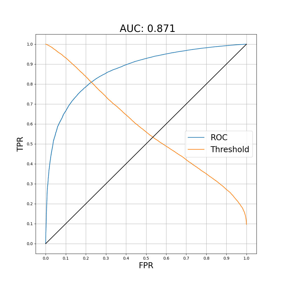
Since you mentioned python, here is an example. It's pretty trivial to plot the threshold along with the ROC using sklearn.metrics.roc_curve.

from sklearn import metrics
import numpy as np
import matplotlib.pyplot as plt

fpr, tpr, th = metrics.roc_curve(true, score)
fig, ax = plt.subplots()
fig.set_size_inches(10,10)
ax.plot(fpr,tpr,label='ROC')

##Plotting the threshold. The value of the first index can be above one so I exclude that point when plotting.
ax.plot(fpr[1:],th[1:],label='Threshold')

ax.plot(fpr,fpr,c='k')
ax.xaxis.set_ticks(np.arange(0, 1.05, .1))
ax.yaxis.set_ticks(np.arange(0, 1.05, .1))
plt.grid(True)

auc = np.round(metrics.roc_auc_score(true, score),3)
plt.title(f' AUC: {auc}',fontsize=25)
plt.xlabel('FPR',fontsize=20)
plt.ylabel('TPR',fontsize=20)
plt.legend(fontsize=20)

With the threshold plotted along with the ROC you can see that as the threshold approaches 1 (on the left side of the figure) TPR and FPR both approach 0, and as the threshold approaches 0 the TPR and FPR both approach 1.

ROC curve example

$\endgroup$
4
  • 1
    $\begingroup$ +1 even if this is an unusual type of answer to have posted on here. I've also thought about plotting FPR and TPR as functions of the threshold. $\endgroup$
    – Dave
    Commented May 4, 2023 at 17:42
  • $\begingroup$ Extremely cool. However, is there an axis/number associated with that threshold? I'm assuming the point where it crosses the ROC is the "best" threshold or at least the point where we should dig into more. But what is that number associated with the threshold? 0.81 or 0.24? $\endgroup$
    – Katsu
    Commented May 4, 2023 at 18:18
  • 1
    $\begingroup$ @Katsu The point where the curves cross is meaningless. Choose a point on the ROC curve that fits the FPR/TPR criteria you like. Then, look vertically to see the point on the Threshold curve that has the same x-coordinate as the point on the ROC. That is the threshold that corresponds. $\endgroup$
    – Brady Gilg
    Commented May 4, 2023 at 18:28
  • $\begingroup$ I see, can you put numbers around that? Lets say I want the point on the ROC where 0.7 TPR and 0.12 FPR. What is the corresponding threshold? The threshold would be 0.92 if reading from the y axis and 0.12 if reading from the x axis. The y axis reading makes more intuitive sense based on the 0.7 TPR and 0.12 FPR criteria (>0.92, then 1 Dog, <0.92, then 0 Not dog) $\endgroup$
    – Katsu
    Commented May 4, 2023 at 20:32
5
$\begingroup$

The ROC curve does not "tell" you what threshold to use by itself. Setting the threshold is a business decision made by the users of the model based on the specifics of their application.

The business people's job is to know how many false positives and false negatives they can take. The ROC curve tells them what are the business implications of picking a given threshold. If there is a threshold value that suits their needs they will use the model.

Determining the threshold involves quantifying several items that depend on the application. Usually false positives carry a cost while false negatives carry a risk. Their impact changes according to what the whole process is like, its goal and where in the process the model is used (is it after a screening? is this the first screening? Is the purpose medical? Security? Financial?). All this info needs to be considered in conjunction with the ROC curve to reach a decision.

$\endgroup$
3
  • 1
    $\begingroup$ Welcome to Cross Validated! How does this address the question about where on the ROC curve the threshold is shown? $\endgroup$
    – Dave
    Commented May 4, 2023 at 20:46
  • 1
    $\begingroup$ @Dave the last paragraph is the answer the OP is looking for, given " I've also read in other places that the ROC curve helps determine where the threshold for classifying something as "1" should be." $\endgroup$
    – Davidmh
    Commented May 5, 2023 at 12:39
  • $\begingroup$ @Dave thanks for the welcome! The way I read the question it is about what point of the curve should be chosen in order to pick the associated threshold value. My answer is that the cuve and its geometrical features (corners, apex point and such) are generally not enough to do that. I edited for clarity. $\endgroup$
    – Rad80
    Commented May 5, 2023 at 20:00
3
$\begingroup$

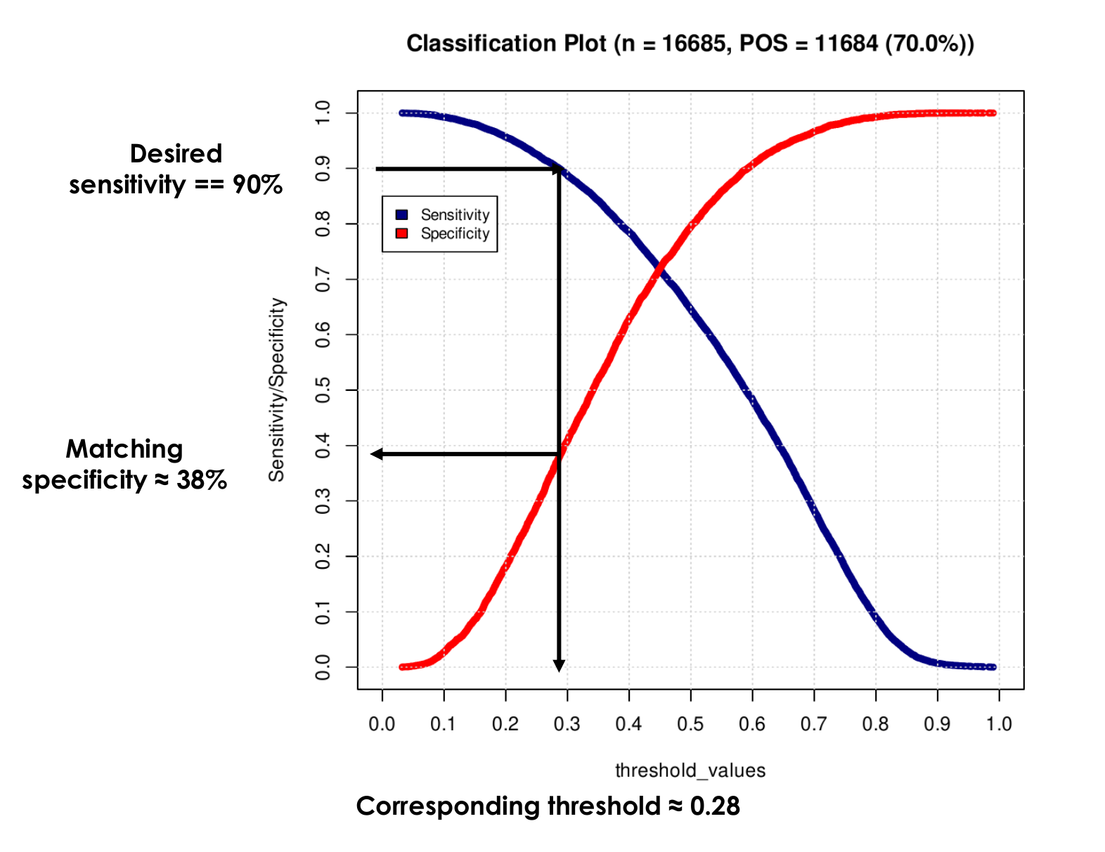
As others have pointed out, ROC curve does not display threshold values, unless additionally annotated. For the purpose of determining the best decision threshold, classification plot may be more convenient.

Determining the best decision threshold using a classification plot

To determine the threshold, draw a horizontal line from the desired sensitivity (90% in the figure) to the sensitivity curve (blue), then draw a vertical line to the x-axis. The ordinate of the point at which the vertical line intersects the specificity curve (red) is the matching specificity, and the abscissa is the corresponding decision threshold. This is similar to choosing the best combination of (sensitivity, specificity) on the ROC graph, but in addition it directly provides the decision threshold.

$\endgroup$
2
  • $\begingroup$ What is the $70\%?$ $\endgroup$
    – Dave
    Commented May 9, 2023 at 19:54
  • $\begingroup$ @Dave: 70% is the percentage of Positive (POS) class samples (11684/16685) $\endgroup$
    – ljubomir
    Commented May 10, 2023 at 4:06

Your Answer

By clicking “Post Your Answer”, you agree to our terms of service and acknowledge you have read our privacy policy.

Not the answer you're looking for? Browse other questions tagged or ask your own question.