This is explained on same page (p. 19):
Technical note. Table 2 is hard to read because it compares 12 admission rates. A statistician might summarize table 2 by computing one overall admissions rate for men and another for women, but adjusting for the sex differences in application rates. An ordinary average ignores the differences in size among the departments. Instead a weighted average of the admission rates could be used, the weights being the total number of applicants (male and female) to each department; see table 3.
In other words, the weighting is done by the number of applicants per department: $$\frac{0.62 \times933 + 0.63\times585 + 0.37 \times 918 + 0.33 \times 792 + 0.28 \times 584 + 0.06 \times 714}{4,\!526} \approx 39\%.$$
You can interpret the equation from the book as follows: $$\textrm{weighted average rate} = \sum_{i=1}^k \frac{\textrm{male admissions in }k}{\textrm{male applicants in }k} \times \frac{\textrm{total applicants in }k}{\textrm{total applicants}},$$ where $k \in \{ \textrm{A}, \textrm{B}, \dots, \textrm{F} \}$ is a given major.
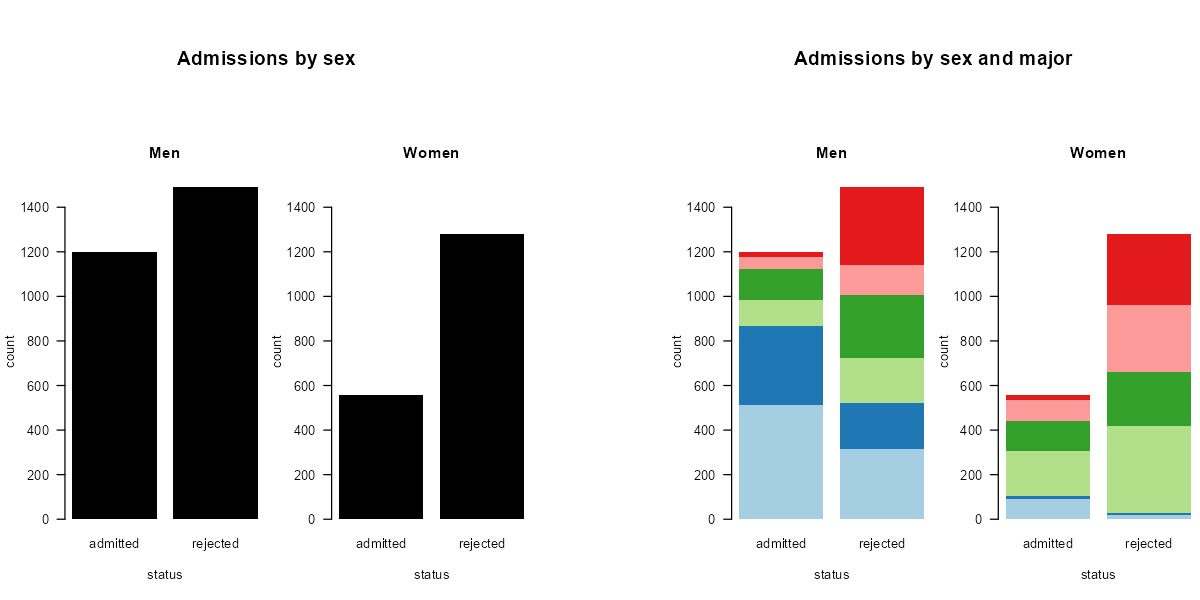
Note that the authors don't say "a statistician would," but that "a statistician might." Personally, I disagree that 12 numbers is too much to display. This obsession with reducing results to a single metric is what led to the paradox in the first place. A simple visualization can summarize all data:

Left: We see the overall admissions and rejections when only considering sex.
Right: We see many more male applicants in the blue groups, which have a low rejection rate.
Reference
- David Freedman, Robert Pisani, and Roger Purves (2007), Statistics (4th edition), W. W. Norton. ISBN 0-393-92972-8.
Code to produce the figure
DF <- data.frame(
  major      = factor(rep(LETTERS[1:6], 2)),
  sex        = factor(rep(c("men", "women"), each = 6)),
  applicants = c(825, 560, 325, 417, 191, 373,
                 108,  25, 593, 375, 393, 341),
  admitted   = c(512, 353, 120, 138,  54,  22,
                  89,  17, 202, 131,  94,  24)
)
DF$rejected   <- DF$applicants - DF$admitted
DFlong        <- rbind(DF[, 1:2], DF[, 1:2])
DFlong$status <- factor(rep(c("admitted", "rejected"), each = nrow(DF)))
DFlong$count  <- c(DF$admitted, DF$rejected)
DFlong$total  <- c(DF$applicants, DF$applicants)
Men           <- DFlong[DFlong$sex == "men", ]
Women         <- DFlong[DFlong$sex == "women", ]

cols <- c("#a6cee3", "#1f78b4", "#b2df8a", "#33a02c", "#fb9a99", "#e31a1c")
layout(matrix(c(1, 1, 4, 5, 5,
                2, 3, 4, 6, 7), nrow = 2, byrow = TRUE),
       heights = c(1, 4),
       widths = c(1, 1, 0.5, 1, 1))
par(mar = c(0, 0, 0, 0))
plot(NA, xlim = c(0, 1), ylim = c(0, 1), type = "n", axes = FALSE, ann = FALSE)
text(0.5, 0.5, "Admissions by sex", font = 2, cex = 1.5)
par(mar = c(5, 4, 4, 0) + 0.1)
barplot(count ~ major + status, Men, ylim = c(0, 1500),
        border = NA, col = rep(1, 6), las = 1, main = "Men")
barplot(count ~ major + status, Women, ylim = c(0, 1500),
        border = NA, col = rep(1, 6), las = 1, main = "Women")
par(mar = c(0, 0, 0, 0))
plot(NA, xlim = c(0, 1), ylim = c(0, 1), type = "n", axes = FALSE, ann = FALSE)
plot(NA, xlim = c(0, 1), ylim = c(0, 1), type = "n", axes = FALSE, ann = FALSE)
text(0.5, 0.5, "Admissions by sex and major", font = 2, cex = 1.5)
par(mar = c(5, 4, 4, 0) + 0.1)
barplot(count ~ major + status, Men, ylim = c(0, 1500),
        border = NA, col = cols, las = 1, main = "Men")
barplot(count ~ major + status, Women, ylim = c(0, 1500),
        border = NA, col = cols, las = 1, main = "Women")

