0
$\begingroup$

Each of the points in the plot below is a mean of 1000 samples. The standard deviation of a point on the RED line is "small" in that it is smaller than the difference between the mean of the RED line and the mean of the GREEN line at that x value.

What is a good clear way to state that the variation of the data in both of these data sets is small? Should I state the standard deviation is less than the half the difference between the set means, or is there a more formal metric to describe the same?
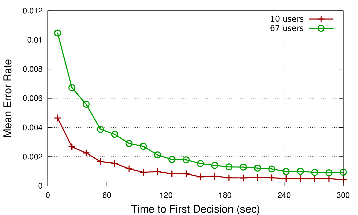
Example of two data sets

PS: This plot is intended to show that GREEN is greater than RED with high likelihood.

$\endgroup$
1
  • 2
    $\begingroup$ If you are red-green colour-blind, then know that the green line is above the red line. The green line connects open circle symbols and the red line connects plus symbols. If you are not red-green colour-blind, please try to remember this when you present graphs. $\endgroup$
    – Nick Cox
    Commented Dec 5, 2013 at 19:30

1 Answer 1

1
$\begingroup$

One option is to plot additional curves from the green data. Here you plot one solid green curve connecting the mean values for each time to first detection.

Instead, you could compute the 25th percentile of all the values at a given time to first decision. Repeat that for each time to first detection, and you'll get a whole curve of 25th percentile values. Do that again for 75th percentiles. Now plot those as, perhaps, dashed light green curves, which will bracket the solid green line.

Readers can then visually compare the red line not just to the solid green line, but also to the distribution of values spreading between the 25th percentile curve and the 75th percentile curve.

Using median values for the solid curves could also be good. And, of course, instead of using the quartile values (25th, 50th, and 75th percentiles at each time to first detection) you can use the mean and +/- one standard deviation at that point. I think ordinal stats are a bit more informative, especially if there are outliers, but it could work.

$\endgroup$
1
  • $\begingroup$ or box plots, violin plots or similar $\endgroup$ Commented Apr 6, 2019 at 14:57

Your Answer

By clicking “Post Your Answer”, you agree to our terms of service and acknowledge you have read our privacy policy.

Not the answer you're looking for? Browse other questions tagged or ask your own question.