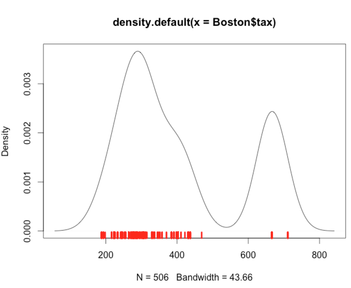
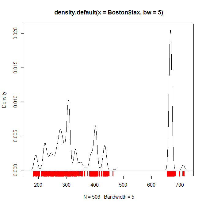
The way to make a rug plot less misleading is often to use something different instead. Rug plots necessarily are relatively good at showing distinct values and very poor at indicating their relative frequency.
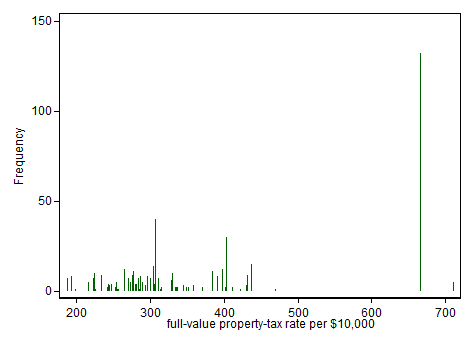
Here is a spike representation of the frequency distribution of the data used in the original post. The principle is that often used to show discrete distributions, a spike proportional in height to the frequency of each distinct value. The Boston data as available and documented here were read into Stata and the spikeplot command used. Something similar should be trivial in all good statistical software. If you like, this is a hybrid of a histogram and a rug plot, although historically graphs of this kind may long predate rug plots.

Stata documentation for spikeplot, including, more to the point of this question, further examples of such graphs, is accessible here
EDIT 3 August 2022 See also this paper for examples of marginal spike histograms as inspired by Harrell, F.E. 2001/2015. Regression Modeling Strategies. Springer.
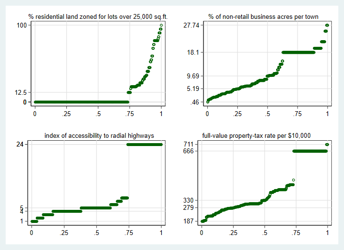
The Boston housing data are often used as an example. Many researchers follow in the path of the original authors, who did not show any plots of the raw data in their paper. Here are four of the more unusual distributions for predictors in that dataset, as shown by quantile plots, plots of the ordered values versus an estimate of cumulative probability. The vertical axis labels are minimum, lower quartile, median, upper quartile and maximum, which in some instances coincide. A quantile plot is good for showing marked spikes and gaps in the data. Naturally an unusual (e.g. spiky) distribution doesn't stop a variable being useful as a predictor, as exemplified also by indicator or dummy variables, but it is a good idea to look at your data before modelling.
In some problems, there may be real doubts about data quality, or at least puzzles about definitions and measurements that need to inform the interpretation.
