I am just wondering what we can infer from a graph with x-axis as the actual and y axis as the predicted data?

I am just wondering what we can infer from a graph with x-axis as the actual and y axis as the predicted data?

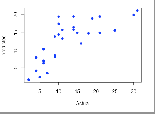
Scatter plots of Actual vs Predicted are one of the richest form of data visualization. You can tell pretty much everything from it. Ideally, all your points should be close to a regressed diagonal line. So, if the Actual is 5, your predicted should be reasonably close to 5 to. If the Actual is 30, your predicted should also be reasonably close to 30. So, just draw such a diagonal line within your graph and check out where the points lie. If your model had a high R Square, all the points would be close to this diagonal line. The lower the R Square, the weaker the Goodness of fit of your model, the more foggy or dispersed your points are (away from this diagonal line).
You will see that your model seems to have three subsections of performance. The first one is where Actuals have values between 0 and 10. Within this zone, your model does not seem too bad. The second one is when Actuals are between 10 and 20, within this zone your model is essentially random. There is virtually no relationship between your model's predicted values and Actuals. The third zone is for Actuals >20. Within this zone, your model steadily greatly underestimates the Actual values.
From this scatter plot, you can tell other issues related to your model. The residuals are heteroskedastic. This means the variance of the error is not constant across various levels of your dependent variable. As a result, the standard errors of your regression coefficients are unreliable and may be understated. In turn, this means that the statistical significance of your independent variables may be overstated. In other words, they may not be statistically significant. Because of the heteroskedastic issue, you actually can't tell.
Although you can't be sure from this scatter plot, it appears likely that your residuals are autocorrelated. If your dependent variable is a time series that grows over time, they definitely are. You can see that between 10 and 20 the vast majority of your residuals are positive. And, >20 they are all negative.
If your independent variable is indeed a time series that grows over time it has a Unit Root issue, meaning it is trending ever upward and is nonstationary. You have to transform it to build a robust model.
For perfect prediction, you would have Predicted=Actual, or $x=y$, so when you draw that line through this graph you see how much the prediction deviated from actual value (the prediction error).
In the graph, the prediction was mostly overestimating the actual outcome $(y>x)$.
In the linear regression, you want the predicted values to be close to the actual values. So to have a good fit, that plot should resemble a straight line at 45 degrees. However, here the predicted values are larger than the actual values over the range of 10-20. This means that you are over-estimating. Therefore, the model does not seem to provide an adequate fit and should be revised.