I have a set of 'activity' values for some enzyme assays I have been doing, that come out of some analysis I've been doing. The problem is, the data is fairly crap, and there aren't many points, but its for project for my MSc so I'm stuck with it. I appreciate that trying to regress 4 datapoints, and especially extrapolate from them is a statistical no-no, but it's what the PhD student who I'm emulating did (albeit with the help of our Uni's Biostats department - a resource I can't really utilise at this point) - and so I would like the results to be directly comparable.
DPConc DPActivity
0      100.000000
83     67.709971
166    6.296231
416    16.546593
I need to extrapolate from this an IC50 value, which is the concentration (x axis) value, for which 50% Activity is seen.
I want (have) to do this by fitting some kind of curve/spline to the points, but I'm at a bit of a loss. The best I've come up with so far is this:
require(splines)
library(splines)

plot(DPConc, DPActivity)
splineDP <- smooth.spline(DPConc, DPActivity, spar=0.45)
lines(splineDP)
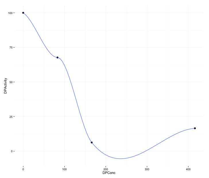
Which for various values of spar gives me this graph (excuse its roughness - I'm really at the end of my tether!)
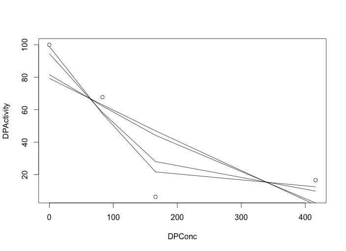
It looks as though some kind of exponential decay is going on, but I'm not enough of a mathematician to be able to concoct the required function. I'd rather derive the function from the data, than make the data fit the function if possible (not least because I have other data that doesn't follow the same trend, though I suspect thats experimental error).
I've tried a couple of different approaches from around the web but my deadline is imminent and I really need the simplest solution. If the solution could be implemented with ggplot, that would be a bonus as my other plots so far have been made with it, the above was just a quick mockup.

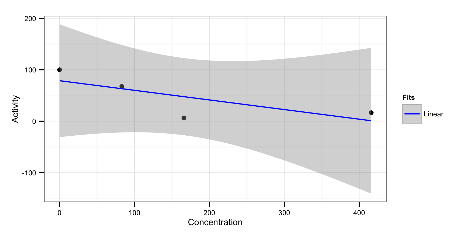
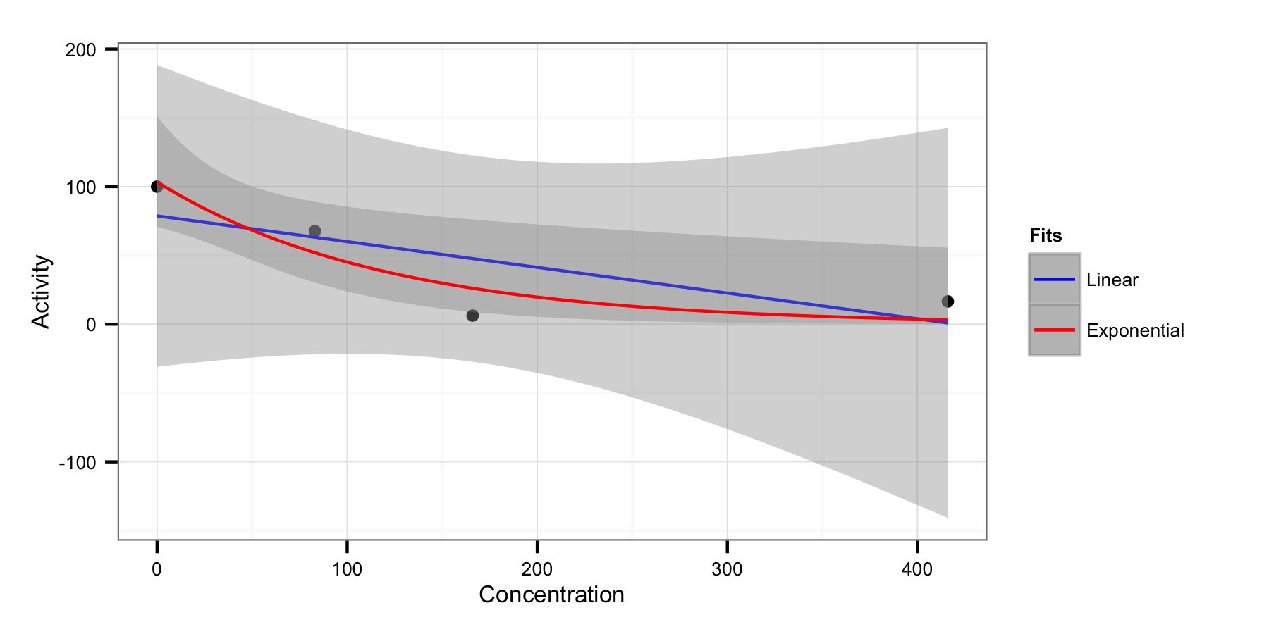
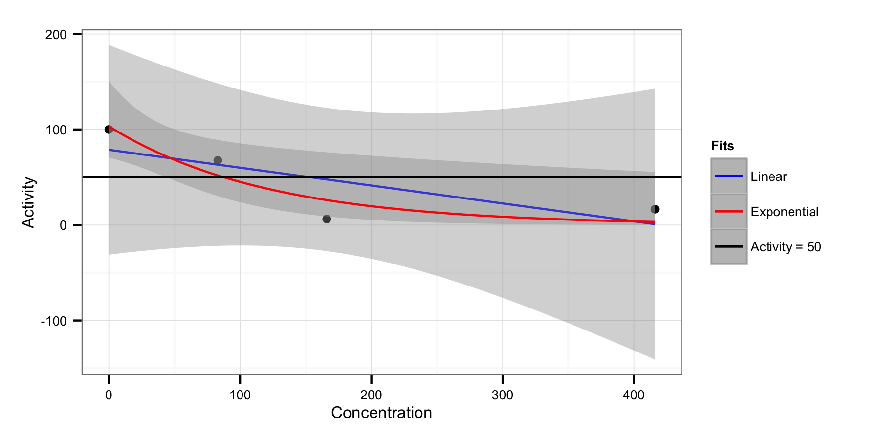
ggplot? $\endgroup$