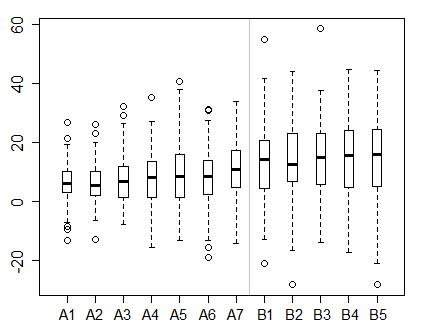
Since you say you follow the barplot, I'll focus on the other two.
Boxplots - what they are and what they show
There are many different definitions of boxplot in current use, though they're all pretty similar. I'll describe Tukey's version of the boxplot in rough terms.
A boxplot grows out of a five-number summary, which consists of the median, the quartiles (Tukey called these the hinges and gave them a particular definition which doesn't influence our interpretation of them) and the extreme values (the minimum and maximum). These 5 numbers split the range of the data up into 4 pieces that have about 1/4 of the points each:

As the name explains, this acts as a summary of the data:

However, it's hard to visually distinguish each one. To emphasize the central portion, we can mark it out with a box. Tukey called the horizontal lines either side of the central box "whiskers".

Some trivial details aside this is presently essentially the range plot (or "range bar") given by Spear in 1952:

(though there are several earlier antecedents which are also boxplot-like displays).
Tukey modifies this "five-number summary" version of the boxplot a little - he draws the whiskers only out to the most extreme points inside 1.5 x the width of the box above and below the box-ends, leaving the points outside them marked individually (in fact he distinguishes those into two groups, but let's not worry about that right now).
For our data there are no points outside those limits, so we get the previous display, which is essentially that five number summary:

This summary tells us a little about the distribution of the data - its center, spread and range. It's possible to discern something of how skewed and heavy tailed the data may be as well, but details like multimodality are completely lost.
We can see a variety of things, for example -- the median is around 9.5, that half the data lie between about 8.5 and 13, the data are mildly right skew, and that the data range from just above 6 to somewhat over 18.
When looking at a single sample, there's no need to summarize the data down to only a few numbers; it's more informative to keep the whole set of values.
However, when you're trying to compare many distributions, the visual summary of center, spread and range can be much more helpful.

ECDF
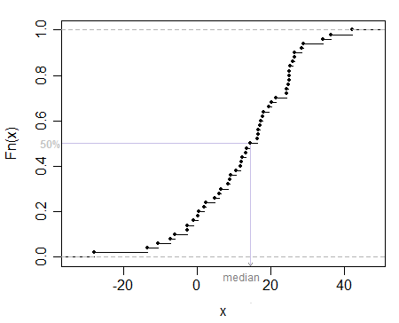
An ECDF, $\hat F(x)$, is a function. It gives the proportion of the sample at or below $x$ for each value of $x$.
So, for example, to compute $\hat{F}(2.3)$ you count how many values are $\leq 2.3$, and divide by the total count of values, $n$. This results in a step function.
It's an estimate of the distribution that the sample was drawn from (if the values are all drawn from the same distribution).
You can find any quantile by reading across from the y-axis and dropping down, and you can find where any x-value lies in terms of what percentage of the data lies at or below it (sometimes called percentile rank) by reversing the operation:

The ECDF is not a summary, it contains all the information in the original sample, displayed in a particular way. It's useful for looking at a single sample, or maybe for comparing a couple of samples, but if you have more than a few ECDFs it can become hard to compare them.
Usage summary
A barplot is for comparing counts in nominal or ordinal categories.
A boxplot is mostly for summarizing a distribution down to a few numbers, which may help when comparing data from many groups.
An ECDF is a complete description of a sample in the form of a function, in such a way as to indicate the proportion of values up to each point.


