3
$\begingroup$

The Question

Parking at a university has become a problem. University administrators are interested in determining the average time it takes students to find a parking spot. An administrator inconspicuously followed $n$ students and recorded how long it took student each of them to find a parking spot. Which of the following graphs should not be used to display information concerning the students parking times?

  1. Histogram.
  2. Stem and leaf display.
  3. Pie chart.
  4. Box plot.

My Thoughts

This question strikes me as inherently incorrect. The data will be numeric and can be categorized or grouped into intervals, so we could create either a bar chart or a pie graph. Of course we could also create a histogram or stem and leaf display.

If I had to choose one answer to throw out, I would guess pie chart is the answer to throw out. A pie chart is the least useful for comparing data and in general has a low information density. However, any one of these types of charts or diagrams would give us a usable visual representation of the data.

The Context

This is from an introductory undergraduate statistics course. It's an online only course. I'm actually a tutor and I have access to 200 pages of PDF's from the student. Unfortunately, posting that quantity is a challenge plus would likely violate copyright.

$\endgroup$
7
  • $\begingroup$ Feel free to add any appropriate tags. I didn't see any others for charts, displays, visual representations, introductory stats, etc. Also, I'll be mostly unavailable until Monday June 10, but will be free respond to comments and answers then. $\endgroup$
    – nickalh
    Commented Jun 7 at 1:19
  • 2
    $\begingroup$ What would a pie chart show and how well would it show it? How would it be usable? $\endgroup$
    – whuber
    Commented Jun 7 at 1:57
  • $\begingroup$ I think resolution of 1 minute is a reasonable assumption. $\endgroup$
    – nickalh
    Commented Jun 9 at 17:19
  • $\begingroup$ A couple of thoughts, I was thinking of a simple, shorter answer, but this is excellent. I'll likely give it a week and possibly accept Shawn's answer unless there's a better answer by then. $\endgroup$
    – nickalh
    Commented Jun 10 at 6:30
  • $\begingroup$ I finally have some more time to read the answers more thoroughly. At the level of introductory first semester stats, stem and leaf plots, often use the tens digit, and if relevant, the 100's digit, on the left column and use the ones digit on the right column. Indeed, having entirely 0's on one side of a stem and leaf plot seems a bit of a waste. $\endgroup$
    – nickalh
    Commented Jun 10 at 20:50

2 Answers 2

4
$\begingroup$

I suppose each of these could be used in different ways, with one of them being potentially the worst:

Histogram

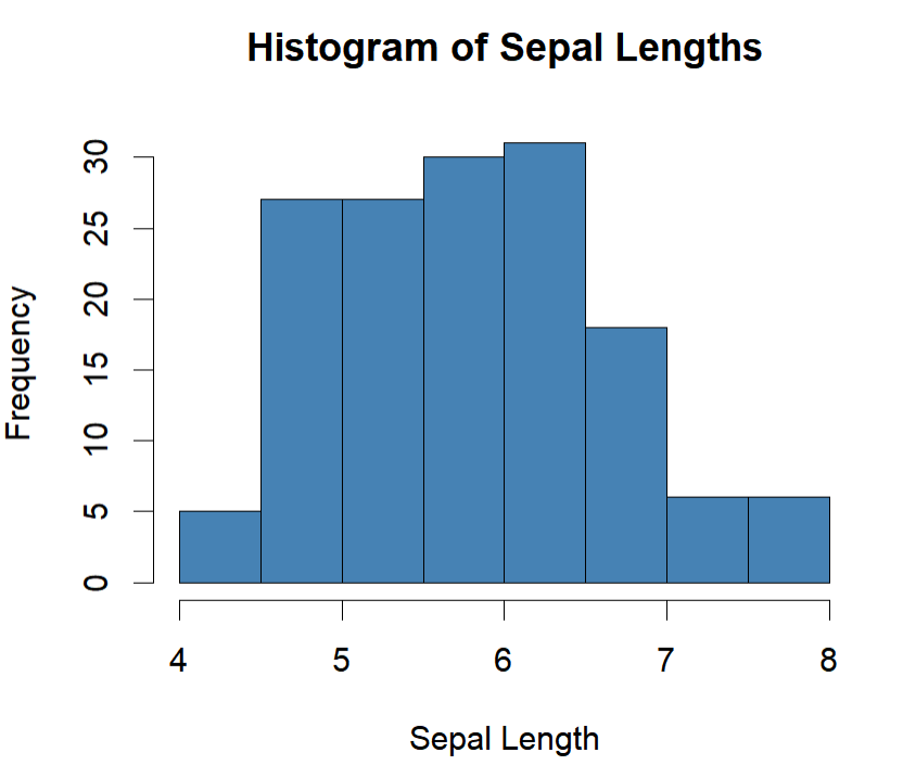
The histogram would be useful if we were just interested in the average amount of time it took for students to find a spot. There are some weaknesses with the histogram (it can sometimes hide irregularities of the data based on how the data is binned), but I wouldn't call it wrong for this purpose and is commonly used this way, such as the histogram of sepal lengths from flowers below:

enter image description here

Stem and Leaf

Stem and leaf plot in some way does something very similar, the only difference is that you can see the exact distribution of values rather than just the binned values, so in this way the information it would give you would be more fine-tuned, like below:

  42 | 0
  44 | 0000
  46 | 000000
  48 | 00000000000
  50 | 0000000000000000000
  52 | 00000
  54 | 0000000000000
  56 | 00000000000000
  58 | 0000000000
  60 | 000000000000
  62 | 0000000000000
  64 | 000000000000
  66 | 0000000000
  68 | 0000000
  70 | 00
  72 | 0000
  74 | 0
  76 | 00000
  78 | 0

Pie Chart

I pretty much loathe the pie chart, but even if we were to say it would work here, I would still say this option is probably the worst given it is used to categorize the values. If we were perhaps interested in each student's average time (say for example each student parks 10 times, so we technically have ten values nested in each student), then this may be used. However, if we are just interested in the average park times, this wouldn't be a chart we could use. So my vote would probably be this one being the worst of the group.

Box Plot

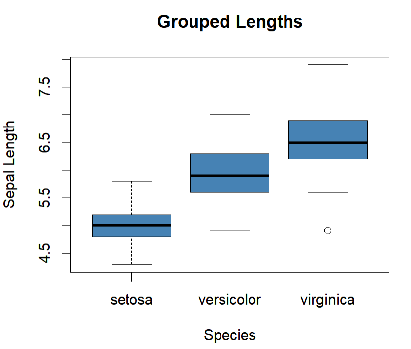
A box plot could be used for similar purposes (by-student times) if it was grouped, such as the flower groupings here:

enter image description here

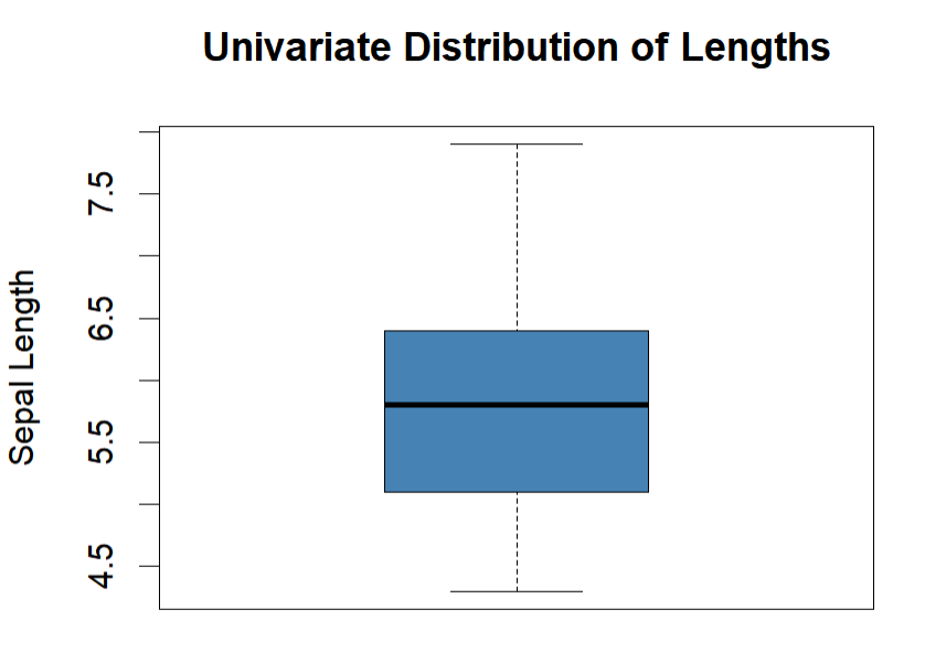
But it could also just be used to represent the univariate distribution of times as well, like below (which shows the shared values between all groups):

enter image description here

$\endgroup$
0
$\begingroup$

Well, I would argue that this is not a very well formulated question.
First, it depends in a way on the resolution of the measurements; are they down to the minute, the seconds, or a $\frac {1} {12}$ th of an hour (5 minutes)? E.g if the measurements were down to some fraction of a minute, this would be meaningless (empty resolution), and the leaves of a stem and leaf plot would not carry any usable information. But let's leave this aside for now, and say that the measurements have have a resolution of a minute.
A histogram is prefectly fine; you can use a bin size equal to your resolution (1 minute), or 2, or 3, or ... And you can change it A pie chart will give you exactly the same answer as a histogram; you can chose the size of the pie slices, down to the resolution of your measurements, or any multiple of it. Yes, a pie chart may be a bit harder to understand compared to a histogram (the pie format is a bit artificial), but... The stem and leaf plot becomes somehow tricky in practice; if the data resolution is minutes, then all your leafs are 0's. So it is no more/no less than a histogram with a bin size of 1. A histogram is clearly better, as we can change the bin size. Yes, you could re-scale your data to be, e.g. in 3 minutes increments (so your leaves would be 0, 1, or 2 3rd's of a minute), but that is kind of messy, and has really no advantage over the histogram.
In you question you mentioned a bar chart; that again would be just like a histogram (the bars may, or not, have gaps in between, but otherwise it shows the same information the same way; and the width of the bars can be adjusted, just like a histogram).
That leaves the box plot; the box plot only shows you the quartiles (and maybe some "outliers"), and the median. But it really hides the shape of the distribution; uni-modal or not? Skewed or symmetrical? Much harder to tell...
So I could argue that the boxplot is the odd man out (while the other 3 basically tell you the exact same thing, with a preference for the histogram). In the interest of full disclosure, I generally do not like boxplots. Histograms, violin plots, interval plots, etc...; all good. Boxplots, not so much...
Having said this, to argue that 1 of the 4 should not be used feels wrong; while 3 of them are almost interchangeable, all 4 describe the data properly; none of them are misleading, so saying that one "should not use one of them" feels unfounded.

$\endgroup$
2
  • $\begingroup$ I think your case against histograms is weak. Yes, bar graphs and histograms are similar, but I prefer them to bar graphs. Typically, histograms have finer categorization and of course make it easier to compare to other data, like for example a 2nd study with a different sample size. $\endgroup$
    – nickalh
    Commented Jun 10 at 6:35
  • $\begingroup$ Indeed, my point was that a histogram is probably the best one ("histogram is perfectly fine", "histogram is clearly better", "stem and leaf ... has really no advantage over the histogram"). What gave you the idea that I wasmaking a case against histograms? In fact, my case was against box-plots. $\endgroup$
    – jginestet
    Commented Jun 10 at 7:11

Your Answer

By clicking “Post Your Answer”, you agree to our terms of service and acknowledge you have read our privacy policy.

Not the answer you're looking for? Browse other questions tagged or ask your own question.