6
$\begingroup$

I have data on results of surgical operations:

  • date of operation (in YYYY-MM-DD format)
  • result of operation (0 for successful operation, 1 for unsuccessful operation)

Date is usually used only for case ordering. I need to

  • plot a learning curve. (I had found that the resulting curve called cumulative average.) x should be the number of cases y - probability of failure (usually decreases).
  • get the data on current performance quality

The question is:

  • What is the way to achieve this in R (with ggplot2 if possible)?

  • Is $\dfrac{successful}{total}*100\%$ will be sufficient statistic for this case or something more advanced is usually required?

$\endgroup$
0

3 Answers 3

5
$\begingroup$

If your dates are in string or factor form, convert them to Dates with as.Date(DateVariable, format="%Y-%m-%d") (potentially with an as.character around DateVariable if it is a factor.

Sort the data.frame with the date and outcome by surgery date. To get the y variable you describe, the easiest way is to take the cumulative number of outcomes and divide by the number of cases to date (which is just a running sequence from 1 to the number of cases when sorted). In code:

#Make some random data to play with
DF <- data.frame(DateVariable = as.Date(runif(100, 0, 800), origin="2005-01-01"),
    outcome = rbinom(100, 1, 0.1))
#Sort by date
DF <- DF[order(DF$DateVariable),]
DF <- rbind.fill(data.frame(outcome=1),DF)

#Add case numbers (in order, since sorted)
DF$x <- seq(length=nrow(DF))

#Create your definition for y (average to date, which is sum to date divided by number to date)
DF$y <- cumsum(DF$outcome) / DF$x

#Plot it
library(ggplot2)
ggplot(DF, aes(x,y)) + 
geom_point(shape=4) +
geom_point(aes(x,outcome),shape=3) +
stat_smooth(method="loess", se=FALSE, color="darkgreen", size=1) +
scale_y_continuous(name= "Failure rate", limits=c(0, 1)) +
scale_x_continuous(name= "Operations performed")

Result:
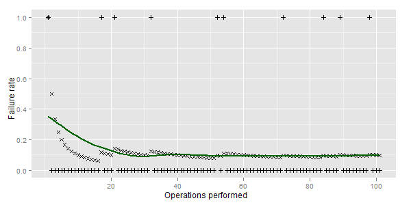
enter image description here

(plus marks success and error cases. X - cumulative sum, line - loess curve)

I don't think, however, this is a good metric. Check out some work on CUSUM curves and risk adjusted CUSUM curves. CUSUM is just plotting number of (negative) outcomes versus case number; risk adjusted CUSUM assumes you can determine a probability of negative outcome (based on pre-operative variables) and use that to determine if performance is exceeding or lagging expectations.

$\endgroup$
3
  • $\begingroup$ Thank you, @Brian. That is exactly the thing I need. I only will further extend it myself (will add points add smoothed line(loess) ) and add this to your answer with resulting plot, if you don`t mind. $\endgroup$ Commented Aug 18, 2011 at 20:20
  • $\begingroup$ Found out that the correct plot is drawn only if the first case was failure. Is it possible to assume that at the start the surgeon experience is imperfect? $\endgroup$ Commented Aug 18, 2011 at 21:18
  • $\begingroup$ @Yuriy, Don't know what makes it incorrect if the first plot is not a failure, but if necessary, you can add DF <- rbind.fill(data.frame(outcome=1),DF) before computing DF$x and DF$y. But then I question the meaning of what you are really plotting. $\endgroup$ Commented Aug 19, 2011 at 5:14
6
$\begingroup$

An informative "learning curve" will indicate the current performance of success. A cumulative average, however, doesn't do that, because it includes old results along with the new. When learning truly improves, the cumulative average will be biased low.

A good solution is to use a Lowess smooth of the response plotted over time. This robust nonparametric smoother is implemented in many R packages: search for the current choices on the RSeek page.

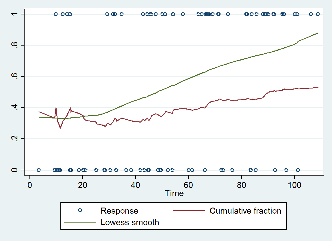
As an example, here is a scatterplot of simulated data, their cumulative average, and a Lowess smooth of the data:

Cumulative average

The green (upper) curve is the Lowess smooth. (This coding uses 1 for success, 0 for failure, so that an improving curve slopes upward.) The two curves differ substantially: the cumulative average barely has a positive slope (about 0.0015) and ends up around 0.5 at the most recent time, whereas the Lowess smooth has a slope around .005 (over three times as great) and ends up around 0.85. To get a sense of which is correct, consider the most recent responses, say those after time=80: there are 26 of them averaging 0.77. The Lowess curve is consistent with that level during this period but the cumulative average curve is clearly too low.

(This is a standard exploratory technique to prepare for logistic regression. If, on a logit scale, the Lowess smooth is approximately linear, then logistic regression of the response versus time should work well to model the learning curve. If the smooth is not linear, you could consider logistic regression with cubic splines, allowing for changes in slope over time.)

$\endgroup$
3
$\begingroup$

Use as.POSIXct to convert to dates, which are stored as seconds from the epoch (and are thus easily plotted) but can be easily displayed in human-readable formats. The help file documents how to import from arbitrary character representations.

Use geom_line for plotting. You can use aggregate or by to bin the observations into days or weeks or whatever. I think ggplot2 has some native functionality for this as well.

I don't know much about learning curves, but I suspect that describing your overall goal more, rather than just the math, would help other people suggest whether the $\frac{successful}{total}$ statistic would tell you what you want to know.

$\endgroup$

Your Answer

By clicking “Post Your Answer”, you agree to our terms of service and acknowledge you have read our privacy policy.

Not the answer you're looking for? Browse other questions tagged or ask your own question.