No doubt you have been told otherwise, but mean $=$ median does not imply symmetry.
There's a measure of skewness based on mean minus median (the second Pearson skewness), but it can be 0 when the distribution is not symmetric (like any of the common skewness measures).
Similarly, the relationship between mean and median doesn't necessarily imply a similar relationship between the midhinge ($(Q_1+Q_3)/2$) and median. They can suggest opposite skewness, or one may equal the median while the other doesn't.
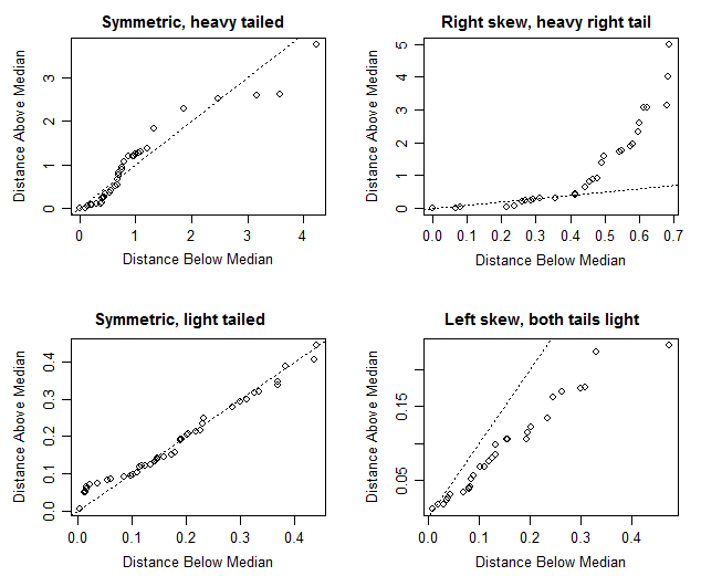
One way to investigate symmetry is via a symmetry plot*.
If $Y_{(1)}, Y_{(2)}, ..., Y_{(n)}$ are the ordered observations from smallest to largest (the order statistics), and $M$ is the median, then a symmetry plot plots $Y_{(n)}-M$ vs $M-Y_{(1)}$, $Y_{(n-1)}-M$ vs $M-Y_{(2)}$ , ... and so on.
* Minitab can do those. Indeed I raise this plot as a possibility because I've seen them done in Minitab.
Here are four examples:
$\hspace{6cm} \textbf{Symmetry plots}$

(The actual distributions were (left to right, top row first) - Laplace, Gamma(shape=0.8), beta(2,2) and beta(5,2). The code is Ross Ihaka's, from here)
With heavy-tailed symmetric examples, it's often the case that the most extreme points can be very far from the line; you would pay less attention to the distance from the line of one or two points as you near the top right of the figure.
There are of course, other plots (I mentioned the symmetry plot not from a particular sense of advocacy of that particular one, but because I knew it was already implemented in Minitab). So let's explore some others.
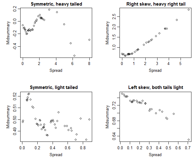
Here's the corresponding skewplots that Nick Cox suggested in comments:
$\hspace{6cm} \textbf{Skewness plots}$

In these plots, a trend up would indicate a typically heavier right tail than left and a trend down would indicate a typically heavier left tail than right, while symmetry would be suggested by a relatively flat (though perhaps fairly noisy) plot.
Nick suggests that this plot is better (specifically "more direct"). I am inclined to agree; the interpretation of the plot seems consequently a little easier, though the information in the corresponding plots are often quite similar (after you subtract the unit slope in the first set, you get something very like the second set).
[Of course, none of these things will tell us that the distribution the data were drawn from is actually symmetric; we get an indication of how near-to-symmetric the sample is, and so to that extent we can judge if the data are reasonably consistent with being drawn from a near-symmetrical population.]


