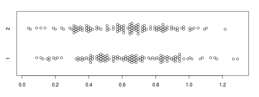
I have a question or two in regard to getting the most out of the statistics of my data. By way of background, my qualitative observations of two distinct populations that are uniformly regarded to be unrelated led me to believe that they are closely related (by way of formation process). I began looking for a metric to test this assertion quantitatively and found one in the ratio between two measured parameters, a ratio that scales with size of the structures under study. Tabulating these ratios for 119 samples in each of the two populations (a and b), I derived means $x_a = 0.64092437$ and $x_b = 0.615966387$, standard deviations $\sigma_a = 0.067220754$ and $\sigma_b = 0.062833103$ and a $t$-test p value of 0.003401814.
In my extremely limited familiarity with statistical analysis, these look like very promising numbers viz. degree of variance and acceptance of my Null Hypothesis (that two populations that are considered to be unrelated are actually closely related) at > 99% CI..
So, my questions are i) do I have this right (given that my numbers are the output of the Excel 'black box') and ii) if so, is there any way to graphically chart these data (raw, mean, or stats) to highlight this closeness visually? Excel provides little of use that I have found, and it seems that a y-axis graph of three-standard deviations to show the entire possible variation would show how tight the data are, but produce a graph with what looks like a single vertical line on it.
How would a statistical adept tackle making the most of his/her data in this respect?

