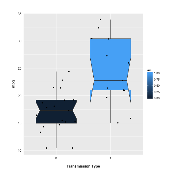
While doing some EDA I decided to use a box plot to illustrate the difference between two levels of a factor.
The way ggplot rendered the box plot was satisfactory, but slightly simplistic (first plot below). Whilst researching the characteristics of box plots I started experimenting with notches.
I understand notches display the CI around the median, and that if two boxes' notches don't overlap there's ‘strong evidence’ – at a 95% confidence level – that the medians differ.
In my case (second plot), the notches don't meaningfully overlap. But why does the bottom of the box on the right hand side take that strange form?
Plotting the same data in a violin plot didn't indicate anything unusual about the probability density of the corresponding violin.


ggplot2. I like the idea of plotting the individual data points too but it's frustrated in so far as points within the dark box are made invisible. $\endgroup$