2
$\begingroup$

Intuitively given the definition of pearson correlation coefficient, I thought at first that partitioning the full range to the data between the 20 and 40 percentile (closer to the median/mean for gaussian distributions) would yield a higher pearson correlation coefficient. Actually, is the other way round.

Why is this?

See the following example:

import numpy as np
from scipy.stats import pearsonr    

mu_x=3
sigma_x=0.01
x = np.random.normal(mu_x, sigma_x, 100000)

mu_y= 0 
sigma_y = 0.1
y = 3*x + 0.2*np.random.normal(mu_y, sigma_y, 100000)

pearsonr(x,y)
(0.83099291398880859, 0.0)

x2=x[ np.where( (x >= np.percentile(x,40)) & (x <= np.percentile(x,60)))]
y2=y[ np.where( (y >= np.percentile(y,40)) & (y <= np.percentile(y,60)))]

pearsonr(x2,y2)

(-0.0029887929213811139, 0.67254795967257908)

Added this following @NickCox suggestion:

for p in range(0,50):
 x2=x[ np.where( (x >= np.percentile(x,p)) & (x <= np.percentile(x,100-p)))]
 y2=y[ np.where( (y >= np.percentile(y,p)) & (y <= np.percentile(y,100-p)))]
 print p,100-p,pearsonr(x2,y2)

 0 100 (0.83235076737608205, 0.0)
 1 99 (0.022661699597148071, 1.2930035229909938e-12)
 2 98 (0.0080658659891794712, 0.01245002894257673)
 .
 .
 .
 continue oscillating around zero.
$\endgroup$
7
  • 1
    $\begingroup$ Plot what you did to get intuition here. $\endgroup$
    – Nick Cox
    Commented Feb 26, 2016 at 19:28
  • $\begingroup$ Hi @NickCox I will. Anyway I suspect that you think that it is totally ok with your expectations these results. If so, why? $\endgroup$ Commented Feb 26, 2016 at 19:43
  • $\begingroup$ Why not reduce the scatter to the two medians? What happens to the correlation as you approach that limit? $\endgroup$
    – Nick Cox
    Commented Feb 26, 2016 at 19:46
  • $\begingroup$ Hey @NickCox I follow your sugesstion to see the behavior when approaching the medians limit and now I´m more confused :/. The drop in the coefficient happens at the first iteration, droping values outside [1,99] percentile! Any help is appreciated here :) $\endgroup$ Commented Feb 26, 2016 at 20:10
  • 1
    $\begingroup$ For an illustrated example of this phenomenon, please see stats.stackexchange.com/questions/13314/…. $\endgroup$
    – whuber
    Commented Feb 26, 2016 at 22:14

2 Answers 2

4
$\begingroup$

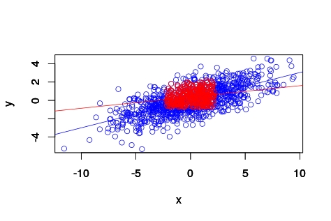
If you truly have a linear association, Pearson's correlation will get smaller when you subset to smaller ranges. This is a classic way to attenuate the estimated slope of a line and a pitfall to watch out for when thinking about subgroup analyses.

# Pearson's correlation attentuated with subsampling
# example in R
set.seed(1)
library(MASS)
Sigma <- matrix(c(10,3,3,2),2,2)
Sigma
d <- mvrnorm(n = 1000, rep(0, 2), Sigma)
colnames(d)<-c('x','y')
dim(d)
head(d)
plot(d)
cor.test(d[,1],d[,2]) # r = 0.67

# just trimming on X starkly reduces the observed correlation
xTrimmed <- (d[,1] > quantile(d[,1],0.25) & d[,1] < quantile(d[,1],0.75))
dTrimX <- d[xTrimmed,] 
dim(dTrimX)
plot(dTrimX)
cor.test(dTrimX[,1],dTrimX[,2]) # r = 0.29

# further trimming on Y does more so
xyTrimmed <- (dTrimX[,2] > quantile(dTrimX[,2],0.25) & dTrimX[,2] < quantile(d[,1],0.75))
dTrimXY <- dTrimX[xyTrimmed,] 
dim(dTrimXY)
plot(dTrimXY)
cor.test(dTrimXY[,1],dTrimXY[,2]) # r = 0.21

# quick plot to illustrate what's happening
plot(d, xlim=c(min(d[,1]),max(d[,1])), , ylim=c(min(d[,2]),max(d[,2])), col='blue')
abline( lm(d[,2]~d[,1]), col='blue' )
par(new=T)
plot(dTrimXY, xlim=c(min(d[,1]),max(d[,1])), , ylim=c(min(d[,2]),max(d[,2])), col='red')
abline( lm(dTrimXY[,2]~dTrimXY[,1]), col='red' )

quick plot to illustrate what's happening

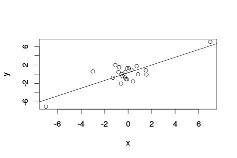
However, here is a case where the trimming reveals a lack of association for all other points.

# generate data with no correlation
set.seed(8)
x <- rnorm(20)
y <- rnorm(20)
cor.test(x,y) # r = 0.003
# add two outliers
x[21] <- y[21] <- -7
x[22] <- y[22] <- 7
plot(x,y)
abline(lm(y~x))
cor.test(x,y) # r = 0.82

Example of outliers creating a fake association

$\endgroup$
3
  • $\begingroup$ Thank you Robert! I guess this is what is happening. However, the correlation dropping from 0.83 to 0.022 by removing the values lower/higher than 1/99 percentile, is something that you would expect? $\endgroup$ Commented Feb 26, 2016 at 21:21
  • $\begingroup$ I wouldn't expect that extreme of a drop if the association is truly linear. It could happen if there was not a linear association and a few outliers were driving the correlation of 0.83. $\endgroup$ Commented Feb 26, 2016 at 21:32
  • 1
    $\begingroup$ I've updated my answer to show an example where two outliers create the impression of a strong linear association. $\endgroup$ Commented Feb 26, 2016 at 21:41
1
$\begingroup$

I think that there is a bug in the example code of the question.

You can not compare x2 and y2 after

x2=x[ np.where( (x >= np.percentile(x,40)) & (x <= np.percentile(x,60)))]
y2=y[ np.where( (y >= np.percentile(y,40)) & (y <= np.percentile(y,60)))]

since they are no more "sincronized" as x and y were.

np.where return a subset of indices, the two subset for x and y are not guaranteed to be equal (usually they are not equal), then you probably lose the correlation because you do not compare anymore the same array components as before.

$\endgroup$
1
  • $\begingroup$ I agree Pablo, the full discussion is interesting besides the bug. $\endgroup$
    – mox
    Commented Mar 24, 2016 at 8:01

Your Answer

By clicking “Post Your Answer”, you agree to our terms of service and acknowledge you have read our privacy policy.

Not the answer you're looking for? Browse other questions tagged or ask your own question.