7
$\begingroup$

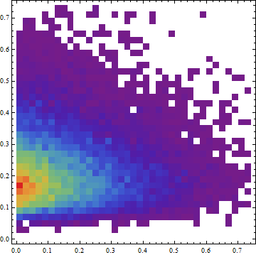
I have observed the following pattern of behavior in my data-set and I'm wondering how I can explore whether I can predict Y using a value of X. This plot is a 2D histogram of values.
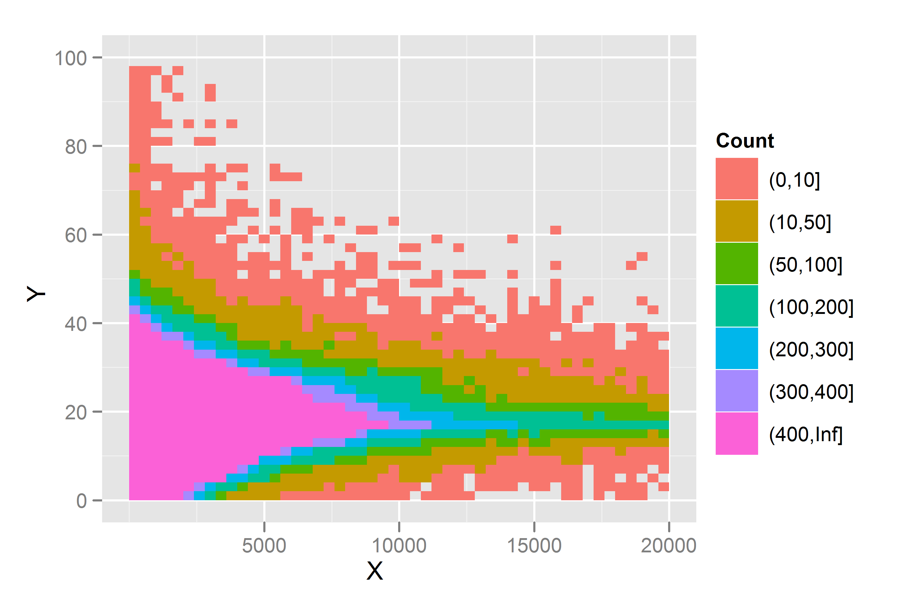
enter image description here

I have previously explored interquartile regression to identify the upper bound, but I'm wondering if there are any other approaches which I can apply which would enable me to identify the range of Y, depending on the X value. I assumed with heteroskedastic data like this that I would need to apply a transformation, but I'm not sure if this is the correct approach.

Could I just fit an interquartile regression to the upper and lower bounds and then provide an estimated value (with an error) for any value of Y that is predicted?

EDIT: Following some suggestions from @whuber and @jbowman I have included some more graphics of the dataset. These are plots of the mean and standard deviation binned by groups of 8 (e.g. 1 - 8, 9 - 16), and a histogram of slices through the data at 4 intervals.
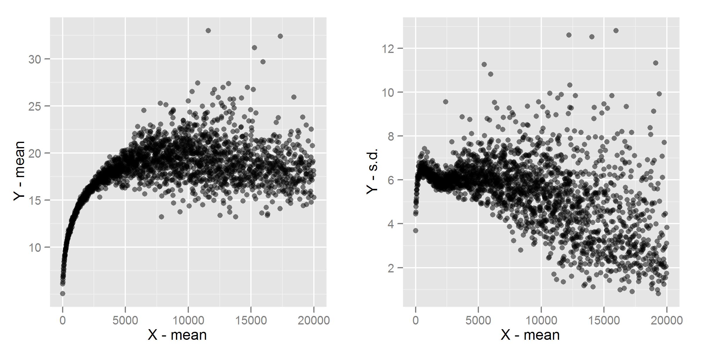
enter image description here

Histograms of slices through the data use a binwidth of 400. For example, for 1000, I included all values of X that are 200 above or below so the slice ranges from 800 - 1200:
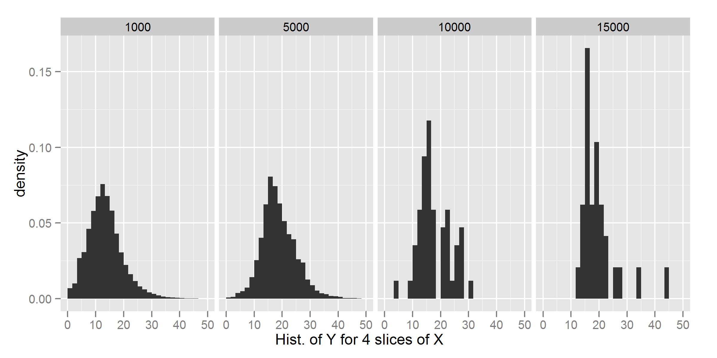
enter image description here

$\endgroup$
7
  • $\begingroup$ It looks like you have a lot more observations with low X than with high X, which in your plot obscures the relationship. You might want to try, for an initial exploration, grouping X, say by 500s, and plotting the mean or median of Y for each X group, and also the standard deviation or a robust version thereof (hubers from the MASS package will give you robust location and scale parameters.) This would give you some idea of what sort of relationship there is embedded in E(y|x) and SD(y|x), both useful when you move on to generalized linear models (glm or gam.) $\endgroup$
    – jbowman
    Commented Jan 10, 2012 at 0:31
  • $\begingroup$ Thanks for the suggestion @jbowman. If I plot the median (or variant) for each grouping can I use that value if I know that the standard deviation varies for each observation? I thought that was violating the heteroskedastic assumption required for a linear model (but I'm not certain if there is a way of dealing with this). $\endgroup$
    – celenius
    Commented Jan 10, 2012 at 1:54
  • 1
    $\begingroup$ For a plot you can do whatever you want, of course. As whuber points out, it's not at all clear that the relationship is heteroskedastic. But even if it is, if there isn't much heteroskedasticity, a linear fit will be quite good, especially with so much data. Otherwise, there are various methods you can use to (largely) correct for heteroskedasticity, e.g., generalized linear models. $\endgroup$
    – jbowman
    Commented Jan 10, 2012 at 4:44
  • $\begingroup$ Good images in that edit. I recommend normalizing the histograms so they can be compared: don't show frequency, show relative frequency. Also, make the slices thicker: 8 per slice leaves a lot of scatter. You can afford slices containing hundreds of values. Doing that will clarify the SD. Indeed, plot the Y SD vs. X mean, not vs. X SD: you're interested in how the Y distribution varies with the location of X; the SD of X is meaningless. Finally, it's looking like you should be using the log of X in these plots rather than X itself. $\endgroup$
    – whuber
    Commented Jan 10, 2012 at 16:49
  • $\begingroup$ I updated the recent plots based on your suggestion, @whuber. I agree with your point about plotting Y.SD agains X.mean; I think I wanted to do that originally and got a little confused. $\endgroup$
    – celenius
    Commented Jan 10, 2012 at 17:17

2 Answers 2

8
$\begingroup$

This is really an illustrated comment.

It's not at all clear that the relationship is heteroscedastic. It may appear so in large part due to the decreasing number of observations with larger $x$. Take this simulation, for example:

2D density plot

This kernel density plot shows 20,000 iid draws from $(X,Y)$ where $X$ has a $B(1,5)$ distribution, $Y$ has a lognormal distribution (geometric mean = $\log(0.2)$, geometric SD = $0.45$), and $X$ and $Y$ are independent. Here are histograms of their marginal densities:

Marginal density plots

The appearance of heteroscedasticity arises solely from the scarcity of $(X,Y)$ values for larger $X$. This appearance is further exaggerated by the skewness of $Y$.

This suggests that to begin with, you take some vertical slices through the data, say near both ends (low $X$ and high $X$) and the middle, and fit distributions to the $Y$ values found within those slices. Is there evidence that these distributions really are different? If so, how do they differ? E.g., do they have similar shapes with varying first and second moments? If their shapes appear significantly different, are they at least approximated by distributions within a three-parameter family (for location, scale, and shape)? This will suggest appropriate follow-on analyses (including, perhaps, some re-expression of the $Y$ values).

$\endgroup$
1
  • $\begingroup$ +1 good catch. From the 2D histogram, my first thought was that it was heteroskedastic. $\endgroup$ Commented Jan 10, 2012 at 3:54
1
$\begingroup$

If you are merely interested in modelling the mean of the above relationship, the solution to address the heteroskedasticity should not be complicated (there is a chance though that I am completely mistaken with what I say here).

OLS estimators are not biased from heteroskedasticity and so you only have to worry about the standard errors, i.e. issues regarding the statistical significance. You can use heteroskedasticity robust standard error estimates. Those are more conservative than the normal ones but with the amount of data you have my guess is that you still have highly significant results.

From the "mean vs mean" plot you provided, I would guess the right specifiation could be a logarithmic model y ~ log(x) or so. You can then estimate this using OLS with robust standard errors.

If you want to model the boundaries etc, things become more complicated and it will depend a lot on what you want to do with it.

$\endgroup$

Your Answer

By clicking “Post Your Answer”, you agree to our terms of service and acknowledge you have read our privacy policy.

Not the answer you're looking for? Browse other questions tagged or ask your own question.