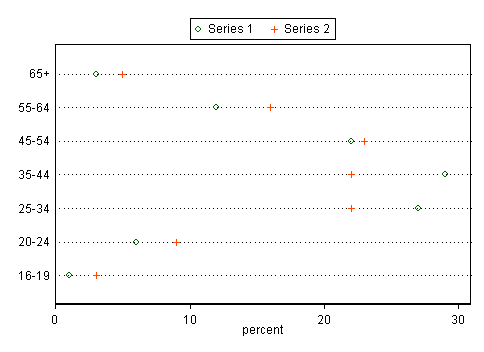
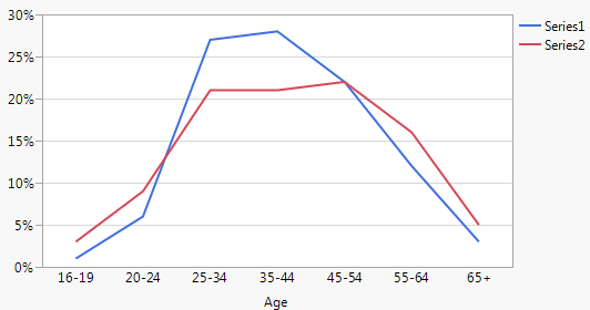
I have a number histogram from a data source. I want to compare their distribution. For example series 2 is more to the right than series 1.
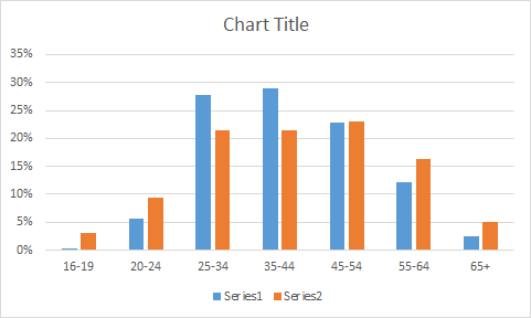
Is there any good way to contrast besides plotting the histogram side by side. I can think of qqplot or box plot. But the data is already binned. Would it make sense if I interpolate the percentile linearly?
EDIT1:
I am exploring the chart in Excel. There not a lot of flexibility for creativity. I hacked Excel to make it in demographic chart style. The good thing is it is a familiar visualization to many people.
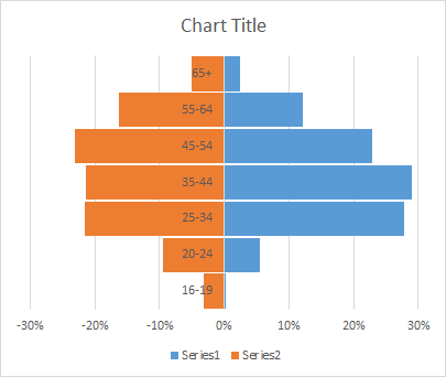
EDIT2:
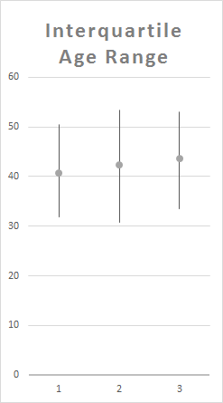
I interpolate the data to get 25 and 75 percentile to make this interquartile, not quite boxplot, chart. It loses a lot of details. But it may be useful for comparing a lot of series.
EDIT3:
Sorry for not posting the raw data initially. The stuff is disorganized while I'm experimenting.
16-19,0.0028826,0.031066407
20-24,0.05581761,0.094111701
25-34,0.278301887,0.215492493
35-44,0.289046122,0.214615109
45-54,0.228773585,0.230744934
55-64,0.120807128,0.163116187
65+,0.024633124,0.050853168

