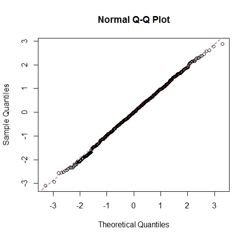
Why is the QQ Plot for Normal Distribution a Straight Line?
The values on the y-axis are the sorted data values (the order statistics).
The values on the x-axis are what you'd expect sorted data (at the same sample size) from a standard normal distribution to give. That is, the smallest data value is paired with what you expect the smallest data value from a standard normal distribution of the same sample size to be, the second smallest data value is paired with the expected second-smallest data value from a standard normal distribution, and so on up to the largest value.
Since any normal distribution is a scaled and shifted standard normal distribution, and scaling and shifting just change the axes, not the appearance of the plot, samples drawn from any normal distribution should yield a plot where the values are close to a straight line (if the values are really from a normal distribution, the plot can wiggle away from a straight line but it won't deviate in a consistent fashion from a straight line).
Also, according to the accepted answer here: Percentile vs quantile vs quartile quantiles are in the range [0,1], but QQ plots shows quantiles that are clearly outside the [0, 1] range.
The answers there are worded in a way that it might mislead you. The quantile function takes values between 0 and 1 as its argument, and produces values on the range taken by the original random variable or sample (depending on whether it's population or sample quantiles under discussion).
So with a standard normal distribution (which can take values between $-\infty$ and $\infty$), $q(\frac12)$ is the median ($0$), $q(0.025)$ is the 2.5 percentile ($-1.96$) and so on ... $q=F^{-1}(p)$ for $0< p< 1$ (equality can occur for distributions that are not on an infinite range). For a sample quantile, there are various definitions possible (the package R offers nine different ones) but they all attempt to choose values so as to give approximately the right proportion of data below them.

