16
$\begingroup$

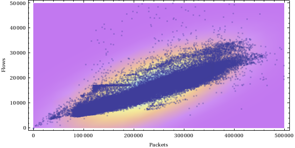
I have data which looks like:

Figure

I tried to apply normal distribution (kernel density estimation works better, but I don't need such great precision) on it and it works quite well. Density plot makes a ellipse.

I need to get that ellipse function to decide if a point lies within the ellipse's region or not. How to do that?

R or Mathematica code are welcomed.

$\endgroup$
0

5 Answers 5

20
$\begingroup$

Corsario provides a good solution in a comment: use the kernel density function to test for inclusion within a level set.

Another interpretation of the question is that it requests a procedure to test for inclusion within the ellipses created by a bivariate normal approximation to the data. To get started, let's generate some data that look like the illustration in the question:

library(mvtnorm) # References rmvnorm()
set.seed(17)
p <- rmvnorm(1000, c(250000, 20000), matrix(c(100000^2, 22000^2, 22000^2, 6000^2),2,2))

The ellipses are determined by the first and second moments of the data:

center <- apply(p, 2, mean)
sigma <- cov(p)

The formula requires inversion of the variance-covariance matrix:

sigma.inv = solve(sigma, matrix(c(1,0,0,1),2,2))

The ellipse "height" function is the negative of the logarithm of the bivariate normal density:

ellipse <- function(s,t) {u<-c(s,t)-center; u %*% sigma.inv %*% u / 2}

(I have ignored an additive constant equal to $\log(2\pi\sqrt{\det(\Sigma)})$.)

To test this, let's draw some of its contours. That requires generating a grid of points in the x and y directions:

n <- 50
x <- (0:(n-1)) * (500000/(n-1))
y <- (0:(n-1)) * (50000/(n-1))

Compute the height function at this grid and plot it:

z <- mapply(ellipse, as.vector(rep(x,n)), as.vector(outer(rep(0,n), y, `+`)))
plot(p, pch=20, xlim=c(0,500000), ylim=c(0,50000), xlab="Packets", ylab="Flows")
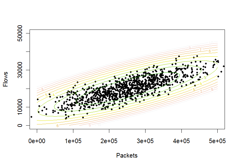
contour(x,y,matrix(z,n,n), levels=(0:10), col = terrain.colors(11), add=TRUE)

Contour plot

Evidently it works. Therefore, the test to determine whether a point $(s,t)$ lies inside an elliptical contour at level $c$ is

ellipse(s,t) <= c

Mathematica does the job in the same way: compute the variance-covariance matrix of the data, invert that, construct the ellipse function, and you're all set.

$\endgroup$
5
  • $\begingroup$ Thank you all, especially @whuber. This is exactly what I need. $\endgroup$
    – matejuh
    Commented Mar 9, 2012 at 18:41
  • $\begingroup$ Btw. is there any simple solution for kernel density estimation contours? Because if I want to be more strict, my data looks like:github.com/matejuh/doschecker_wiki_images/raw/master/… resp. github.com/matejuh/doschecker_wiki_images/raw/master/… $\endgroup$
    – matejuh
    Commented Mar 9, 2012 at 18:50
  • $\begingroup$ I cannot find a simple solution in R. Consider using Mathematica 8's "SmoothKernelDistribution" function. $\endgroup$
    – whuber
    Commented Mar 9, 2012 at 19:03
  • 2
    $\begingroup$ Does the levels coresponds to confidence level? I dont think so. How can I do that please? $\endgroup$
    – matejuh
    Commented Mar 13, 2012 at 12:29
  • $\begingroup$ That needs a new question, because you need to specify what you seek the confidence of and--judging from your plots--there are concerns about whether such ellipses are adequate descriptions of the data in the first place. $\endgroup$
    – whuber
    Commented Mar 13, 2012 at 14:35
15
$\begingroup$

The plot is straightforward with the ellipse() function of the mixtools package for R:

library(mixtools)
library(mvtnorm) 
set.seed(17)
p <- rmvnorm(1000, c(250000, 20000), matrix(c(100000^2, 22000^2, 22000^2, 6000^2),2,2))
plot(p, pch=20, xlim=c(0,500000), ylim=c(0,50000), xlab="Packets", ylab="Flows")
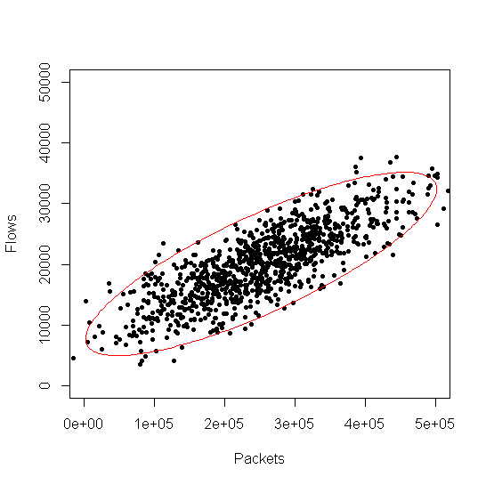
ellipse(mu=colMeans(p), sigma=cov(p), alpha = .05, npoints = 250, col="red") 

enter image description here

$\endgroup$
6
$\begingroup$

First approach

You might try this approach in Mathematica.

Let's generate some bivariate data:

data = Table[RandomVariate[BinormalDistribution[{50, 50}, {5, 10}, .8]], {1000}];

Then we need to load this package:

Needs["MultivariateStatistics`"]

And, now:

ellPar=EllipsoidQuantile[data, {0.9}]

gives an output that defines a 90% confidence ellipse. The values you obtain from this output are in the following format:

{Ellipsoid[{x1, x2}, {r1, r2}, {{d1, d2}, {d3, d4}}]}

x1 and x2 specify the point at which the ellipse in centered, r1 and r2 specify the semi-axis radii, and d1, d2, d3 and d4 specify the alignment direction.

You can also plot this:

Show[{ListPlot[data, PlotRange -> {{0, 100}, {0, 100}}, AspectRatio -> 1],  Graphics[EllipsoidQuantile[data, 0.9]]}]

The general parametric form of the ellipse is:

ell[t_, xc_, yc_, a_, b_, angle_] := {xc + a Cos[t] Cos[angle] - b Sin[t] Sin[angle],
    yc + a Cos[t] Sin[angle] + b Sin[t] Cos[angle]}

And you can plot it in this way:

ParametricPlot[
    ell[t, ellPar[[1, 1, 1]], ellPar[[1, 1, 2]], ellPar[[1, 2, 1]], ellPar[[1, 2, 2]],
    ArcTan[ellPar[[1, 3, 1, 2]]/ellPar[[1, 3, 1, 1]]]], {t, 0, 2 \[Pi]},
    PlotRange -> {{0, 100}, {0, 100}}]

You could perform a check based on pure geometric information: if the Euclidean distance between the center of the ellipse (ellPar[[1,1]]) and your data point is larger than the distance between the center of the ellipse and the border of the ellipse (obviously, in the same direction in which your point is located), then that data point is outside the ellipse.

Second approach

This approach is based on the smooth kernel distribution.

These are some data distributed in a similar way to your data:

data1 = RandomVariate[BinormalDistribution[{.3, .7}, {.2, .3}, .8], 500];
data2 = RandomVariate[BinormalDistribution[{.6, .3}, {.4, .15}, .8], 500];
data = Partition[Flatten[Join[{data1, data2}]], 2];

We obtain a smooth kernel distribution on these data values:

skd = SmoothKernelDistribution[data];

We obtain a numeric result for each data point:

eval = Table[{data[[i]], PDF[skd, data[[i]]]}, {i, Length[data]}];

We fix a threshold and we select all the data that are higher than this threshold:

threshold = 1.2;
dataIn = Select[eval, #1[[2]] > threshold &][[All, 1]];

Here we get the data that fall outside the region:

dataOut = Complement[data, dataIn];

And now we can plot all the data:

Show[ContourPlot[Evaluate@PDF[skd, {x, y}], {x, 0, 1}, {y, 0, 1}, PlotRange -> {{0, 1}, {0, 1}}, PlotPoints -> 50],
ListPlot[dataIn, PlotStyle -> Darker[Green]],
ListPlot[dataOut, PlotStyle -> Red]]

The green colored points are those above the threshold and the red colored points are those below the threshold.
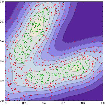
enter image description here

$\endgroup$
2
  • $\begingroup$ Thanks, your second approach helps me a lot with Kernel distribution. I'm programmer, not statistical and I'm newbie in Mathmatica and R so I appreciate your help a lot. In your second approach it's clear for me how to test a one point where it lies. But how to do that in first approach? I suppose that I have to compare my point with ellipsoid definition. Can tou please provide how? Now I have to hope that there are same definitions in R, because I need to use it in RinRuby... $\endgroup$
    – matejuh
    Commented Mar 12, 2012 at 11:41
  • $\begingroup$ @matejuh I just added few more lines about the first approach that might direct you to a solution. $\endgroup$
    – VLC
    Commented Mar 12, 2012 at 16:03
3
$\begingroup$

The ellipse function in the ellipse package for R will generate these ellipses (actually a polygon approximating the ellipse). You could use that ellipse.

What might actually be easier is to compute the height of the density at your point and see if it is higher (inside the ellipse) or lower (outside the ellipse) than the contour value at the ellipse. The ellipse function internals use a $\chi^2$ value to create the ellipse, you could start there for finding the height to use.

$\endgroup$
2
$\begingroup$

I found the answer at: https://stackoverflow.com/questions/2397097/how-can-a-data-ellipse-be-superimposed-on-a-ggplot2-scatterplot

#bootstrap
set.seed(101)
n <- 1000
x <- rnorm(n, mean=2)
y <- 1.5 + 0.4*x + rnorm(n)
df <- data.frame(x=x, y=y, group="A")
x <- rnorm(n, mean=2)
y <- 1.5*x + 0.4 + rnorm(n)
df <- rbind(df, data.frame(x=x, y=y, group="B"))

#calculating ellipses
library(ellipse)
df_ell <- data.frame()
for(g in levels(df$group)){
df_ell <- rbind(df_ell, cbind(as.data.frame(with(df[df$group==g,], ellipse(cor(x, y), 
                                         scale=c(sd(x),sd(y)), 
                                         centre=c(mean(x),mean(y))))),group=g))
}
#drawing
library(ggplot2)
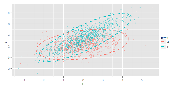
p <- ggplot(data=df, aes(x=x, y=y,colour=group)) + geom_point(size=1.5, alpha=.6) +
  geom_path(data=df_ell, aes(x=x, y=y,colour=group), size=1, linetype=2)

enter image description here

$\endgroup$

Your Answer

By clicking “Post Your Answer”, you agree to our terms of service and acknowledge you have read our privacy policy.

Not the answer you're looking for? Browse other questions tagged or ask your own question.