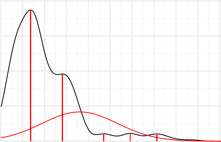
For my dataset I have plotted the density with ggplot. As the data's density is multimodal (a total of 6 destinct modi) I tried to gain insight on the normal distributions associated to each modus.
For this I followed the instructions on JEFworks and adapted the corresponding arguments to my code and get the following plot for the normal distribution for the first modus:
As you can see the normal distribution for the first modus is located between the second and third modus.
In my understanding, as the density graph can be assumed as
$$g(x) = \sum_{i=1}^n f_i(x)$$
with $g(x)$ being my density plot, n being the number of modi of my density distribution as well as $f_i(x)$ being the normal distribution underlying each respective modus.
Therefore shouldn't be the x-position of each normal distributions mean be equal to the respective maximum of my density distribution (and therefore the respective modus?
For another dataset this is nearly true for the first modus, but the graph looks quite "jiggely" around this area:

Is there any possibilty to give flexmix the modus as an input that the model can better know where the mean should be or is my assumption above wrong to begin with?
Edit: I ran my code multiple times, each second time the output is as in the first image, the other times it is comparable to the second image:
Is there any way to check why this happens each second time I run my code?


