Because you asked about histograms, I'm assuming you are interested in comparing the shapes of two distributions to see how similar they are. This is distinct from trying to visualize other aspects of the distributions, such as whether their means differ.
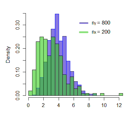
In general, histograms are a blunt tool for assessing the shape of a distribution (see this excellent answer: Assessing approximate distribution of data based on a histogram). Although you would have the same problem with both distributions when trying to compare them, they won't necessarily cancel each other out. Thus, histograms are not really a good choice for this task.
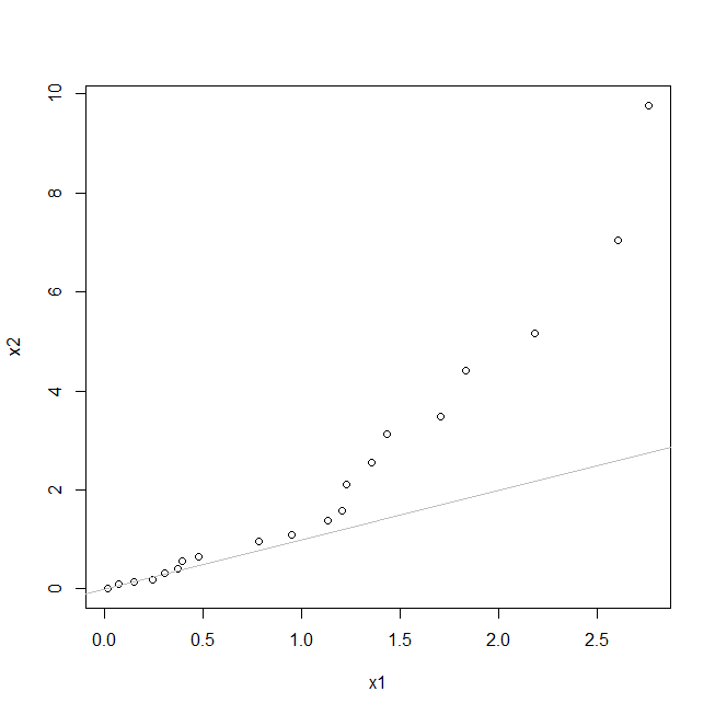
Your best bet is to use a qq-plot. Nowadays, qq-plots are thought of as a means to compare an observed distribution to a theoretical one. However, they were originally developed to compare distributions; the same situation you have here. Interpolation methods are standardly used to match datasets of different sizes, so that is largely a non-issue. If the shapes of the distributions are the same, the points will fall on a straight line.
To explore this suggestion, let's examine some data. Here I simulate data from an exponential distribution and a chi-squared distribution. Both are strongly right-skewed, but their shapes differ. I will code the example using R:
set.seed(7264)  # this makes the example exactly reproducible
x1 = rexp(20, rate=1)
x2 = rchisq(100, df=2)

windows()
  qqplot(x1, x2)
  abline(0,1, col="gray")

The most basic finding is that the points do not fall on a straight line. That means that the shapes differ. A follow-up question is assessing how the distributions differ. To some degree, that can be determined by examining aspects of the plot. I added a 45$^\circ$ line through the origin. To be clear, the points needn't fall on this line—they could fall on any straight line, but this particular reference line can help us understand how they differ: Because the points start together at (0, 0) but are largely above the line, we can tell that the variance of X2 is larger than that of X1. We can see that the last point is about (2.7, 10), so the maximum X2 value is much further out. Because the middle value is above the line, we can tell the median of X2 is larger than the median of X1. Furthermore, the concave-up curve implies that X2 is more skewed than X1.
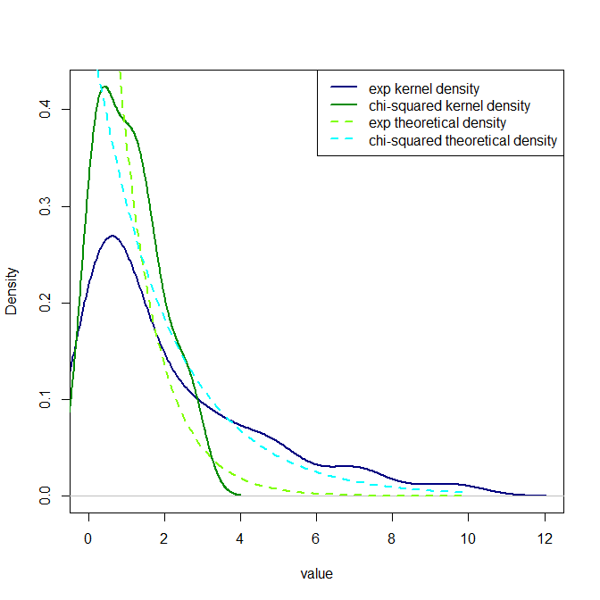
Nonetheless, it is typically difficult for people to determine shapes, or relative shapes, from qq-plots. I typically recommend people pair them with kernel density plots. You can assess if the shapes are similar with the qq-plot, and then figure out what the shapes seem to be from the density plot.
windows()
  plot(density(x2),  col="navyblue", ylim=c(0, max(density(x1)$y)),
       xlim=c(0, max(density(x2)$x)), lwd=2, xlab="value", main="")
  lines(density(x1), col="green4", lwd=2)

  xs = seq(0,10,.1)
  lines(x=xs, y=dexp(xs, rate=1), lty=2, lwd=2, col="chartreuse")
  lines(x=xs, y=dchisq(xs, df=2), lty=2, lwd=2, col="cyan")
  legend("topright", legend=c("exp kernel density",
                              "chi-squared kernel density",
                              "exp theoretical density",
                              "chi-squared theoretical density"),
         lty=c(1,1,2,2), lwd=2, col=c("navyblue","green4","chartreuse","cyan"))

I think the shapes are easier to see here. (I also included code for the true PDFs, if you want to see what they look like.)

