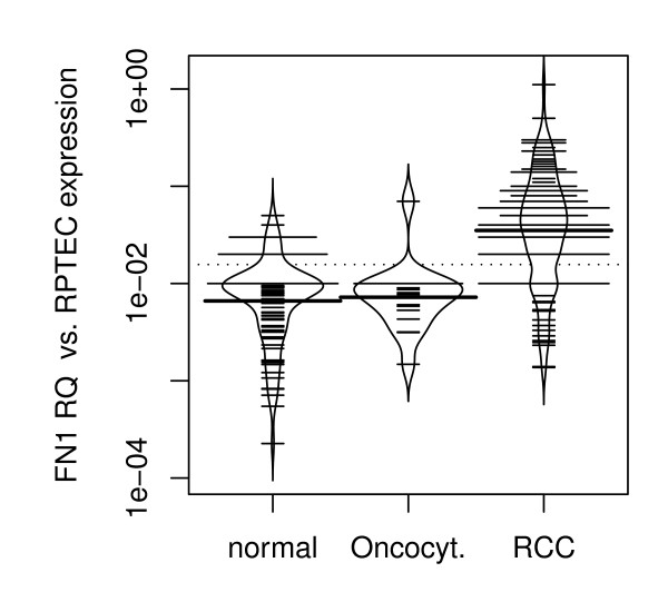
How does one interpret and generate bean plot charts. Here is one example taken from Walkes et al. 2010. What kind of data is it most useful for?

(source: biomedcentral.com)
How does one interpret and generate bean plot charts. Here is one example taken from Walkes et al. 2010. What kind of data is it most useful for?

(source: biomedcentral.com)
Boxplots were really designed for normal data, or at least unimodal data. The Beanplot shows you the actual density curve, which is more informative.
The shape is the density, and the short horizontal lines represent each data point. This combines the best of a boxplot, density plot, and rug plot all in one and is very readable.
Unfortunately, the example that you've chosen decided to add a bunch of longer lines which clutter the graph beyond recognition (for me). [snip]
EDIT: Having now worked with beanplot a bit more, the longer thick lines are the mean (or optionally median) for each bean. The longer thin lines are the data, with a sort of "stacking" where wider lines indicate more duplicate values. (You can also jitter them, which I prefer, but at least the "normal" category already has a fair density of points that jittering might make worse.)
I still think the example you chose is a rather cluttered, which could perhaps be cleared up by using jittering instead of stacking.
The paper that describes the R package for making bean plots is a nice read.
Without having read the whole paper, it appears to be essentially a variant of the boxplot. As such, you could use it where you would have otherwise used a boxplot, such as comparing the univariate distributions of several groups. It displays a line for each point and overlays a kernel density estimate. From looking at it, I would think it might be more informative with small amounts of data, but be too cluttered with more data. It doesn't seem very Earth-shaking to me, at first blush. If you want to know something more, elaborate your question.