6
$\begingroup$

Netflix and Google among others use customer usage (number of videos streamed or unique searches conducted) as a proxy for value, or for determining which version of a test is best. I am curious how they would measure this but I'm not great at statistics.

If they split their customer base into even groups, the usage within the group will still follow a distribution. So just comparing the mean usage in each group might be misleading if one group has a Bill Gates in it (or someone whose usage dominates the distribution).

What are some proxies I can use to help measure "this segment's usage is higher than the other segment's"? The distribution I am trying to measure is much more likely to have extreme usage numbers than Netflix or Google whose usage numbers are limited by the number of hours in a day.

Would a Q-Q plot be appropriate?

$\endgroup$

3 Answers 3

6
+25
$\begingroup$

Statistically, this question seems reducible to: how can you compare two distributions to see which one is bigger? You are right to question the naive use of the mean as a blind summary of the distribution. However, there are still very many ways you could approach this. Here are a couple of options:

1) The two-sample Kolgomorov-Smirnov test. You can think of this as a way to plot the two empirical cumulative distributions and then search for the point with the largest maximum vertical deviation between the distributions. This has the advantage of being agnostic about precisely where in the distribution you look for the differences. I actually think this page is better than the Wikipedia page at explaining it, because it has better graphics.

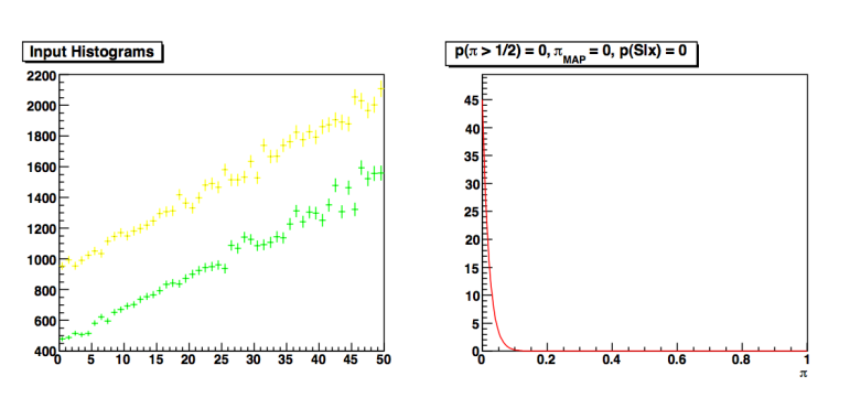
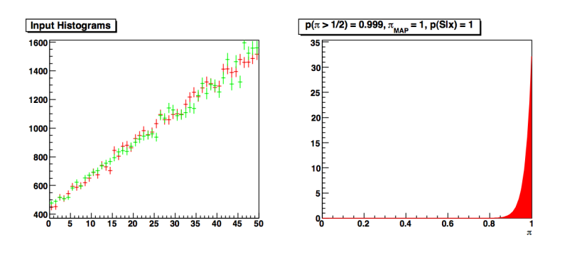
2) A Bayesian comparison between the case that both samples are drawn from the same distribution and the case that both are drawn from different distributions. Here you will likely want to bin the distributions into histograms. This paper discusses and demonstrates a nice way of performing this. It models each histogram as coming from a Poisson distribution, and then infers whether they share the same rate parameter or whether the rate parameters differ. This is captured by a parameter $\pi$, whose probability mass is near one in the case that the histograms are the same,

two histograms drawn from the same distribution

and is near zero in the case that the histograms are different,

two histograms drawn from different distributions

(The code is available online. You'll need ROOT installed.)

This method is likely to give better answers, but will take more time to implement. Whether you should use it or something like it depends on how crucial it is to you to get an extremely accurate answer rather than a good enough one.

Q-Q plots

This might be a nice way to visualize the differences between the two usage distributions. From what I can tell, Q-Q plots are more often used to compare one empirical distribution to a theoretical one, e.g. to a normal distribution, to justify its use. If you want to do a Q-Q plot with two empirical distributions you will first need to estimate the quantiles.

Q-Q plots may be worth investing some time into, but as a descriptive plot (i.e., you can't easily get a summary statistic out of them), you will either have to convert what you learn from them into a form that is easier to interpret, or make sure that whoever you are presenting the data to can interpret them. And they are not that easy to interpret. So, bottom line: yes, they could work, but unless you are already good at them I think it'd be easier to use another option.

$\endgroup$
2
$\begingroup$

Quick answer

Compare medians instead of means, which will be more robust to the effects of extreme values.

More details

The best way to compare the distributions of usage between your customer groups depends on what you are trying to achieve by comparing them. For example, say you have the following groups:

A: 4, 5, 6
B: 0, 0, 0, 0, 50

There is no one answer to which group is has higher usage, but here are a few scenarios:

Mean

Comparing the mean of B (10) to the mean of A (5) would be appropriate if you want to know, for example, whether the increase in total usage would be greater if you were to add 5 new customers that would fall into group A (expected increase of 25) versus 5 new customers from group B (expected increase of 50). The extreme values will only contribute to larger variance on these expectations.

Median

Comparing the median of A (5) to the median of B (0) would be appropriate if you just want a quick way of saying whether a "typical" customer from group A would have higher usage than a "typical" customer from group B. Calculating the median is easy and gives good results, and in most cases will provide nearly the same results as the following more rigorous approach.

Mann-Whitney U / Wilcoxon rank-sum / AUC... a.k.a "test statistic of many names"

Calculating the U statistic is my personal favorite (although the proliferation of names is confusing). The U statistic is the probability that the usage of a uniform randomly chosen customer from group A is greater than the usage of a randomly chosen customer from group B. It's useful in a wide variety of situations. In addition to having an intuitive meaning, it's easy to test if the value of this U statistic is significant. It generalizes well to more than two groups, under the name Multiclass AUC*.

Significance

You will probably also want to check that any differences between groups are significant. The Mann-Whitney U works for this, as does the Kolgomorov-Smirnov (KS) test. The way-too-common T test makes assumptions about the distributions that don't sound justified with your data.

If, like me, you can't stand the proliferation of tests named "{Dead statistician} {Letter of alphabet} Test", (and you are interested in really understanding the concept of statistical significance), you can choose your software and simulate the process many times and see how unlikely the observed value of the test statistic is (bootstrapping*).

For example, if you want to see if the measured value of your U statistic is unlikely to occur if the groups are not different at all, try this:

  1. Combine the data from group A and group B into one group, 4, 5, 6, 0, 0, 0, 0, 50
  2. Randomly pick values from the combined list, with replacement, to form two groups with the same sizes as A and B, for example A': 0, 4, 4 and B': 50, 0, 0, 6, 5. Since you know that these A' and B' were just chosen randomly from the same population, this is an instance of a "null model" that the groups are not different.
  3. Measure the "test statistic" for these two groups (this could be the difference in means, the difference in medians, the AUC, the KS value, or anything else you dream up) and write it down.
  4. Repeat 2 and 3 many times.
  5. Measure the "test statistic" for your actual groups, and compare it to the distribution of test statistics that you just generated. If it it falls outside the range, then the actual value of your test statistic was unlikely to occur in your null model, and the value is statistically significant.

NOTE: I couldn't put more than two links in here, because I don't have enough street cred on Cross Validated yet. I'll edit when I do.

$\endgroup$
2
$\begingroup$

It sounds like you are looking for a robust test of the difference between two measures of location. You are right that using the mean poses all sorts of problems, not least of them extreme outliers. Research in recent decades has shown that comparison of means, relying on large sample properties, is much more problematic in many real-life situations than had been appreciated.

A good alternative is a comparison of 20% trimmed means. A percentile bootstrap around a mean with at least 0.2 trimming is "one of the most effective methods for obtaining accurate probability coverage and achieving relatively high power" (p.336 of Wilcox 2012, Modern Statistics for the Social and Behavioral Sciences, CRC Press, thoroughly recommended). There are straightforward implementations available in R.

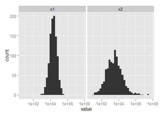
For example, consider the mixed log-normal distributions in the R code below. x1 is generally much bigger than x2, but x2 is contaminated with 20 very large values that blow the mean out of the water. Either the median or the trimemd mean give a much better sense of the general centre of location.

> x1 <- exp(rnorm(1000,10,1))
> x2 <- exp(rnorm(1000,8,2))
> x2[sample(1:1000,20)] <- exp(rnorm(20,12,5))
> combined <- melt(data.frame(x1,x2))
Using  as id variables
> tmp <- round(rbind(with(combined, tapply(value, variable, mean)),
+ with(combined, tapply(value, variable, mean, tr=.2)),
+ with(combined, tapply(value, variable, median))))
> row.names(tmp) <- c("Mean", "TrimmedMean", "Median")
> tmp
               x1      x2
Mean        35229 1282017
TrimmedMean 25077    5992
Median      22454    3896
> qplot(value, data=combined, log="x") + facet_wrap(~variable)

enter image description here

$\endgroup$

Your Answer

By clicking “Post Your Answer”, you agree to our terms of service and acknowledge you have read our privacy policy.

Not the answer you're looking for? Browse other questions tagged or ask your own question.