A ROC curve visualizes TPR and FPR for all possible thresholds.
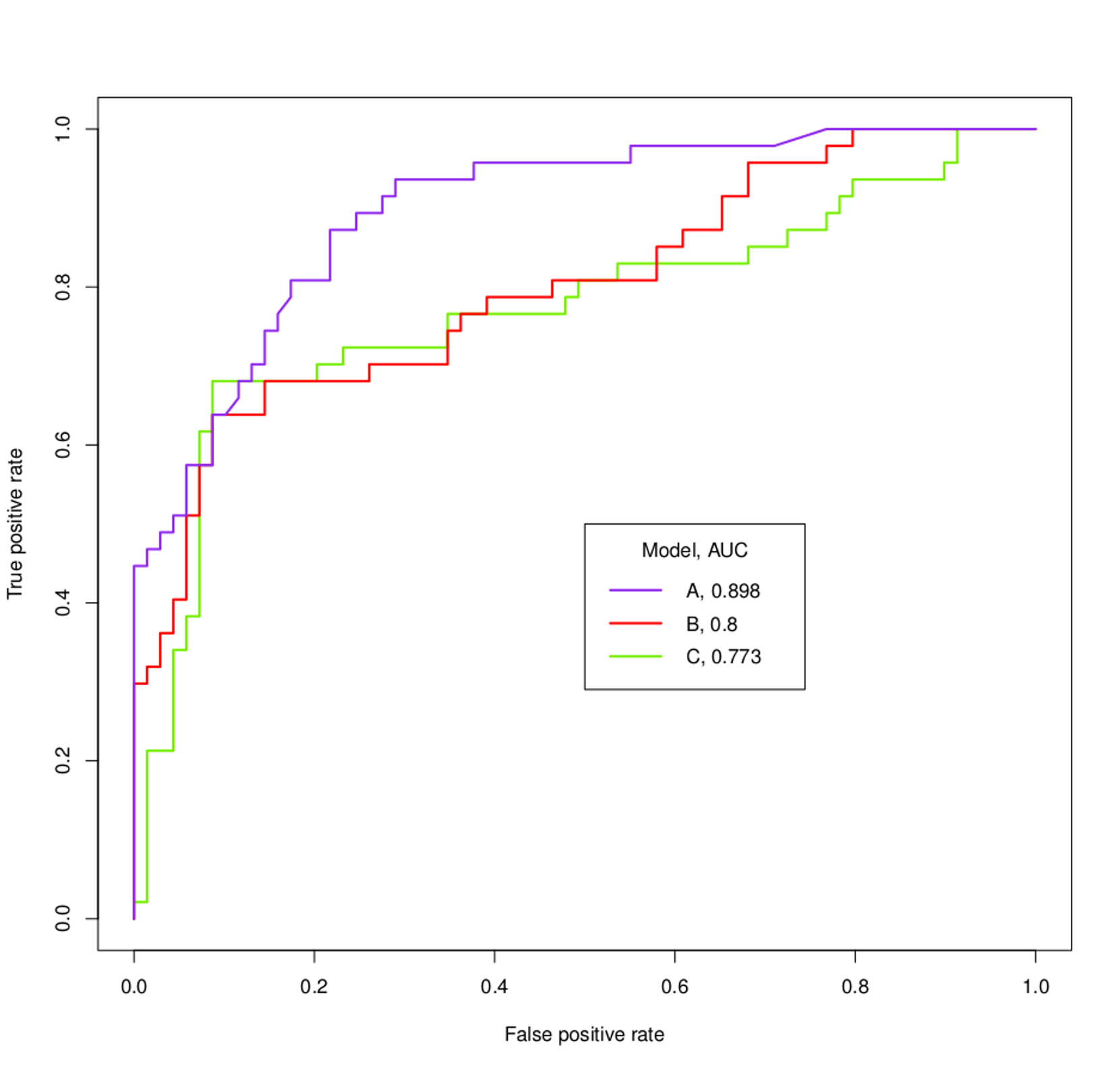
If you plot two ROC curves 'A' and 'B' and they do not cross each other, then one of your classifiers is clearly performing better, because for all possible FPR values you get a higher TPR. Obviously the area under the ROC will also be greater.
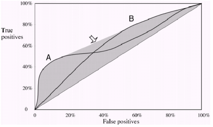
Now, if they do cross each other, then there is a point where FPR and TPR are the same for both curves 'A' and 'B'. You can no longer say that one ROC curve performs better, as it now depends on what trade-off you prefer. Do you want high Precision/low Recall or low Precision/high Recall ?
Example: If one classifier performs much better on a FPR of 0.2, but it is important to reach high Recall, then it performs well on a threshold you are not interested in.
About the ROC curves in your graph: You can easily tell that 'A' performs much better, without even knowing what you want to achieve. As soon as the violet curve crosses the others it crosses them again. You are most probably not interested in that small part, where 'B' and 'C' perform slighty better.
In the following graph you see two ROC curves, that also cross each other. Here, you cannot tell which one is better as they kind of complement each other.

Notice, that at the end of the day, you are interested in picking one threshold for your classification and the AUC only gives you an estimation of how well a model performs in general.


